 patternfly
Update padding & spacers on pfe-card
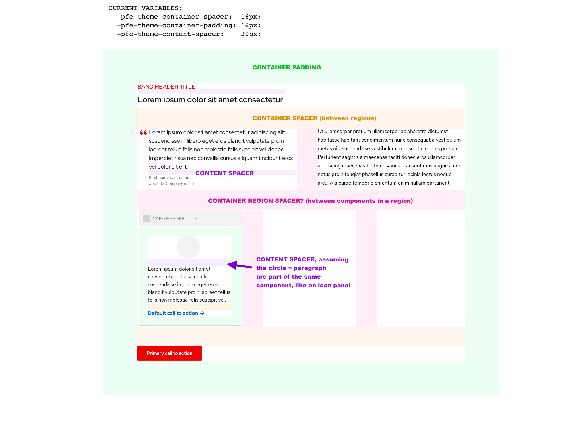
We need clear definitions around when to use which one of these variables:
  container-spacer:              16px,
  container-padding:             16px,
  content-spacer:                24px,
There seems to be some mixnmatch in some components but my general understanding is:
- Container spacer is used to align UI items in components, like the chevron in an accordion header
- Container padding is used between the edges of containers and the content they hold
- Content spacer is used between sections within containers, like card header & card body, or band body & band footer.
Can anyone either tell me if these assumptions are right or wrong? And let's add that to the docs and clean up some of the outliers, like for example this is in the _extends.scss:
%container {
    position: relative;
    display: block;
    width: 100%;
    padding: #{pfe-var(container-spacer)};
}
(and I think that should be container-padding). Thanks!
+1
My assumption was similar:
- Container spacer is used to between two container elements like two cards in a grid or stack
- Container padding is used inside a container such as the padding between the edge of the card and the content inside it
- Content spacer is used between sections within containers, like card header & card body, or band body & band footer
🤷♀
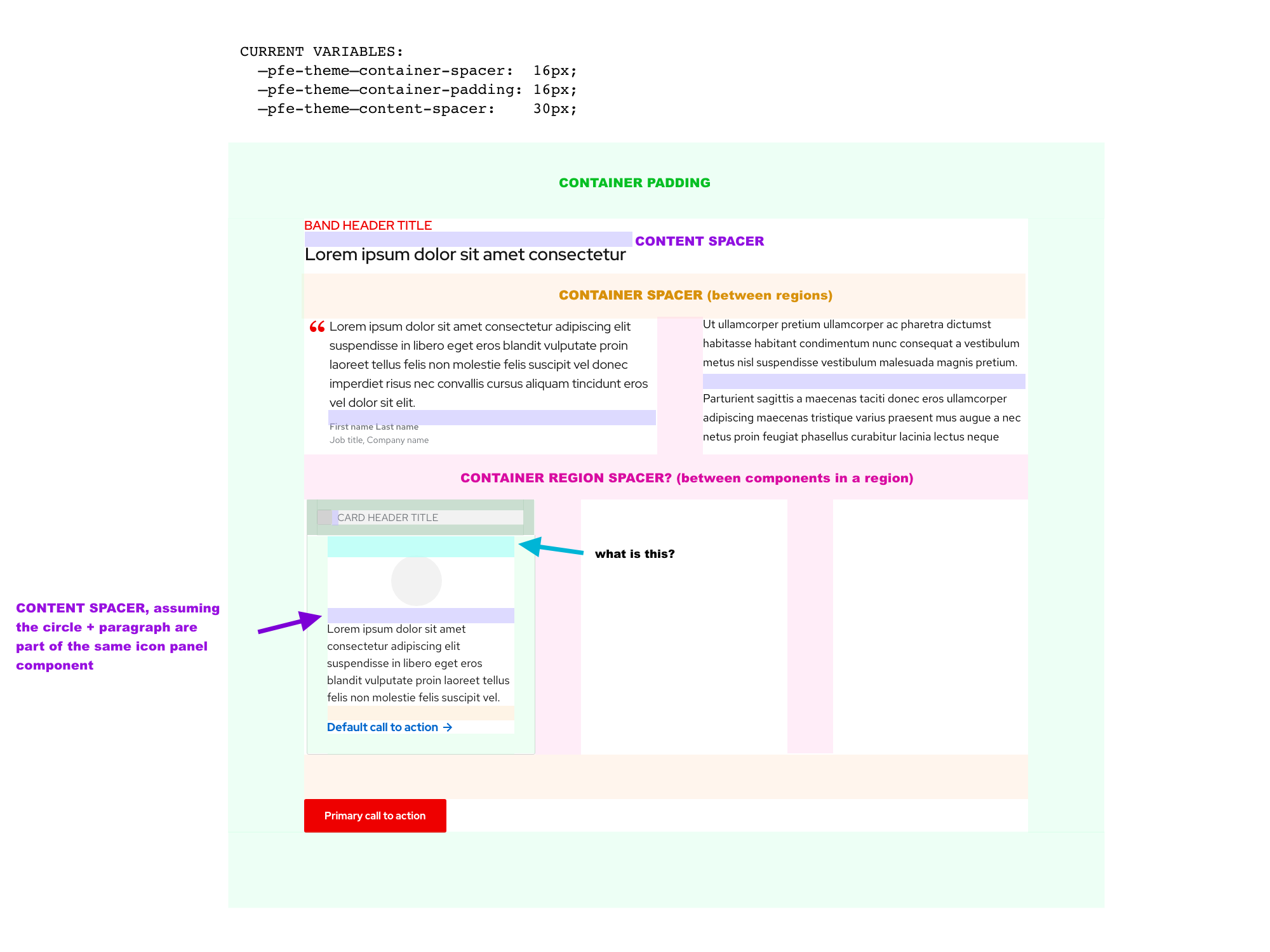
@castastrophe I think i agree with the first two bullets, but I would have guessed that content spacer is the default amount of space between things like paragraphs, or maybe between two elements in a component, like between the icon & text in an icon-panel.
It does beg the question of the space between regions in a layout, vs. the space between components in the same region of a layout. Do we need a 4th variable, like container-region-spacer or something?
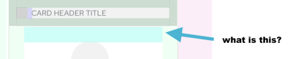
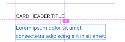
Adjusted the image to indicate an area of the card that we have questions about.. is that a container-spacer or container-padding variable?
Also related to spacing; on the card mockups: https://xd.adobe.com/spec/3e62e93c-8338-4f31-5040-3b81f0ed5c71-4853/screen/930cbfcc-d26a-49cc-85e9-30e360dde698/Card-bar
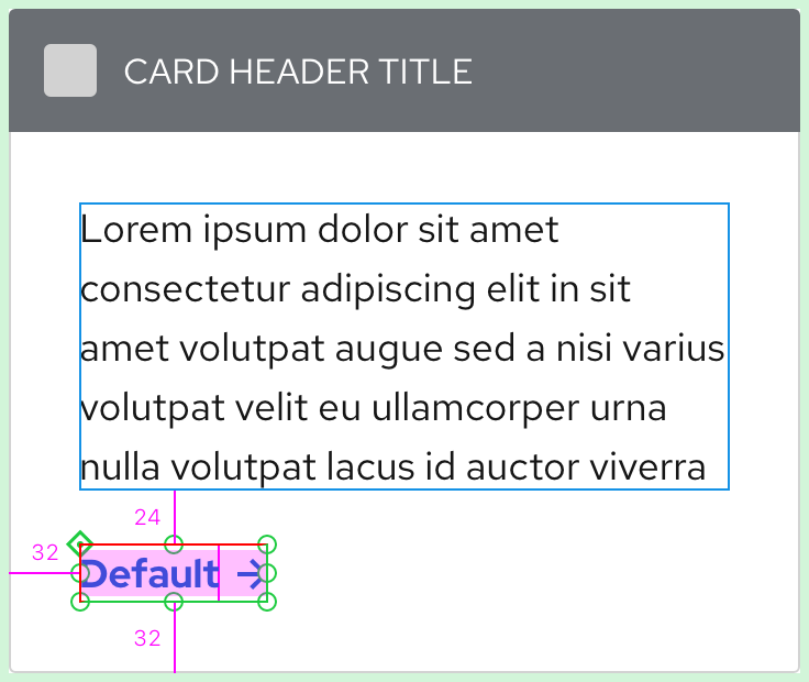
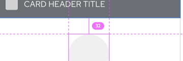
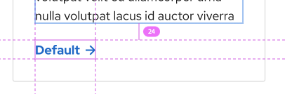
It shows the distance between the card header & card body as 32px, but the distance between the card body & card footer is 26px. Why are they different?
It also says there are 26px between the paragraph and the CTA, where does 26px come from? The spacers file only lists 24px.
cc @coreyvickery
@starryeyez024
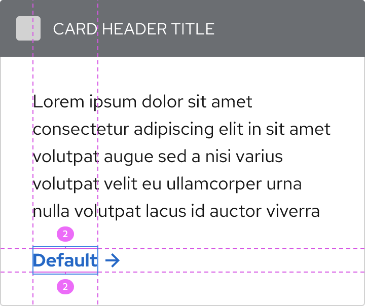
Unlike Sketch, XD doesn't apply extra height to text layers when the line height changes. For example, in Sketch, a single line of 16pt type with a default line height = 21px; with a line height of 24 = 24px. I've been told that this is the same in code.
In XD, sometimes I have to draw invisible rectangles around text layers which represents text's true height in code. In the examples below, the CTA is 18pts and 23px tall in XD, but its true height is 27px tall because the line height is 27 (1.5). I also did this to the CTA and Button text layers in XD to compensate for the text height when we compared my designs to Allie's in Sketch way back when.
XD app
The pink area represents the text layer height in XD; the red border represents the invisible rectangle in XD; the thin green border represents the true height of the text layer in code.
XD link
You have to know where to hover to find the invisible rectangle, but it's there.
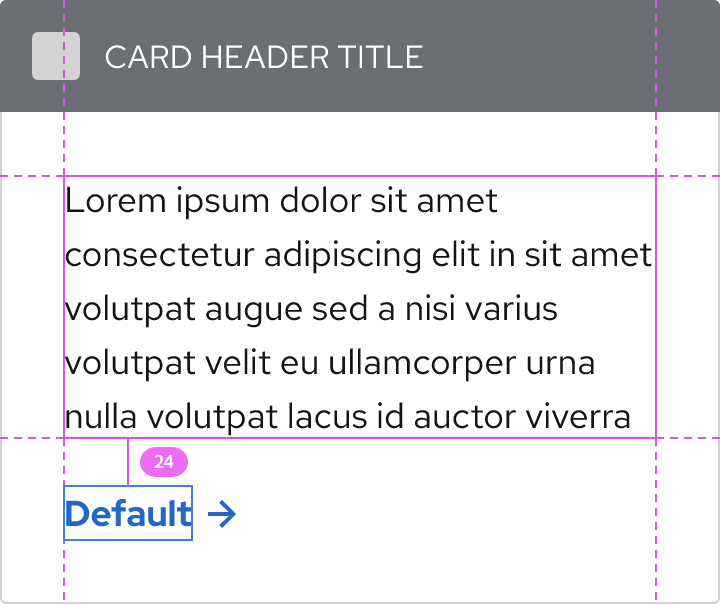
This is a very long-winded way of saying that the space in between the paragraph and CTA should be 24px.
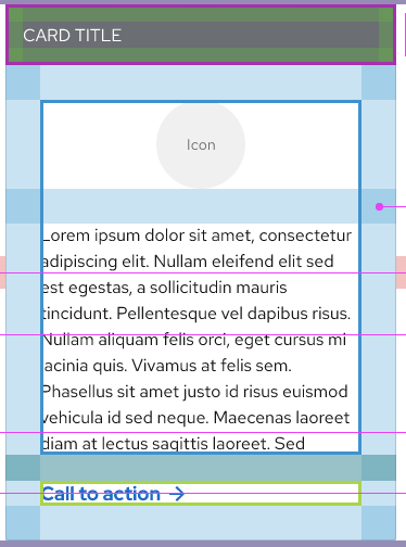
It shows the distance between the card header & card body as 32px, but the distance between the card body & card footer is 26px. Why are they different?
What did you mean by this? It should be 32px all around, even under the bar.
@coreyvickery thanks for the explanation, we'll try to find the hidden blue boxes from now on. :)
To elaborate on my question, it was noting that the space between header & body regions is 32px:
but the space between body and footer regions is 24px:
Based on your response, you're kind of answering this question:
as "card padding", which is 32px. It seems as though a card header with a new background color is almost like a separate connected container, because it has its own unique padding. And the 24px is the container-spacer (space between regions). If that's true, I would extend the question to the other card mockups, which show 16px between the header & body regions; should that be 24px?
This deviates from how we have traditionally thought of the card header, body, and footer regions as equals. We have not usually changed the left/right padding on the header because sometimes the card header has a background color and sometimes it doesn't. We do adjust the space between the header and body if there is no background color though, so we could apply similar logic to support the reduced side padding. https://url.corp.redhat.com/6c8639b
Would you say that the smaller padding on the new card header designs is tied to the fact that there is a background color on the header? Asked another way, does a card header region cease to exist (visually) if it doesn't have a different background color?
https://docs.google.com/document/d/1nNQd2kVYo0OMd0JxcqdKRCLTbCThpCG6DzERXNpEhCc/edit?usp=sharing
@starryeyez024 Do you think this requires more discovery? Or perhaps a call? I'm not sure where we left off with this conversation.
From the perspective of the card story, I asked @castastrophe yesterday and she said she had what she needed to move forward, but I'm sure she will reach out if she has further questions.
In general, I think it would be great if there was an artboard in the design kit that showed how these 3 types of spacers are differentiated. :)
@coreyvickery let's document this as part of the card pattern/component for the design system site. It doesn't really fit in the kit.
@starryeyez024 @castastrophe @dcaryll @markcaron @chrisdo1 @diwanshi @KrystalMoore16
Here's my research for pfe-card so far. I tried to include as many specs as possible, but let me know if there's anything that I missed.
https://xd.adobe.com/view/f51a270d-23ee-4734-8db1-f09f8a8e6db0-a049/
Hey @coreyvickery, this looks great! Thank you for looping me in.
It may just be me since I have an astigmatism and this tends to bother people like me more than others, but the color for the dark theme (#151515) seems a bit harsh on the eyes when there's white text on it. I tend to experience a lot of eye strain and a halation effect from it.
Can we consider using --pf-global--BackgroundColor--dark-300 instead of 100 for cards and other components, like tooltips, in the future? Just a suggestion. Thanks in advance!
@starryeyez024 Did we want to break up this issue into smaller issues?
@coreyvickery first of all, slow claps for this :D
To answer your question though, yes, this issue is specifically around padding & spacing. If there are tweaks around color, that should definitely go in a separate issue since those values are globally set for all layouts ( @KrystalMoore16 that is good feedback; what you are suggesting is changing the default value of --pfe-theme--color--text--on-dark).
@bennypowers For 2.0, I don't think so, but I still think we should make these changes if someone can tackle them.