We need a more diverse set tones in our red family -- specifically a midtone red
Working on labels updates, it became clear that we are lacking options in our red color palette. The new heavy red labels need to have a subtle red outline, which just can't be achieved with what we have now. @mceledonia we've talked a bit about this already
Current:
 Proposal:

related to this: https://github.com/patternfly/patternfly-design/issues/753
Our red color palette doesn't follow the same convention as our other colors, which causes us to run into issues like the above. Here's a quick visual:
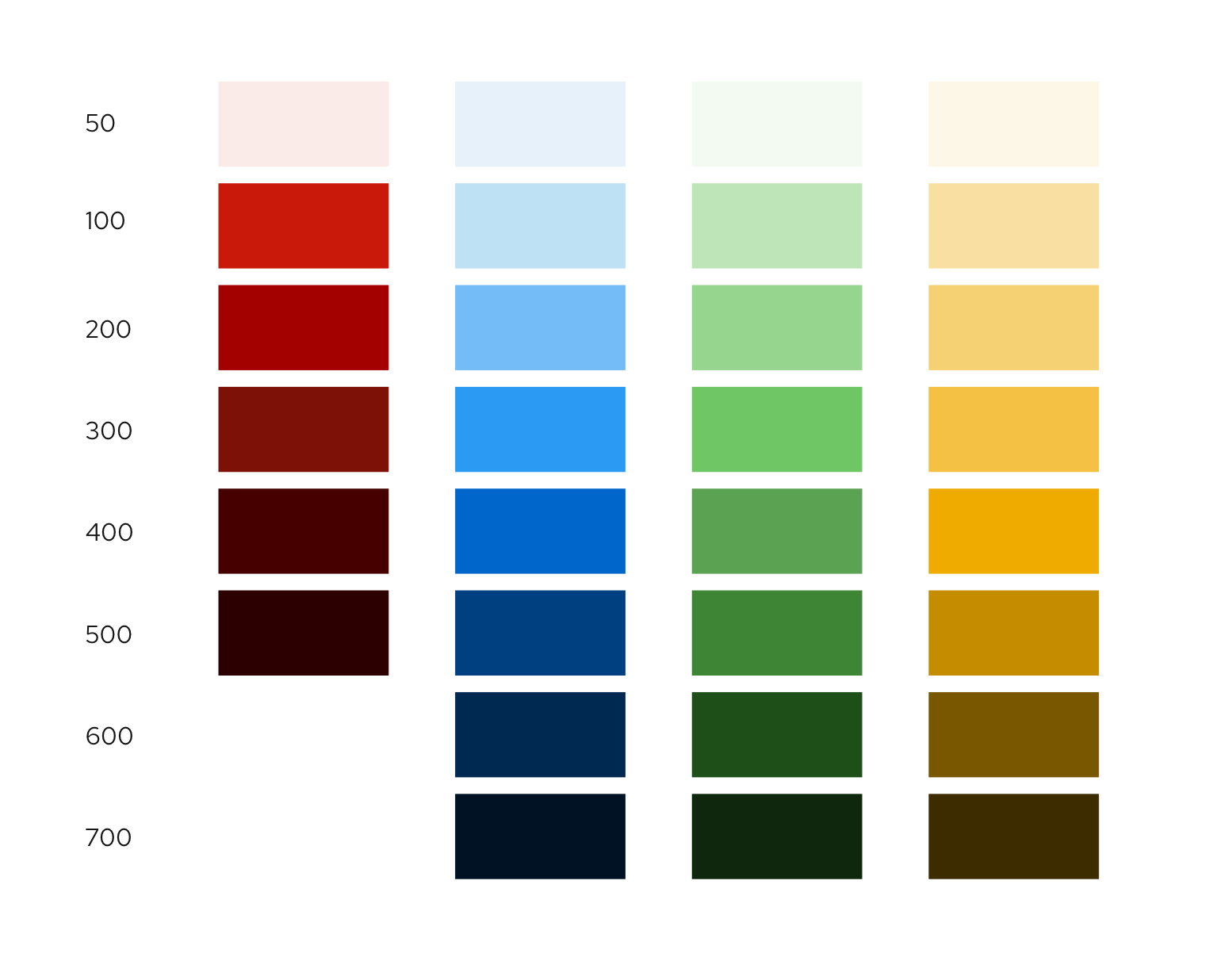
This was most likely because of our alignment with the old brand system which did not include brighter reds, but luckily the new system does. That being said, since our usage of the color red is exclusively negative, I don't think we would want to use the brand reds as that would be using our brand colors in a negative light.
I'll see what I can do to come up with some new reds which both match our regular color palette structure and work for our use cases like the one Mary has shared above!
@mceledonia I assume this has been covered by the RH visual language work. Can you confirm what, if any, agreements we've reached on this?
red-50 #FAEAE8 V4 ONLY
red-100 #FFDBD9
red-200 #F69F98
red-300 #EE665B
red-400 #C9190B --pf-global--danger-color--100
red-500 #8A0A00 --pf-global--danger-color--200
red-600 #5A0600 --pf-global--danger-color--300
Still a bit awkward because our ...-50 colors are what we're using for our background, but in the new color structure that's taken care of by -100 so it is very similar in brightness. the current ...-50 red is still brighter than ...-100 so I'm proposing we leave it as-is, and just add/adjust the rest as seen above.
Thanks, @mceledonia . Is this a change then that we should be making to our global color variables for v5. @mcoker thoughts?
For v5 we can leave out red-50 but I'm proposing leaving it in for v4 so that we don't end up with a red-100 status background color (amongst other color-50's ) and/or a red-300 core color (if we just removed 100 from the above list) when our core colors are usually color-400.
The new V5 colors all start at 100 and have the core/main color at 400, which is a slightly different structure than what we have now which is a bit all over the place.