Button guidelines: add guidance on placement of a Test button
On multiple occasions people have asked where to place a Test button in a form when the user is encouraged to test configuration changes before saving. We should add this topic to the Button guidelines.
Notes:
Possibility shared:
Other possibilities = putting it somewhere else, like on the top right of the form where it could always be accessible.
I do have a few questions/concerns about this direction that I wanted to bring up:
Concerns:
- It doesn't feel like the "right" location for this type of action. While not true in every instance, both "Save" and "Cancel" will cause you to move away from the page, and "Test" wouldn't.
- The "Test" action seems like something you would do before saving the screen. An exaggerated example might be something like "Spell Check." I don't think anyone would consider putting that as a button in this location.
- It's not extendable. If two actions were needed, would you put both between save and cancel?
Adding this sort of action to the top right in the header would be a clearer and more flexible solution.
- It would allow for many actions if needed through the use of a kabab
- It would do a better job of showing the action as part of the form.
- This solution would work for pages with fixed headers and footers, but we would need additional guidance for pages that did not.
For those pages that have unfixed headers
- How common is it to have unfixed headers and footers?
- How common is it to fixed footers but not headers? Is that common?
- Is it currently recommended in most cases to use fixed headers and footers? If so, would this issue only arise when doing a targeted redesign of a screen?
Thanks!
@mmenestr I am going to transfer this one to design for further exploration. Feels like more than a documentation question. I can see two sides of this. Part of me feels like the button should be at the bottom of the page where it will have the user's attention after they complete the form. But I also see @arburka 's argument for why it does not belong there. Maybe there are other possibilities we are not thinking of? Would be good to see how others handle similar use cases.
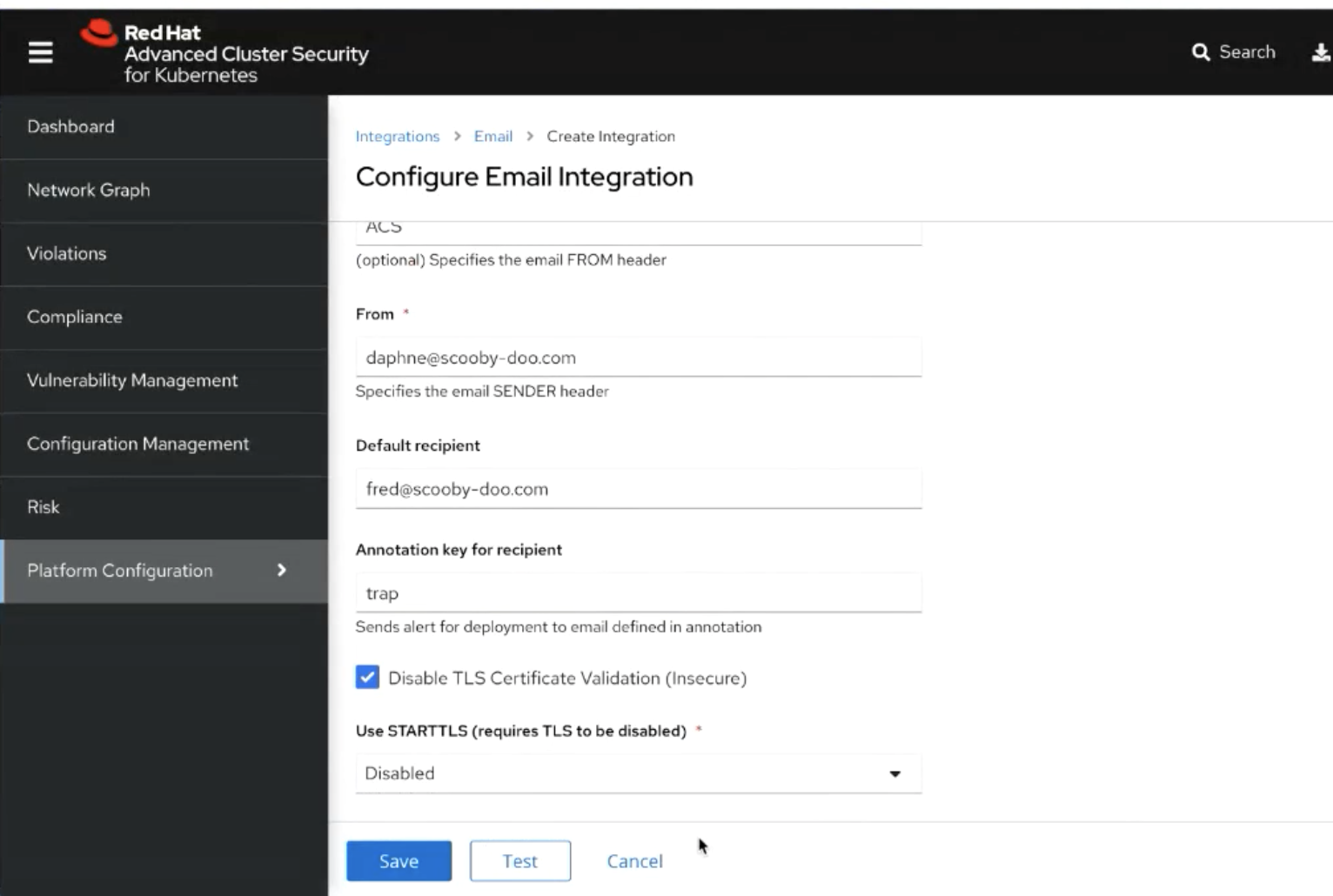
Based on feedback in the PF meetings and product examples I tried this as an inline "test configuration" action on specific inputs. If this action is for an entire form it is more in-line with our existing form validation. Here are some screens that show start, in-progress and final state based the test.
This looks great @andrew-ronaldson . Thanks for your effort on this.
@mcoker can you take a look at the mockups attached above? They include placing a "Test configuration" button as a plain button below a form field and displaying a spinner while the test is in progress. Do you see any issues there? I know we currently have the progress button component, but wasn't sure if a plain modifier can easily be applied to get what we see here or if this requires a new variant to create a lighter weight progress button.
@mcarrano this looks good to me, although the button looks like an inline link button and that button doesn't support the progress state, so we would need to add that support.
Yeah, I thought that would be the case. I've opened https://github.com/patternfly/patternfly/issues/4994 to add that variant.
This pattern will be documented as part of the Forms guidelines. Closing this in favor of https://github.com/patternfly/patternfly-org/issues/3418