Typora-foresee-theme
 Typora-foresee-theme copied to clipboard
 passwordgloo
Theme supports for dark and light mode.
Typora foresee theme

 中文 |
中文 |  English
Thanks
Based on default night theme modifies my theme
Selected textstyle is inspired by typora-dyzj-theme
How to use
- Clone this repository or download zip
- Typora open Settings>Apperance>Theme,click the button
open theme folder - Copy and paste files into the theme folder
Features
- Automatically switch theme mode based on the appearance of the system
- User defined color configuration
- Modular design approach adapts to diverse needs
- Use
scssformat substitute originalcss
BREAKING CHANGES
Code Style
Inline code
[!note] Use Mac keyboard style for line code and
kbdelement
inline code like this

kbd element like this

[!important] Please go to Preferences>Markdown> to turn on
displaying line numbersfor a better experience
- Support custom cursor color

- Different code style based on the appearance of the system


Blockquote
- Default blockquote style use theme single color
You can type > to insert blockquote by default

- Blockquote style supports linear-gradient
<blockquote alt = 'green'>green</blockquote>
<blockquote alt = 'blue'>blue</blockquote>
<blockquote alt = 'orange'>orange</blockquote>
<blockquote alt = 'purple'>purple</blockquote>
<blockquote alt = 'red'>red</blockquote>

- Github blockquote style
> [!note]
>
> Note text

> [!tip]
>
> Tip text

> [!warning]
>
> Warning text

> [!caution]
>
> Caution text

> [!important]
>
> Important text

- Blockquote style can change its color when it close to heading

Title
[!note] Redesign header style and its focus mode

Icon
<section alt="note">note text</section>
<section alt="info">info text</section>
<section alt="tip">tip text</section>
<section alt="warning">warning text</section>
<section alt="caution">caution text</section>
<section alt="important">important text</section>

[!tip] Provide local small icon in which foldername called
icon
[!important] Copy and save in a fixed location on your computer, and directly reference the file to the image

Badge

Personalities
[!warning] The foresee-XXX.css file located in the root directory of the files is compressed by default. Please modify the
foresee.scssfile located in theforeseefolder so that you can make your own personal style
$display: (
  light:#FFF,
  dark:#666
);

$article: (
  light:#FFF,
  dark:#323232
);

$sidebar: (
  light: #F2F2F2,
  dark: #3E3E3E
);

$textColor: (
  light:#DEDEDE,
  dark:#323232
);

$tomato: #ff6347;

$purple: #ff00ff;

$blue: #00bfff;

$green: #00cd66;

$orange: #ff8c00;

$red: #f14669;

/* Gradient colors */

$black-gradient: #596164, #646c70, #6f787d, #7a8389, #868f96;

$blue-gradient: #005bea, #007bf9, #0097ff, #00affe, #00c6fb;

$tomato-gradient: #ed2842, #f33d58, #f7506d, #fa6181, #fb7294;

$orange-gradient: #e9a11a, #eab211, #e8c40a, #e5d50f, #dee71d;

$purple-gradient: #c471f5, #d66feb, #e46fe1, #f06fd7, #fa71cd;

$green-gradient: #0ba360, #39b05d, #57bc5a, #72c856, #8ed451;

/*  You can change theme color and theme gradient color */

$themeColor: $orange;

$focusColor: $green;

$themeGradient:$orange-gradient;

$focusGradient:$green-gradient;

:root {
  --bg-color: map-get($article, light);
  --select-text-bg-color: map-get($display, dark);
  --text-color: map-get($textColor, dark);
  --primary-color: $themeColor;
  --rawblock-edit-panel-bd: map-get($sidebar, light);
  --item-hover-bg-color: $themeColor;
  --control-text-hover-color: $themeColor;

  --md-char-color: rgba(72, 93, 108, 0.75);
  --meta-content-color: var(--md-char-color);
  --primary-btn-text-color: var(--text-color);
  --active-file-text-color: $themeColor;
}

// Custom fonts and style

$border-radius: 6px;

$font-family: "Microsoft YaHei", "PingFang SC", "Arial", "sans-serif";

/* you can change default page width
#write {
  max-width: 914px;
}
*/
Tutorial
Visit wiki to learn tutorial
Preview
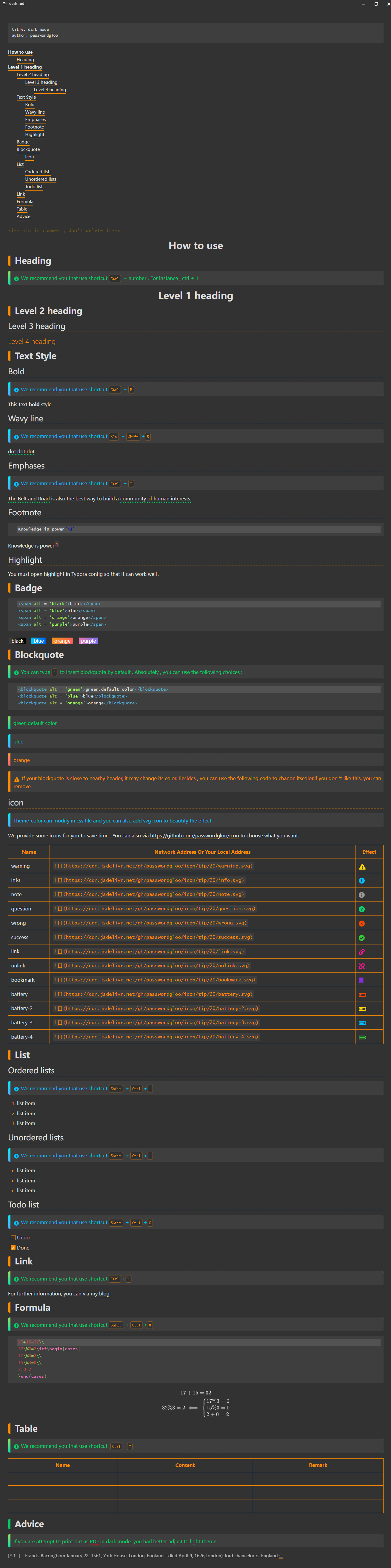
Dark mode
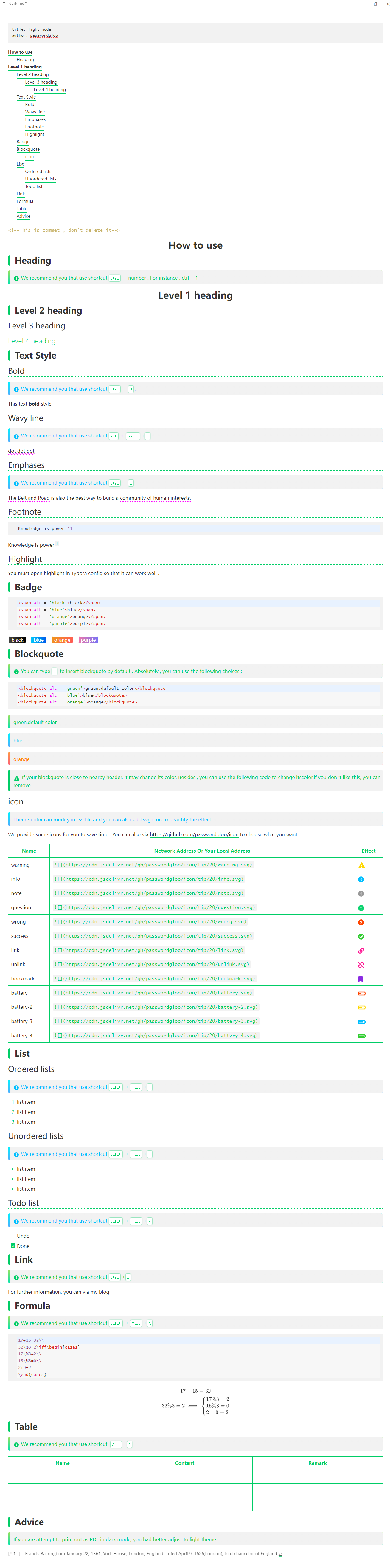
Light mode
Purpose of use
-
classify my files
-
left the footprint of learning
-
enlighten other's thoughts
 passwordgloo