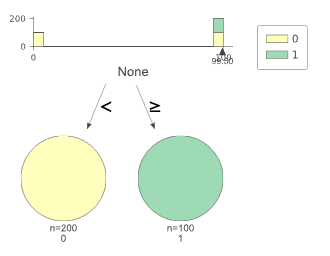
labels too close to the axes overlap for classifiers
@parrt , is this the kind of thing you're talking about? Cut points are overlapping with axis bounds.
hahah. yep. that's a good example. thanks!!! Any chance you can send a tiny bit of code we can run as a test for that?
Yes, sure. Thanks for testing!
import numpy as np
from sklearn.tree import DecisionTreeClassifier
from dtreeviz import trees

X = np.tile((0, 99, 100), 100).reshape(-1, 1)
y = np.tile((0, 0, 1), 100)

clf = DecisionTreeClassifier(random_state=22)
clf.fit(X, y)
trees.dtreeviz(clf, X, y, class_names=['0', '1'])
@parrt we could try moving the wedge down, but we'd also need to move the feature name / x-axis label.
I wonder what we do for regression. I think I simply move to the label away from the wedge. Ah:
if node.split() > xmin + .10 * xr and node.split() < xmax - .1 * xr:  # don't show split if too close to axis ends
    xticks += [node.split()]
@parrt Hmm that just turns the wedge off, not an ideal solution. I think we should give the user options:
- The current behavior, you may have overlaps.
- Hide wedge if split is too close to axis limits as in the regression.
- Move all of the wedges and x-axis titles down by enough vertical distance that overlaps are not possible.
Let me know if you'd like help coding any of this up.
Hmm...i'd like to keep vertical space small as possible so (3) not great solution, unless we decide to only do that when we'd overlap.
Options are nice, but they double or triple the testing space. :(
I think for now we can just do (2).
I wonder what we do for regression. I think I simply move to the label away from the wedge. Ah:
if node.split() > xmin + .10 * xr and node.split() < xmax - .1 * xr:  # don't show split if too close to axis ends
    xticks += [node.split()]
@parrt actually that code just controls an extra tick on the x-axis at the split location. The wedge at the split and ticks at the beginning and end of the axis are drawn regardless, see xticks = list(overall_feature_range) and wedge(ax, node.split(), color=colors['wedge']).
    if not node.is_categorical_split():
        **xticks = list(overall_feature_range)**
        if node.split() > xmin + .10 * xr and node.split() < xmax - .1 * xr:  # don't show split if too close to axis ends
            xticks += [node.split()]
        ax.set_xticks(xticks)

        ax.scatter(X_feature, y_train, s=5, c=colors['scatter_marker'], alpha=colors['scatter_marker_alpha'], lw=.3)
        left, right = node.split_samples()
        left = y_train[left]
        right = y_train[right]
        split = node.split()

        ax.plot([overall_feature_range[0], split], [np.mean(left), np.mean(left)], '--', color=colors['split_line'],
                linewidth=1)
        ax.plot([split, split], [*y_range], '--', color=colors['split_line'], linewidth=1)
        ax.plot([split, overall_feature_range[1]], [np.mean(right), np.mean(right)], '--', color=colors['split_line'],
                linewidth=1)
        **wedge(ax, node.split(), color=colors['wedge'])**
Would you like me to make a PR addressing this for both classification and regression? I can turn off the offending tick at the beginning / end of the axis if the split is too close. It may also be a good chance to combine both wedge() functions into a single _draw_wedge() utility function in utils.py, with a flag for classification or regression.
- It definitely makes sense to combine that functionality to generate a wedge.
- What if we moved the wedges below the axis but only if they would collide or get too close to the left or right edge?
- It definitely makes sense to combine that functionality to generate a wedge.
Sounds good, will do.
- What if we moved the wedges below the axis but only if they would collide or get too close to the left or right edge?
hmm then the heights / aspect ratios of the subplots included in the graph would probably be off for those nodes. I think it is okay ditching one of the axis endpoint labels if the wedge is within 10% of an end, as the wedge also has a numerical value. Plus that keeps everything else on the plot consistent, and is easy to implement :smile:
Yes I think your approach is good. We drop the axis label and keep the label on the wedge itself if too close. Seems like the simplest solution
@parrt actually, looking at the wedge plotting code, only classification tree non-categorical splits get a text label under the wedge. I've started refactoring the wedge plotting code in https://github.com/parrt/dtreeviz/pull/236 here, which makes it clearer.
Would you like to add the text label to the other wedge types as well? Or keep the text label behavior as is, and still blank out one of the axis end point tick labels?
It seems we should also be doing the text label under the split for regression trees. I think we do

@parrt I think that is a tick label, not an extra text object like is done for the classification trees:
            ax.text(tip_x, tip_y -2 * tri_height,
                    f"{myround(x, precision)}",
                    horizontalalignment='center',
                    fontsize=ticks_fontsize,
                    fontname=fontname,
                    color=color)