Improve diff accessibility
The color scheme used to connotate improvements or regressions uses green and red and blue for neutral. Unfortunately, those colors are not particularly accessible, and given that about 300 million people are colorblind we should make sure that at least a more accessible color palette is available or even used by default.
I did some reading on this, and we can go with replace red/green scheme with yellow/blue scheme as that is colour-blindness friendly.
Here is an example in regard to GitHub PR diff:

Comparison between various vision anomaly:
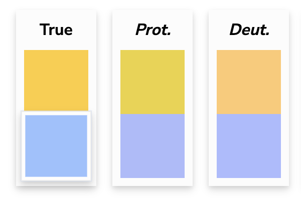
Another option, instead of the red/green, we could go with magenta/green as that too gives good contrast (but doesn't retain the same perceived colour) for various types of vision anomaly.

Wdyt?
Also, should we make this scheme the default or make it switchable with a user preference option?
I frankly don’t think I’m the right person to decide this, but if that’s what GitHub uses for diffs then I feel that’s probably a good choice.
No, that is just something from a third-party GitHub theme modifier.
I'll do some more research, and then we can decide.