legacy-paperclip
 legacy-paperclip copied to clipboard
 paperclip-ui
DSL 2.0
Need to keep mind that the DSL doesn't need to do everything. Functionality can be added via hand-written code outside of the DSL. The goal is to have a DSL that can sanely be mapped to a UI builder.
⚠️ I think the best approach to this will be to add functionality to the existing DSL based on some brainstorming done in this doc. I.e: shape the DSL according to what's specified here -- eventually arriving at this 2.0 state. The UI builder ultimately needs to shape the DSL (mostly based on feel / UX) so it'll be pre-mature to design it before that happens. This is just brainstorm ticket.
More insight into a previous format that worked: https://github.com/crcn/tandem/blob/10.0.0/packages/front-end/src/global.pc
- Global variables & mixins
- user-friendly labels
- style overrides
- ability to visualize mixins
v2.0 features based on UI tooling requirements. Some requirements:
- variants
- components
- slots
- bindable attributes
- style overrides
- theming
UX should be similar to existing design tools. Though, there will be a few caveats to this:
-
There will need to be explicit, and unique IDs
- Particularly for style overrides, slots
- These can be auto-generated
-
⚠️ it may make sense to make CSS immutable in the UI, and for the UI to use a simplified DSL instead. CSS applied to visual elements would be considered default styles that can be overridden in the user panel. I think this should satisfy eng. in terms of having the ability to include custom CSS into Paperclip, along with third-party CSS.
TODO: ** need to keep a list of all required features, and DSL shape based on that.**
First order of business is I think to simplify the DSL to ensure that complexity doesn't creep into the UI and render the editor unusable. Slots seem like a good place to start. Right now they're too flexible.
Some variations around how slots can be written:
<!-- conditional -->
{a && <div />}

<!-- default child -->
{a || <div />}

<!-- slightly more complex conditional -->
{a && <show-if-a /> || <show-if-not-a />}

<!-- conditional + slot or default if b isn't present -->
{a && (b || <div />)}
Ideally the DSL will be totally usable with just the second option: slots w/ default children. Motivation for this is mostly coming from the previous version of Tandem where components + previews were one in the same. I think the UX should be that.
What about removing conditional slots ({a && <div />})? Visibility can be attached to a CSS class instead. Though, that's hardly an optimal solution, and I would imagine that to be expensive for larger components with different visibility states. Though, structurally conditional slots is somewhat problematic since that may encourage bad practices where logic is stored in the DSL + actual code -- as seen in Hum Capital's codebase. I think that PC UIs need to be strictly logic-less, with the exception of style variations. If people need to display different states of a component, they can render separate previews.
Threading slots is another matter. For example:
<div export component as="Container">
  {child}
</div>
<Container export component as="Container2" child={child2}>
</Container>
How should this be visually represented? I suppose that the best option would be to double click into the shadow of an instance, right click a slot, and select "pass through" or something similar (this could recursively expose the prop to the root component). The UI for this would be the attributes pane that contains a propety-value pair where the key is the target prop name, the value being the custom prop name. This sort of UI would also work for style overrides. For example:
<div export component as="Container">

  <!-- class binding automatically generated based on the PC label. Hopefully users would feel compelled to fill in this label since they'll otherwise see a sea of meaningless containers in the layers view -->
  <span class={labelClass} data-pc-label="Label">
    {label}
  </span>
</div>

<Container>

  <!-- "class" is default when embedding styles like this, but we can
  assign that to another prop instead that can be passed down to descendents -->
  <style prop="labelClass">

  </style>
</Container>
This seems about right, and would leverage existing infra. The main change to the PC engine would be to look for the prop key and use that instead of class. The wrinkle in this however is that we'll need to scan for multiple style blocks now instead of just one.
What about injected class names? This feels problematic:
<div export component as="Container" {class?}>
 {children}
</div>

<Container class="$injected $another-problematic-injection" />
Or maybe it's not? In the key-value props pane, we could represent the value as a list of classes that the user can define. Clicking on any list element would display a drop menu that would enable anyone to inject styles into the target component.
What about this?
<div export component as="Container" {class?}>
 {children}
</div>

<Container export component as="Container2" class="$injected $another-problematic-injection {class?}" />
Same thing, the class prop being threaded here could be visible in the UI.
Though, the computed value is a string. This would only live on the virtual object. The actual representation of the virtual string would need to be displayed when an HTML attribute is hovered considering that the value would need to be the original AST value. For example:
<div export component as="Message" {class?}>
  {children}
</div>

<Message class="blarg">
  aa
</Message>
If the Message instance is selected, and attributes are displayed, then the class attribute should have a value of "blarg". If double clicked into the Message instance so that the component is displayed, class attribute should have a value of {class?}. When hovering over the value, a tooltip should be displayed showing "blarg".
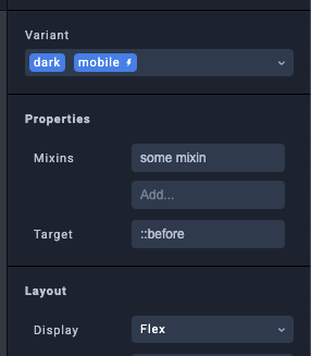
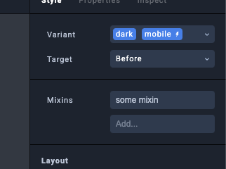
Regarding the style panel,
I think the proper approach is to work backwards from the user interface and then figure out how that ties into a DSL.
Some high-level things that are necessary:
- ability to define any style rule (necessary for third-party CSS)
- components
- attribute bindings
- slots
- default children
Another thing to note is that we don't need to display the entire AST in the UI (text does this better for us!). We just need to ensure that all ASTs are accessible where they're used.
having some ability to import Figma layers + icons directly into the canvas. Maybe a sidebar "import" button that takes from various resources, with a "connect" button that allows multiple sources to be used
media Desktop only screen and (max-width: 100px);

export component as Pane {


  property dark: boolean;
  property class: string;

  // variants can have many different kinds of triggers, including custom CSS props.
  // Need to stress test this on all CSS selectors
  variant dark (trigger: [Desktop, ".dark", ":nth-child(2n)", self.dark]);

  @name "header"
  render div (class: self.class) {

    style {
      color: black;
    }

    style (variant: dark) {
       color: white;
    }

    // @ denotes decorator
    @name "Header"
    render div {
      style {
        font-family: sans-serif;
        color: white;
      }
      slot header {
        text "default header"
      }
    }
  }
}
☝️ rough idea for DSL updates. need to think about the variant prop a bit more since the syntax is different than prop reference syntax (omitting self.*). It's tempting to include self.variantName. However, variants will only be referenced from within the component. Maybe that's okay considering that variants can only be defined in classes. Or maybe it should be okay to enable variants to be defined within the global scope? This might come in handy for things like themes. For example:
// When ".dark" is defined anywhere in the document, then trigger
variant dark (trigger: [selector(".dark")]);

component Pane {
  render div {
    style {
      color: white;
    }
    style (variant: dark) {
      color: black;
    }
  }
}
What about style overrides? Here's a naive take:
component Pane {

  property customStyle: Style;
  property children?: Node;


  render div  {
    style (include: self.customStyle) {
      color: white;
    }
    slot self.children

  }
}

style paneStyle {
  color: red;
}

render Pane (customStyle: paneStyle) {

}

/* alternatively, the style can be defined like so */
render Pane (customStyle: style { color: red }) {
  div {
    text "hello world"
  }
}
With props, we can be extra specific about the kind of children a component can accept. For example:
component Child {

  // alternatively we can use "body" to denote body of { } braces. Node[] denotes 1 or more children,
  // Node denotes only one child
  property body: Node[];

  render div {
    slot self.body;
  }
}
component Pane {
   property body: Child[];

   // omitting tag name renders a fragment instead
   render {

      @name "Header"
       div () {
           text "some rich"
       }
   }
}
@annotation syntax is a bit cumbersome, especially when manipulating the AST, so it may make more sense to include that prop in the AST that the annotation belongs to instead. E.g:
render div () /* @name: "custom" */ {
}
Though, this should read like a comment, not something that's actually part of the element itself. I.e: it should live outside of the div since it's outside of the implementation (shooting from the hip a bit but this feels a bit right).
Rich text is another consideration at some point. there may need to be special syntax for that. Or maybe not? The utility of having special syntax is really only for the visual editor, but this would read a bit strangely in code. That, and we'll want to ensure that rich text can be wired up with style variants.
Can look at SwiftUI for inspiration: https://developer.apple.com/xcode/swiftui/
ideally the new style syntax is an isomorphism with CSS - formatted in such a way to be more compatible with UI builders & focusing more on the variations of styles.
// media query that the user can define
mediaquery test only screen and (max-width: 800px);

/* make the variant accessible to other parts of the app */
export variant dark {
  connect test;
}

/* not a fan of using the same "variant" keyword to use the variant */
style myStyle variant dark {
}
What about style mixins?
mediaQuery mobileSize

variant mobile {
  connect mobileSize;
}

style anotherStyle variant mobile {
  color: red;
}

style myStyle extends anotherStyle variant dark {
  color: blue;
}
☝️ this would indicate that anotherStyle is applied if variant blue is on. That should be possible.
I think it's worth being cognizant that variant triggers are platform specific, and should not be directly coupled to the DSL per-say. Instead, possibly included in a std library like so:
import std.html.triggers.{MediaQuery};

mobileSize: MediaQuery([/* args here, dunno what they look like */]);
☝️ not really well thought out but closer to I think what's desired for a platform-agnostic DSL.
variants could also be set up to be triggered by component props like so:
component MyComponent {
  var test: bool;
  variant dark {
    connect self.test;
  }

  render div {
    style {
      color: black;
    }
    style if dark {
      background: black;
      color: white;
    }
    text "Hello world"
  }
}
Better variant syntax:
variant test {
  connect mobile;
}

style myStyle if test {
  color: blue;
}
What about global variables? I suppose that styles could be atomized like so:
variant dark {
  connect selector(".dark");
}

variant light {
  connect selector(".light");
}

namespace colors {
   atom bigRed #FFF if dark, #000 if light;
}

style myStyle {
  color: bigRed;
}
☝️ something like this could be transpiled to:
.dark {
  .elementid_myStyle {
    color: #FFF;
  }
}
.light {
  .elementid_myStyle {
    color: #000;
  }
}
It may actually be unnecessary to define variants specifically -- perhaps we can define it in abstract terms and use triggers directly?
import std.html.triggers.{MediaQuery};

declare mobile MediaQuery(only: "screen", max-width: 100px);

declare test Style {
  color: red;
}.if(mobile);


declare dark [mobile, selector(".css")]
This actually translates quite well to CSS selector behavior. Expressed in a different way:
div {
  style if selector(":nth-child(2n)") {
     background: red;
  }
  text "I'm some text!"
}
Looking at this:
DSL for this would be:
style anotherStyle {
}


style {
  if variant {
     target before {
        include anotherStyle;
        color: blue;
     }
  }
  if mobile {
  }
}
common re-usable variants:
import std.html.variantTriggers.selector;

variant hover selector(":hover")
render div {
  style {
    if hover {
      color: red;
    }
  }
}
Need to be able to define IDs on individual div elements of components.
public component Test {

  /* props */
  public bool test;

  render public div Test {
    public span anotherId {
      style {
        color: blue;
      }
      text "something like this"
    }
  }
}


render Test {
  style {
    target anotherId {
      color: blue;
    }
  }
}
☝️ leveraging target prop also used for pseudo-elements. I think this would enable any class to be overridable. Though, my sense around this is that it may make elements too exposed. Like, styles should be exposable and not the entire element itself. What about this:
componen Test {
   render div {
     style testStyle overridable {
     }
   }
}
This may offer some additional flexibility for style mixins defined in the test. For example:
component Test {
  style dark overridable {
    color: white;
  }
  render div {
    style include dark {

    }
  }
}


render Test {
  style {
    target dark {
      color: orange;
    }
  }
}
Need to be cognizant about adding additional variant styles to instances that already have them For example:
component Parent {
  variant test;


  render div {
    public style someStyle {
       if Test {
         color: red;
       }
    }
  }
}

component Child {
   variant mobile (trigger: MediaQuery(max-width: 300px));

   // assign parent variant to prop on this component
   // so that Parent is encapsulated
   variant test Parent.test;

   render Parent {
     style {
       if self.mobile, self.test {
         target context.someStyle {

         }
       }
     }
   }
}

component Child2 {
  render Child {
    style {
      if Child.mobile, Child.test {
        target Parent.someStyle {
          color: red;
        }
      }
    }
  }
}
This works, but it's messy. Child should encapsulate Parent, mostly for readability. Child2 shouldn't know the implementation details of Child. For this to work I think there needs to be ID aliases or something similar.
I think some sort of "prop drilling" is necessary for this to work properly.
Another alternative:
component Parent {
  render div {
    style someStyle {
    }
  }
}

component Child {
  render div {
    Parent isnt {
      style {
        target someAlias current.someStyle {
          color: red;
        }
      }
    }

    Parent inst2 {
      style {
        target anotherAlias current.someStyle {
          color: red;
        }
      }
    }
  }
}

component Child2 {
   render Child {
     style {
       target someAlias {
         color: red;
       }
     }
   }
}
At the same time, I think this is relatively messy to deal with. I think we can settle in nested paths. I mean, this should be edited visually -- the details are hidden to the user.
Here's what we get:
component Parent {
  variant mobile MediaQuery(max-width: 100)
  render div {
    style someStyle {
    }
  }
}

component Child {
  render div {
    Parent isnt
    Parent inst2
  }
}

component Child2 {
   bool someProp

   render Child {
     style {
       target node.inst.someStyle {
         if self.someProp, Parent.mobile {
           color: red;
         }
       }
       target node.inst2.someStyle {
         color: blue;
       }
     }
   }
}
👆 Easier to read, a bit smellier. Then again, target inst.someStyle is very specifically for one kind of element, so maybe control shouldn't be given to the enclosing element (Child in this case). If Parent is removed from Child, then target inst.someStyle would be a no-op (we shouldn't force this to be cleaned up since that would result in a poor UX), and flagged for removal (or even automatically removed if we want).
Brief come-back to slots:
component Parent {
   bool test;
   render div {
     if self.test {
       text "hello world"
     }
     slot someSlot {
       text "I'm a default slot!"
     }
     slot children;
   }
}

Parent {
  text "default child";
  target node.someSlot {
    text "I'm a slotted child!"
  }
}
☝️ However, this syntax would imply that we can override nested children which isn't the case. That shouldn't be possible. Does this force us back to a scenario where we give control to enclosing elements over what's exposed?
Side note on this, it may be safer to generate an interim AST that's easier for the designer to consume, and then maps to original source code like this. Mostly around doing things like this:
const project = translateToFriendlyDataFormat(parse(`
  component Parent {
    render div {
    }
  }
  component Child {
    render Parent {
    }
  }
`));

{
  components: [
    {
      annotations: {},
      id: "Parent",
      uuid: "59bb",
     render: [
     ]
    }
  ]
}
Then again, the IDs need to be unique, so it probably makes more sense to use the user friendly IDs for an extra layer of safety.
For V1 of this too, I think this could be done in TypeScript with the eventual goal of moving back over to Rust. Just a lot easier to implement.
Another consideration around this is to possibly shape this in a format that's more easily consumable for the designer, so staying away from an AST format. This however would mean that duel-editing may be a no-go, but then again this is a tool geared for designers, and they'll likely only care about seeing things visually. Developers can continue to use HMR.
☝️ for hand-writability, this may be a good excuse to build out the Rust engine. It can be kept in the purview
What about overriding variants of private components?
component Child {
   render Parent {
     style {
       target node.inst1, SomePrivateComponent.variant {

       }
     }
   }
}
Perhaps there shouldn't really be the notion of private components? What are the implications of that?
Does Figma have the concept of private components? There is the concept of publishing components which has this implied level of scoping. From a coding and pure maintenance perspective, having the ability to see what elements of a file are public is a nice to have. The implications of not having that are:
- Users of a file don't know what are internal pieces of functionality, vs external pieces of functionality. I could see some patterns coming about around privatizing elements by defining namespaces in order to deter people from modifying them. This even goes for stylizing elements.
- But is this necessary? Is it okay to use internal components? TODO: look at specific atomic edits, and
- Without
What about just using different syntax?
component Child {
   render Parent {
     style {
       target node.inst1 {
          if target.variant {

          }
       }
     }
   }
}
☝️ this is better since it doesn't expose SomePrivateComponent.
Some syntactical changes just to make sure there's alignment with the shape of render function:
// using switch-like signature. Behavior up to the expression.
target {
  node.inst1 {

  }
  node.another {


    if {

    }
  }
}
Need to consider CSS variables too:
export component StyledContent {

  // class doesn't really mean anything to the DSL. When referencing
  render div(class: "BottomContainer") {
    style {
      border-top: 1px solid var(--color-grey-30);
      height: 100%;
      width: 100%;
    }
  }
}
Also need to be considerate of imported styles:
// injects the css into this document
import "tailwind";

render div (class: "button small") {
}
☝️ presumably, CSS would be injected into this file
imports will need to dumped into a namespace to ensure there are no collisions:
import a.b.c as ns1;
import a.b.c2 as ns2;


render ns1.Preview;
render ns2.Preview;
modules are another consideration.
I think it may also make sense to make the syntax for styles consistent with other attributes. For example:
render div(class:"something") {
  style(border-top: 1px solid var(--color-grey-30); height: 100%;
}
We need to take the guesswork why syntax is shaped the way it is. There should be a reason if possible.
Previews are slightly problematic since they may use components from other documents - of which may have overridden styles. It shouldn't be expected for developers to be cognizant about these style changes. Or should it be the designer's job to be cognizant about how primitive components are used in logic, or what developers need. The options I see are:
- somehow pass style overrides behind the scenes to nested instances that have style overrides
- add variations to nested elements instead of allowing style overrides (🤮)
- have ability to add logic to instances
- Plugin API for designer that allows custom components to be registered.
4th option appears like the best one since this would enable people to create single page applications. API can be specific to the designer, with flexibility to add other logic files (for other languages) that
Framer can be some inspiration around this: https://www.framer.com/developers/
We can probably enable slots for these components so that they remain editable in the UI.
A simple atomic component that can be included might be something like Repeat.
The question that I have around this is mostly around type safety. How should that be enforced?