luci-mod-status: improve channel_analysis and firewall page
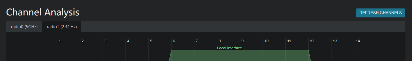
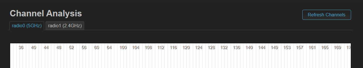
Many user complained problem with using pool with wifi scan. This comes from the limitation that some wifi driver have problems with scanning nearby wifi and keeping traffic. Fix this by doing the wifi scan only one time on page load and provide a button to refresh the channels manually. The original implementation is preserved as the user can simply reenable the poll referesh from the ui. While at it also sort the table by channel instead of by signal quality to better track the most used channels in the table.
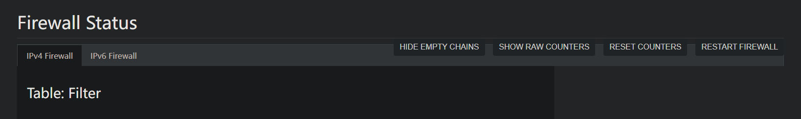
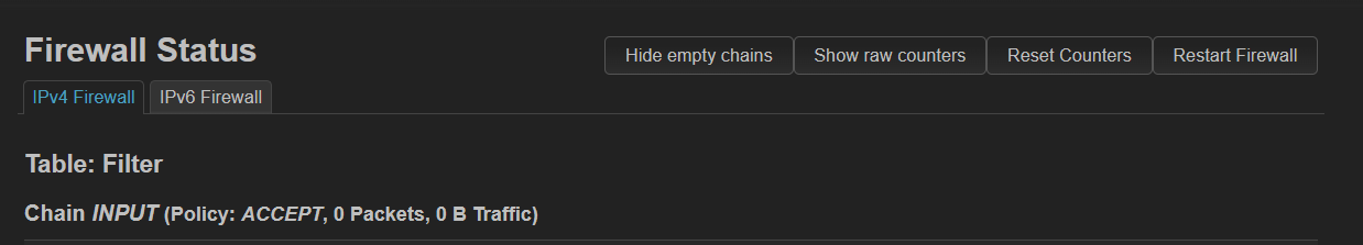
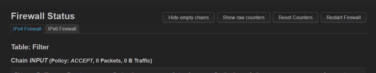
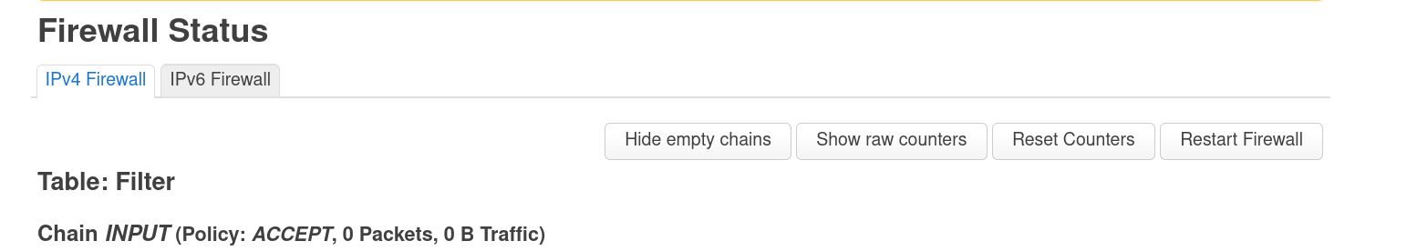
This also try to improve the firewall page that is currently bugged. 2 new css class are introduced called cbi-title-section and cbi-title-field. With these new class it's possible to put buttons on the same line of the title view and we can use flex instead of using right class + hardcoded margin.
Signed-off-by: Ansuel Smith [email protected]
@jow- only concern I have it the use of style in the h2 div... Any idea how to improve? An old pr [1] still open added the ability to add buttons at the end of the h2... Would be handy here and also in the firewall status page that is currently broken...
Current implementation by this pr
Broken implementation by using strange div and right class
[1] https://github.com/openwrt/luci/pull/5224
The visual glitch above looks like a problem of the material theme. It should look okay on bootstrap.
@jow- yes it does but from the code it looks like an hack than a correct implementation with flex and putting them in a div. Also IMHO it would be better to put them on the line of the h2 instead of the tabmenu div. (they are relevant to the global view not specific to the current tab)
give me a sec so i try to do the same change on the firewall change just to check if it does look better
(ignore the extra space... material theme have the entire firewall page broken but honestly part of the problem is also the code)
Please test bootstrap as this is the default theme, I don't really care how it looks in material
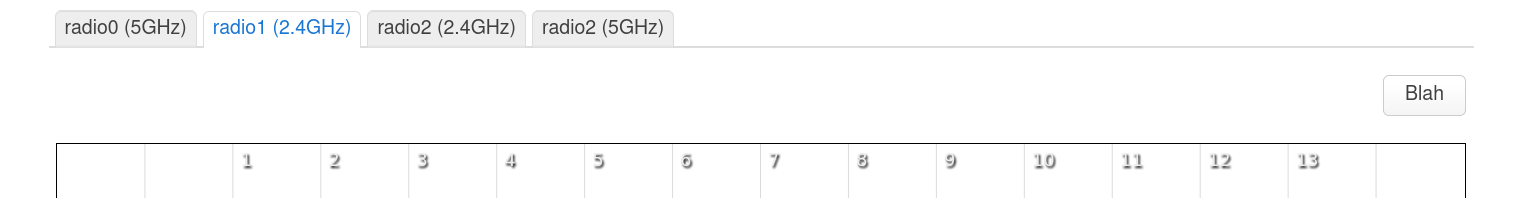
I think the simplest solution is moving the right class div after the <ul>, then removing the extra margin style.
That'll push the content a bit away from the tabs but I think this is okay.
Example for channel analysis using a mock button:
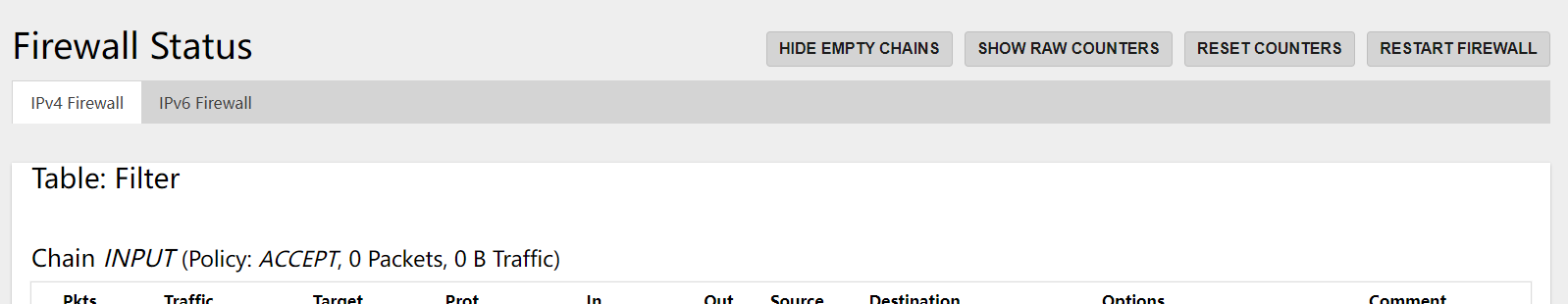
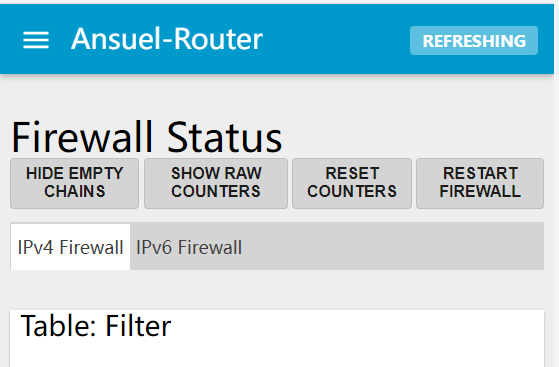
Example for firewall:
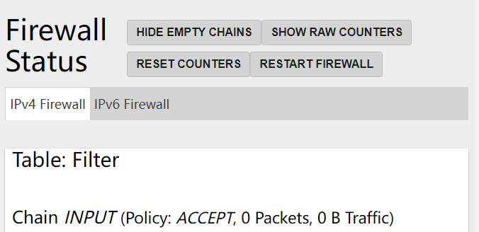
What i don't like is the extra white space on the left, i mean the buttons on the right of the h2 seems to be the perfect place for this kind of thing... but I understand this kind of change would require a tweak to the themes to be correctly implemented...
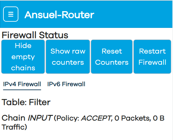
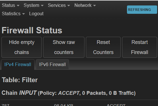
@jow- ok I tested the firewall page with all the different themes (material, bootstrap, openwrt and openwrt2020) On the mobile page, bootstrap and openwrt have the button behind the tabs and are not selectable. Openwrt2020 works correct and material works correctly. I fixed all of these problems and now the buttons are more or less the same with all the 4 theme. In a normal screen, they are all correctly placed on the right on the same line of the h2.
What do you think?

I merged the channel analysis commit. The firewall change is too invasive for my taste.
Edit: The iptables status view also is inactive due to nftables usage on recent builds, going to close it