Current layer not marked obviously enough in Layers Panel
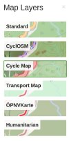 to tell which layer is selected.
The frame in the layer panel is quite obvious for me, and of course I see the chosen style applied in the main part of the window. Your example shot looks downsized, what device/screen resolution is that from?
I am emulating how it looks to older users. Thin green is bad because, well as you see lots of the world is green according to those maps. Thick orange would be better.
Or some other color... Blue would be bad because most of the world is ocean.
https://github.com/openstreetmap/openstreetmap-website/pull/3674 changes it to blue
Blue would be bad because most of the world is ocean
but usually you are not looking at the map of the ocean
#4674 made the frame blue but also twice as wide, it should be visible enough now