paperwork
 paperwork copied to clipboard
Make the extra text visible
When viewing a document, there is no way to see the additionnal text added by the user, except by "editing the document".
This text should be visible, but discrete
Another random idea: a box in a corner of the document panel which becomes transparent when hovering.
@tiramiseb Don't you mean "that becomes opaque when hovering"? Oh, I see! You mean the text would get displayed by default! And hovering would allow to see "below". This won't work well with touch interfaces (and Gnome3 is doing its best to be touch-friendly).
The idea of putting the information in the corner of the document area is good, though. Maybe an icon, then, that would expand into a text area while hovered, or while focused (click) until unfocused (click elsewhere)?
Later on, if the icon is always present, this interface could replace the extra-text part of the properties and become the standard way of entering extra text… if you don't mind the concept of "empty extra text" :-p
Some kind of synthesis of the ideas above: after the last page, add a text field which resizes to match the width of the pages being shown. This is what it could look like.
This mockup is pretty much what I had in mind. I was just thinking of maybe settings the background of the extra keywords to something like yellow (like Post-Its I guess), to make it really really clear they are no part of the scanned (not sure if it would actually be useful).
I suggest another approach: we keep the extra text with date and labels altogether, but we move it up above the labels, and set a white background to draw attention to the pane. Most importantly, we consider it as a first class feature to help the user to organize, instead of a workaround in case OCR fails.
Mockup below.
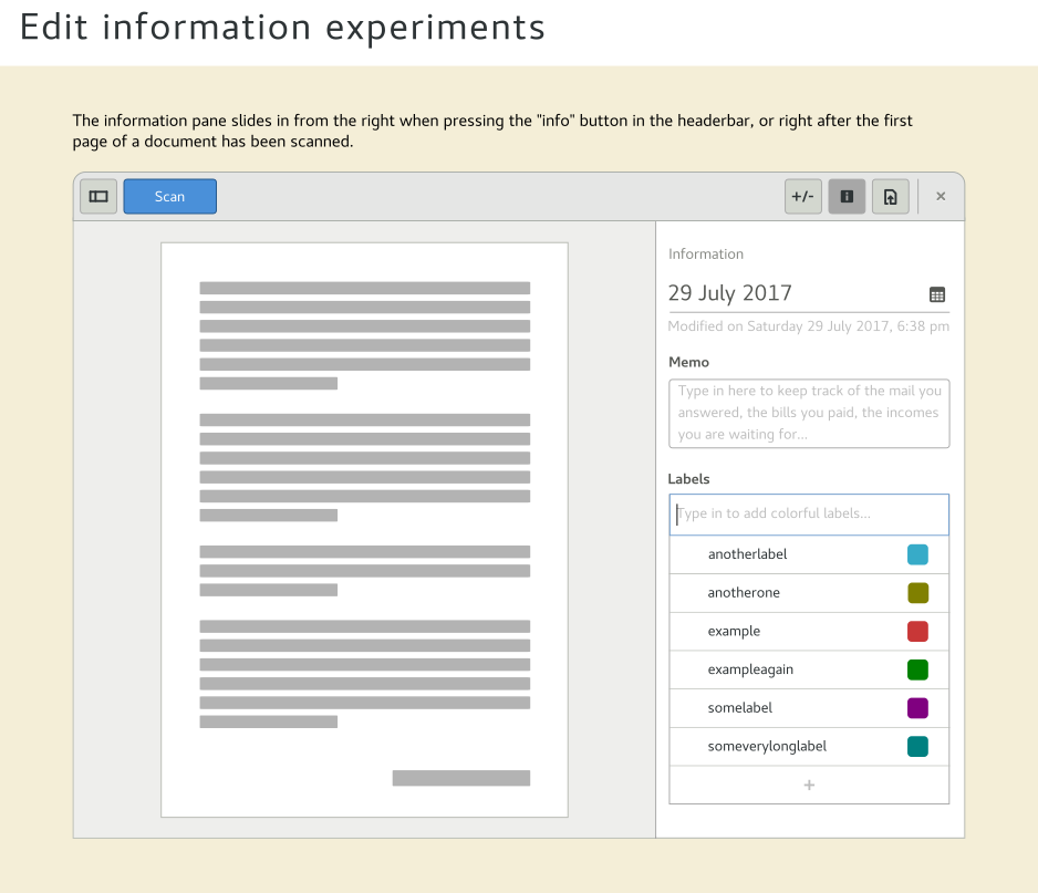
I don't think moving it up is a good idea. I don't want the memo / additional keywords to be too visible. It's a workaround for OCR bad results. Most of the time, it should be used at all.