joss
 joss copied to clipboard
links in main docs TOC should point directly to readthedocs
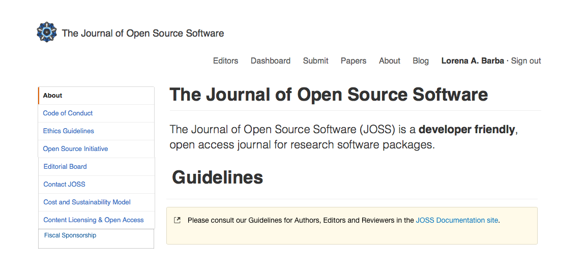
On http://joss.theoj.org/about, some of the items (eg Reviewer guidelines) in the left column (the TOC) point to anchors in this same document that then point to sections of the readthedocs site. These items should probably just point directly to the appropriate sections of the readthedocs site. (Though the anchored text may be reasonable to keep as well, for someone scrolling through this page.)
There could be a third option. Normally, you don't want to have two different behaviors occurring from clicking on the navigation (one pulling you down to the anchor, the other sending you off to another site). Maybe it's best to have link out to the documentation on the top of the page, right after the subtitle, and remove from the nav.
Normally, you don't want to have two different behaviors occurring from clicking on the navigation (one pulling you down to the anchor, the other sending you off to another site).
This wouldn't bother me :)
Maybe it's best to have link out to the documentation on the top of the page, right after the subtitle, and remove from the nav.
I think the idea of having a single link to point to each of the parts of the documentation is good - I just don't like a link that points to another link. I can't quite envision what you suggest, but I would be happy to try it out.
I've read in many sources that navigation menus should only point to other parts of your website, and not link out of it, and that consistency of behavior is the # 1 usability rule.
Examples: "Consistency is the most important principles in navigation menu design. If your site has different mode of the navigation menu, users might think themselves on another site rather than your site. Be sure to use the same navigation mode so that users can easily access your site without losing it." [1]
"Navigation elements offer users a road map to all the different areas and information within the site. In order to work effectively, navigation should be clear and consistent across your website." [2]
"Prioritize Consistency. Navigational inconsistencies may result from content that doesn’t fit neatly into the site’s sections, so is listed on its own. Other times, people may need to quickly access something that lives deeper within the website, so the site owner adds quick links to the nav. However, there are other solutions that avoid making inconsistent additions to the navigation." [3]

Here's a quick mock-up of the solution I propose.
Note also that I propose to change the navigation item "NumFocus" to "Fiscal Sponsor" because it kind of looks awkward to have the heading and the logo of NumFocus one above the other like it is now.
Actually, "Open Source Initiative" is also awkward as a heading, because it appears right on top of the OSI logo saying the same thing. I would change that nav item to "Affiliations."
We've talked about running readthedocs under our domain, but that doesn't resolve that its layout doesn't readily nest within the rest of this page. Lorena is certainly right that the sidebar should not leave the current site navigation context, but perhaps there could be Docs in the top menu?
I mostly like Lorena's suggestions, but they don't really solve the problem of it taking two clicks to get to author, reviewer, or editor guidelines - they would make the site look better, but these things would now take a different two clicks...
Jed's suggestion might be a slight improvement, but would again need two clicks to get to specific parts of the docs.
I wish I had a better solution to offer...
I think this is more or less done with the new web site. My only remaining suggestion is that "Docs" in the top header may not be the most description term for what's there.
I also think it's not good form to link out to a separate website (the documentation website) from the navigation menu. Nav should lead to sections within the website.
@labarba - I don't have a problem with those links, but out of curiosity, how would you change the page?
The front page has a big "Documentation" button on the right. I would make "Documentation" appear similarly front-and-center on every page, and remove from the nav.
Thanks - though I continue to disagree. I don't think documentation is a useful word here, at least compared to "for reviews" or "for authors". I wonder if there's a way to solve both of our issues by integrating the readthedocs site into the main site somehow?