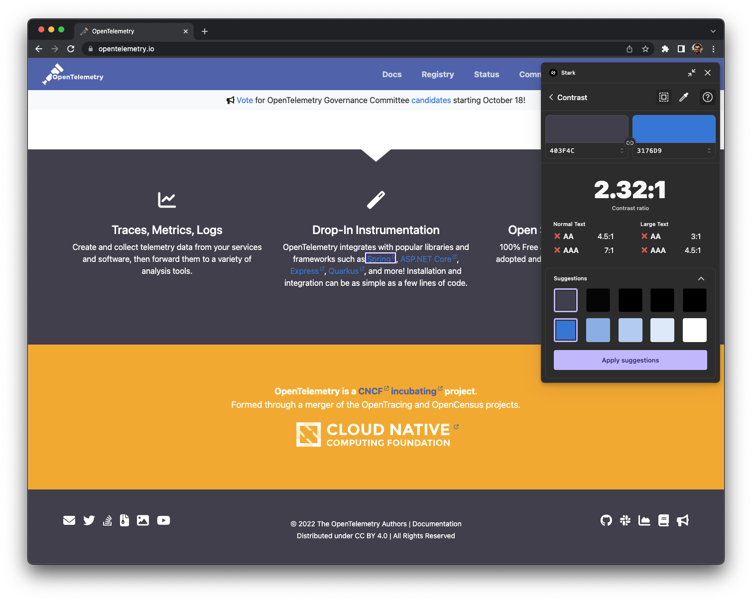
Low contrast hyperlink in the dark background sections
Desired feature or idea. Improve hyperlink color when inside dark background sections. They currently also fail all WCAG levels.
+1 for making a fix to this issue: improving the accessibility of the site helps make OTel more inclusive to the community.
@cartermp if we decide we do want to make a change, I'm happy to take this issue.
@raunaqgupta do you recommend the site handling the two modes (ie behaving one way for dark mode, behaving differently for light mode), or simply changing the URL coloring so that it can be perceived in either dark or light mode?
I would recommend just updating colors so contrast is the so bad. IIRC we don't have a dark mode for the site.
https://github.com/open-telemetry/opentelemetry.io/blob/f5fc3c0a8d965794e4500bff85656511cf107c17/assets/scss/_styles_project.scss#L122-L125
Here's the file/style where the a color is specifically being set for dark and secondary sections. My suggestions are to:
- Separate dark and secondary
- Update hyperlink for dark
- I personally feel the secondary section is too yellow and can be toned down a bit
- Update the hyperlink color (if needed after 3) for the secondary section.
I'll send a PR soon.
PR merged, thanks! I'll submit a followup PR for the remaining issues: #1916, doesn't fix the contrast on the Registry page, for example.