Previous cohorts are now hard to find
We changed the navbar lately: we removed the drop-down menu linking all previous cohorts and add instead a table on the main page with all cohorts, including links and the table is linked in the drop-down menu "OLS program".
But it seems confusing, and people could not find the previous cohorts.
Here are some comments from community members:
- "I think the cohorts would be nicer to have on a seperate page called 'cohorts', instead of rather hidden where it is now?"
- "Also think the navigator should have a “previous cohorts” entry, (I had to change the url directly because I could not find it the cohort 4 link yesterday)"
- "Previous cohort pages should be easier to navigate, as people are probably most interested in the project, this should come first (the projects-participants page). presently, it is not clear what links to what in the table of cohorts."
- " Agree with the navbar drop-down beeing too large. I think you do not need that amount of details in a navbar. a previous cohort menu does not need a dropdown at all, it could lead to the table (the table links need to be more intuitive/descriptive then). We could have each cohort as an entry of the dropdown, but it would mean that the design will need to change at ~ cohort 10. We could have “cohorts > OLS-7” and “cohorts > previous cohort”."
Any suggestions on how to improve that
- If we have a separate page, what should go there?
- How to make the previous cohorts easier to find without overloading the navigation bar?
How to make the previous cohorts easier to find without overloading the navigation bar?
we could have "OLS-6 > Previous cohorts".
Also, the cohorts table could be arranged in descending order and a visual hierarchy could be applied to easily differentiate the most recent cohorts from the previous cohorts at first glance.
- If we have a separate page, what should go there?
- How to make the previous cohorts easier to find without overloading the navigation bar? Another suggestion that I think could help is buy designing and developing A horizontal carousel of all the a cohorts can be designs (a prototype can be made and sent here if requested) each carousels have or indicates each cohorts with their distinctive logos and a brief intro . On clicking you get directed to a new page specifically designed for only a cohort and this applies to all the cohorts.
If OLS-6 is very important to be shown on the nav menu, then it should have a drop down icon that shows “Other Cohorts”. This way, the current cohort is showing and people can easily visit the “Other Cohorts” page
Hey, I would like to work on this I agree that the current cohort should be on the navbar with the previous cohorts as a drop-down menu
So with what @Chalcedony219 I quite agree. We can have the recent OLS cohort name on the nav bar and have 'previous cohort' as a dropdown right under. That then leads to a page where all the previous cohort will be arranged.
For visibility of the cohort arrangement, we can have cards with the name of the cohort on them ( e.g OLS-1, OLS-2 etc...) and their given name (e.g Hope, Persecution. etc) plus the logos on the cards. It'll come in a hierarchical way that's pleasing to the eyes. Three columns of cards on two rows or more depending of the number of cohorts. That way the information is clear, distinguished and easy to navigate. The other information on the table can be added to the page of the cohorts itself directly, since they are past, users do not urgently need to see date or number of mentees and mentors. Those can be hidden for later. It also helps to keep the page clean.
On clicking any of the cards, the full information of cohort can now be displayed.
@bebatut
I want to move 'Cohorts' from programs to OLS-6.
When you click on cohorts there, it leads to a page that looks like the image below
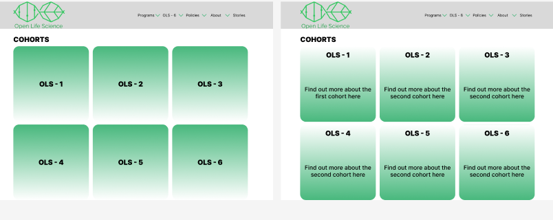 The 'screen' on the left is the front of the card (from @Bisola15 's suggestion) and the 'screen' to the right is the back. It flips over when you hover above it.
And when you click on the card it takes you to the corresponding cohorts page
The 'screen' on the left is the front of the card (from @Bisola15 's suggestion) and the 'screen' to the right is the back. It flips over when you hover above it.
And when you click on the card it takes you to the corresponding cohorts page
But i would also like to remove the things that are the same in all the years (Like schedule & Goals and learning objectives) and add it to the general 'Cohorts' page (underneath the cards) so each individual year has unique information.
I hope this is clear enough, I would like your opinion/input before i go too far with the code
@bebatut I want to move 'Cohorts' from programs to OLS-6. When you click on cohorts there, it leads to a page that looks like the image below
But i would also like to remove the things that are the same in all the years (Like schedule & Goals and learning objectives) and add it to the general 'Cohorts' page (underneath the cards) so each individual year has unique information.
I hope this is clear enough, I would like your opinion/input before i go too far with the code
I love your effort 😌💃🏾 and how you brought the idea to life in short time.. Well done 👏🏾. The task is labelled discussion though, so I don’t think we’re supposed to work on it. We're just supposed to talk about what we think can be made better... I might be wrong, we'll wait fo @bebatut input 🤲🏾
Thanks @Bisola15. Will definitely wait for @bebatut now. Did not notice the discussion tag.
Thanks for the thoughts there
Some comments
- Important one: we need to keep somewhere a table like the one available currently. It is really helpful for us, the organizers, to have the numbers and dates of the cohorts aggregated somewhere
- The different links in the actual table are important, specially the projects and schedule. So they must be clearly visible
- There are discussions currently in the branding GitHub repository to design logos for the different cohorts
The table can be underneath the cards shown. With a header like 'Overview of the Cohorts'. After the other things i stated earlier The logos can maybe replace the green color of the cards
Was @Bisola15 right and this is just a discussion or should i keep going?
@Bisola15 nice one, @bebatut The card is a good choice to differentiate each cohort and its more visible to user but i thinks the link to each cohort can be placed on the card so as to make it easy for users navigate to each cohort details which will limit the landing page being too crowded with so much details. the Table with all its details can be created on its own page where a link will take users to.
@bebatut I agree with everyone else who has said the Cohorts should be in the navigation bar while still having the table in the home page as easy reference. I also think the table can be better represented. I generally think the website can be redesigned, as I also noticed that there are no clear Call To Actions and the photos are not properly optimized for people with lower bandwidth.
The cohorts collection page could be represented the same way blog posts are represented in blog collection pages; with search queries made available for easy navigation. Then each cohort will have a mini landing page that opens up when the page visitor clicks to know more about the cohort. https://summerofcode.withgoogle.com/archive Google summer of code does this pretty well. It can be used as reference
@Bisola15 nice one, @bebatut The card is a good choice to differentiate each cohort and its more visible to user but i thinks the link to each cohort can be placed on the card so as to make it easy for users navigate to each cohort details which will limit the landing page being too crowded with so much details. the Table with all its details can be created on its own page where a link will take users to.
Hi @lisaomoh101 Thank you! so the idea is the same. The card itself is sort of like a "LINK", that was what I meant
Hey there! I have submitted a pull request on this that you can check out if you wanna :) #463