Fixes #1305 and #1320, resolves #1464: Fixed The Overlap Of The Language Selector Over The Search Bar
The Language Selector Overlaps With The Search Bar
Referencing back to the incomplete PR, #1345 and the discussion under it, the language selector at the navbar overlaps with the search bar at ocaml.org/learn/tutorials/ . @pitag-ha @avsm
Fixes #1345 , resolves #1305
Made A List Dropdown Out Of The Languages Selectors Available.
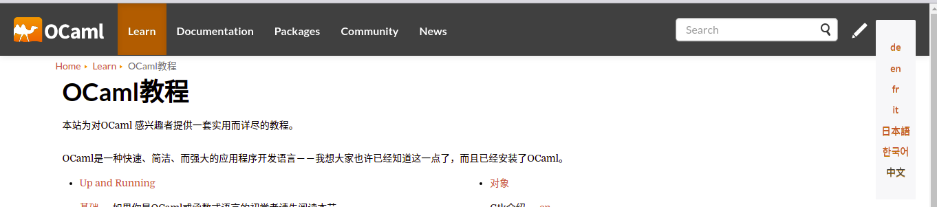
I made the display of the non-active languages none but added an ellipsis to the active language as an intuitive indication of invisible items contained within. Then when hovered, the whole list of languages available drops down, and any language select get displayed and others rendered invincible.
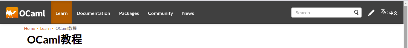
Rest state:

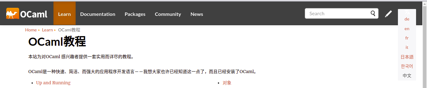
Hover state:
I don't know how it generates all these other commits that don't belong to me within this PR.
I only made PR with my commits.
This is disheartening though.
Ohh, I guess I understand what's happening.
So in my bid to keep my forked repository up to date with the ocam.org repository, I did a separate forking of the ocaml.org repository again and committed my changes to it before making my PR. But the recently forked repo has commits from the ocaml.org repo that are yet resolved so they all merged up together under my commit in this PR.
Is that right? @pitag-ha @avsm
don't know how it generates all these other commits that don't belong to me within this PR.
That's because you've opened the PR against the staging branch again instead of the master branch :) Let me explain a bit more what I said here: when you open a PR, you can choose two branches: the branch you want your changes to be merged into and the branch that contains your changes:

In the left dropdown (i.e. the one that says base: ... you need to choose master. You've chosen staging instead.
Also, you've provided two after screenshots which is already very helpful, thanks! In general, it would be great if you could also provide a before screenshot :)
And about the content: I didn't know you were also changing the layout of the language selector. I thought you would only change its position and fix the overflow that was provoked by the change of position. There is another PR also changing the layout of the language selector. I'm not saying which one is better, I'm just pointing out that there's a conflict now :)
The issue the PR is linked to should contain the screenshot of the issue being fixed, this will help make the PR more focused on the solution and anything related to it. Less cluster of information.
And about the content: I didn't know you were also changing the layout of the language selector. I thought you would only change its position and fix the overflow that was provoked by the change of position. There is another PR also changing the layout of the language selector. I'm not saying which one is better, I'm just pointing out that there's a conflict now :)
For the layout changes, I really wanted to have the solution presented and then discuss it further if necessary.
Then creating an issue, I just wasn't sure if that was the right call to make, but you're right, it's a new feature.
don't know how it generates all these other commits that don't belong to me within this PR.
That's because you've opened the PR against the
stagingbranch again instead of themasterbranch :) Let me explain a bit more what I said here: when you open a PR, you can choose two branches: the branch you want your changes to be merged into and the branch that contains your changes:
In the left dropdown (i.e. the one that says
base: ...you need to choose master. You've chosenstaginginstead.
Okay, thank you. I would love to know what's feasible to do concerning it? Make a new PR to the base: master?
@pitag-ha, I want to open an issue to further discuss this PR, then link them together.
Is that okay?
For the layout changes, I really wanted to have the solution presented and then discuss it further if necessary. Then creating an issue, I just wasn't sure if that was the right call to make, but you're right, it's a new feature.
I didn't mean to blame that on you, I'm sorry if it came across like that!
@pitag-ha, I want to open an issue to further discuss this PR, then link them together. Is that okay?
From my side that's not necessary; we've already discussed several things and up to details I agree with the further choices you've made :) Also, there are already 3 issues this PR fixes: #1305, #1320, #1464
Thank you.
I use to read up on all issues available to avoid conflicts with any I'm currently working on, I guess I need to do more of it owing that I have been away for some time. Linking the issues fixed with this PR would be necessary, right?
Hi @IkehAkinyemi thanks for you PR! It looks good, can you also provide a screencast for what the dropdown selector would look like in the mobile version? Thanks! :)
Hi @IkehAkinyemi thanks for you PR! It looks good, can you also provide a screencast for what the dropdown selector would look like in the mobile version? Thanks! :)
Here's the screencast for the UI layout of the language selector on my mobile screen.
https://user-images.githubusercontent.com/60588809/114291226-a123ce80-9a7d-11eb-93b5-b179531df225.mp4
Hello @gs0510, I would love to hear your thoughts on the behaviour of the dropdown on a mobile screen from the screencast I uploaded. Also, I can provide the link to test out quickly the behaviour on your end. Attached below is the link to the Github Page host link to view it on a mobile screen.
https://ikehakinyemi.github.io/test-ocaml.org/
@IkehAkinyemi When you select the language in the dropdown bar, the screen has the ellipses followed by the language tag. Can you get rid of the ellipses? Thanks!
Hello @gs0510, I will so do.
But before I included the ellipsis, I did some homework on what it will mean using to it to portray some omission(hidden contents). I included it there to show that we have some contents that are not currently showing/visible to the user. And when they hover it, these contents automatically make themselves visible to the user. Below is a screenshot of a section from the Wikipedia page On Ellipsis:
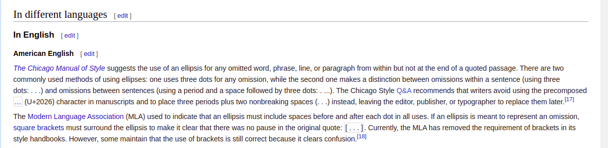
The last two sentences within the second paragraph in the screenshot made some distinctions I would love you to look at it.
But please don't get me wrong here, I'm just trying to let you know why I think including the ellipsis in the first is ideal for the user experience on the language selector.
And if you think otherwise with me, I will be so glad to learn from you about it and immediately get rid of the ellipsis.
Just to give anther idea: another possibility would be to use a language select item as done e.g. on the React page:
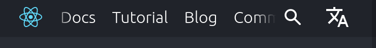
What do you all think about that?
@dinakajoy has given some input on this PR for mobile mode here and here. @dinakajoy, do those two sites you mention (React Libraries and Brainhub) use a language selector at all?
@dinakajoy, do those two sites you mention (React Libraries and Brainhub) use a language selector at all?
Please take a look at https://wordpress.com/ (language is at footer), https://wordpress.com/support/ and https://vuejs.org/, to see how they differently positioned the language selector. I don't think it matters where it is positioned, I am only pointing out that placing it at the right side after the hamburger on mobile is not a common design. Hamburgers are always at the right end of the navbar (most commonly used design)
Please take a look at https://wordpress.com/ (language is at footer), https://wordpress.com/support/ and https://vuejs.org/, to see how they differently positioned the language selector. I don't think it matters where it is positioned, I am only pointing out that placing it at the right side after the hamburger on mobile is not a common design. Hamburgers are always at the right end of the navbar (most commonly used design)
Thank you @dinakajoy, the position of the language selector on the mobile screen against the hamburger menu needs repositioning to follow a commonly used design layout.
And the position matters as much as every other element/component within the webpage, so putting it where it's easily visible would matter a lot, but the current position on the mobile should change just as you suggested.
Just to give anther idea: another possibility would be to use a language select item as done e.g. on the React page:
What do you all think about that?
This is another possible solution to it, it makes it clear that this is a language selector.
But the only flaw I see with this, it doesn't state what current/active language is selected. But I guess it's something less important because the current text content of the webpage would make the difference.
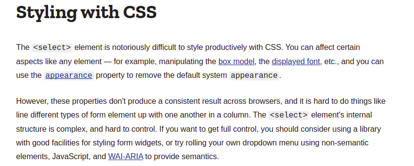
Using the select tag should've been the ideal approach to the dropdown, but the shortcoming of the element, when styled with CSS, isn't productive — doesn't produce a consistent result across browsers(browsers' compatibility) and also varies according to OS.
See the MDN article on the select element, below is a screenshot on the style section:
I'm currently working on improving the UI layout of the language selector against the menu to look good, design worthy.
Hope I'm not missing out on any information or suggestion so far — I didn't know about the further discussions on @dinakajoy PR until @pitag-ha mentioned it here. Thanks.
I updated the PR. Refactored the UI layout for the mobile screens. Then tried and added the translate SVG icon to the language selector. Also, the layout is improvable so I will love all suggestions to make it better.
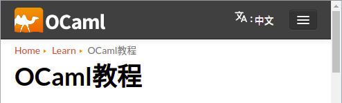
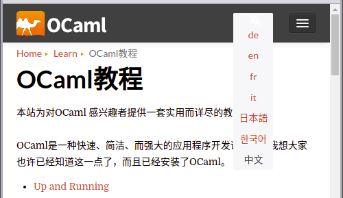
Below are the screenshots of desktop and mobile screens' layouts
Desktop:
Hover:
Mobile:
Hover:
This unfortunately conflicts with the main branch, so I can't push it to staging until that's resolved.
I have resolved some of the conflicts on the PR. The remaining conflicts are not conflicts but changes/code I added/removed to implement the dropdown and the language selector icon features.
Why it's a conflict, I don't know. But the recent changes/state of my PR can be merged into the staging branch. Please check it out as well.