UI: Remove exit button from control dock
Description
Removes the exit button from the control dock
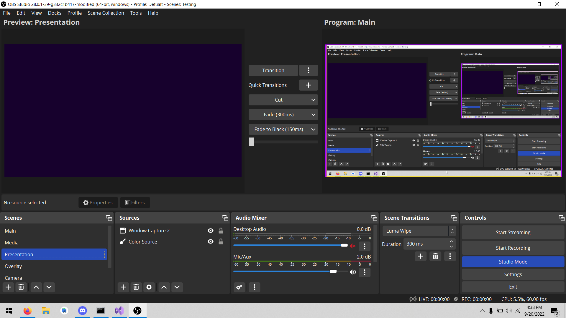
Current:
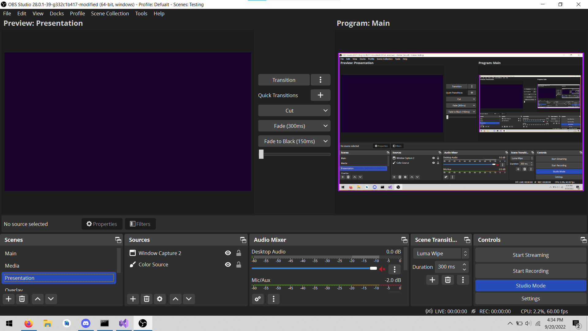
Without exit button:
Motivation and Context
With the release of the Yami theme, the padding around the UI increased significantly causing the preview to be squashed. Next to the YouTube broadcast button issue (fixed in #7267), the most common complaint is the preview is too small. Look at the screenshots posted by these users and the control dock is almost always the culprit. By removing the unnecessary exit button, the minimum control dock size shrinks and allows users to have a bigger preview.
Based on the feedback around #2751, many see the button as unnecessary. Users can still exit from within the app via file > exit, which is still accessible via keyboard.
How Has This Been Tested?
Tested on Windows 10 21H2, launched obs and used the file > exit button to close
Types of changes
Tweak (non-breaking change to improve existing functionality)
Checklist:
- [ ] My code has been run through clang-format.
- [x] I have read the contributing document.
- [x] My code is not on the master branch.
- [x] The code has been tested.
- [x] All commit messages are properly formatted and commits squashed where appropriate.
- [ ] I have included updates to all appropriate documentation.
Please also remove the string 'Exit' in UI/data/locale/en-US.ini as it is hereby no longer used.
That is a problem with the theme honestly, removing one button won't fix the overall issue.
I personally use the exit button as well, so I would rather it's not removed.
I pretty much forced to use System theme right now, for the reasons you state above, the new theme wastes a lot of space.
So I believe we should fix the real issue here, the default theme should be changed to another, or it needs to be reworked to not waste so much space.
Enable the virtual camera and the replay buffer and the "issue" still there.
Just in case, if some users like to make custom themes that inherits the Yami and want to hide/remove some Control buttons, they may try suggestions discussed on the forum: https://obsproject.com/forum/threads/recording-button.83929/post-572914 (only modification of the .qss theme file required in this case, so you can experiment right now without waiting when the changes will get its final shape)
Hide the scene transition tab while you're at it. The tab name doesn't even fit into the window in your screenshot, plus I'd argue it is the least used tab from the bottom.
Hide the scene transition tab while you're at it. The tab name doesn't even fit into the window in your screenshot, plus I'd argue it is the least used tab from the bottom.
No, please don't. Please keep PR scope limited. @lextra2 you can resize the dock or move it somewhere else or close it via the "Docks" menu.
I know I can hide it myself. But the point stands.
Enable the virtual camera and the replay buffer and the "issue" still there.
That was worded poorly on my part. I didn't intend or mean to present this as a solution to the "issue". Personally, I actually prefer the larger padding of Yami. For many users on smaller displays though, any extra reduction in the minimum height of the bottom docks would be potentially beneficial. This was fix was more fueled by my dislike of the button with the potential added benefit for some users. It also helps as a stepping stone towards a redesigned output panel like that of obsproject/rfcs#12 and #6421
Please also remove the string 'Exit' in UI/data/locale/en-US.ini as it is hereby no longer used.
Will do, I was unsure if it was used elsewhere and figured it would be safer not to.