obs-studio
 obs-studio copied to clipboard
UI: Modernize about dialog
Description
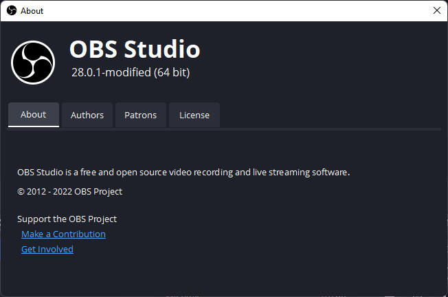
The basic layout of the about dialog got changed. A Tab bar replaces the previous bottom navigation panel as the main tool to navigate the about panel.
The OBS logo got moved into a smaller header above the tab bar containing only the logo itself, project name and version number. In turn general project information and links got consolidated into their own "About" tab and the previous "About" section got moved into the "Patrons" tab.
After:
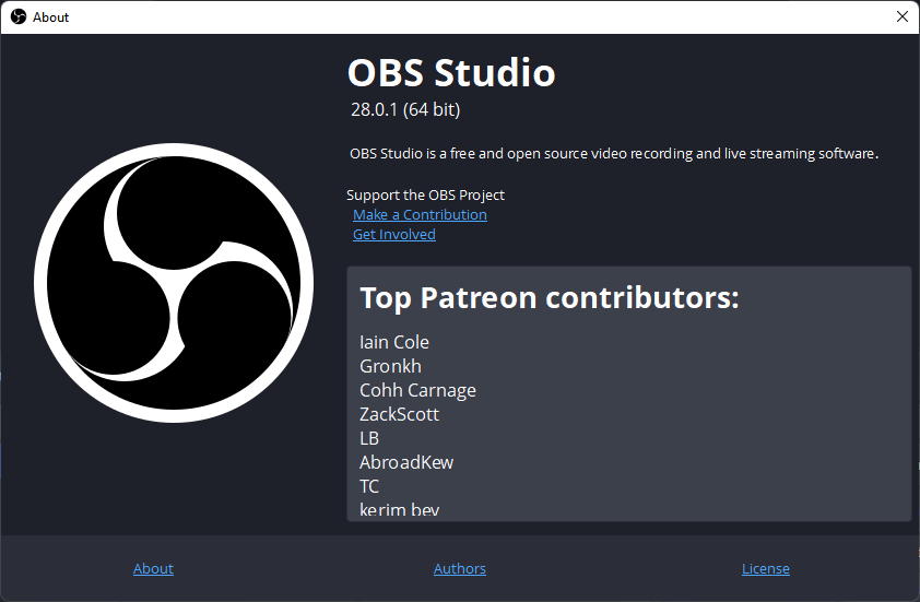
Before:
Motivation and Context
The custom widget at the bottom of the about panel already imitated the functionality of a tab bar, replacing it with a QTabWidget makes the function more recognizable and adjusts well to pre-existing theming.
While the logo is important it simply took up too much space, the intention for shrinking and moving it was to shift the main focus on to the actual tab content.
I do recognize that changing that the UI is more of an art than science. I'd appreciate other thoughts on if this is even any better than the previous dialog, or how it could be improved by e.g: changes to layout, dimension, tab order, tab content...
How Has This Been Tested?
Tested on Windows 11 22H1
- Resize the dialog to make sure elements resize and re-position accordingly
- Click through each tab to see if the content is being shown
- Check if all links lead to their respective destination
Types of changes
- Tweak (non-breaking change to improve existing functionality)
Checklist:
- [x] My code has been run through clang-format.
- [x] I have read the contributing document.
- [x] My code is not on the master branch.
- [ ] The code has been tested.
- [x] All commit messages are properly formatted and commits squashed where appropriate.
- [x] I have included updates to all appropriate documentation.
I believe displaying Patrons by default is intentional, and should be kept.
I've personally been experimenting with ideas myself, and think the following would be worth discussing.
1. Update the dialog to use the new logo - likely a copy of https://github.com/obsproject/obs-studio/blob/master/UI/xdg-data/icons/obs-logo-128.png

2. Add an icon before the version number for the platform (Windows/macOS/Linux)

3. The OBS logo should be vertically centered to match the text next to it
Thank you for submitting this PR, I'm excited to see this evolve.
In regards to your different points:
- You're right!
- That's very cute and I love the idea! Any recommendations for a suitable source for platform icons?
- This one still eludes me, initially the logo actually is vertically centered with the text but once theming applies and text size is changed the alignment gets thrown out the window. One solution would be to hardcode text size but that wouldn't really be ideal.
- About the patrons tab being kept as default, this I didn't think of but it makes sense. It also occurs to me that that's probably the reason why the information I put into the "About" tab was previously displayed at all times so as not to stow away information about the patrons. Ideally the patron tab should be displayed first but the information in the about tab should also be displayed. I'm gonna experiment with different variations on how one could lay this out.
I like the modern design. If the patreons should be shown right away, how about just having it as a separate frame on the right? so the only tabs will be About, Authors, and License? You could maybe even have autoscroll, if that's possible? Just throwing suggestions.
I like the modern design. If the patreons should be shown right away, how about just having it as a separate frame on the right? so the only tabs will be About, Authors, and License? You could maybe even have autoscroll, if that's possible? Just throwing suggestions.
Thanks for the idea! Unfortunately I couldn't quite make it look right, I'm still learning lots about Qt but it's not quite enough to create good looking animations. But I ended up trying something similar by putting the "About" information next to the obs logo again. This is what it currently looks like:
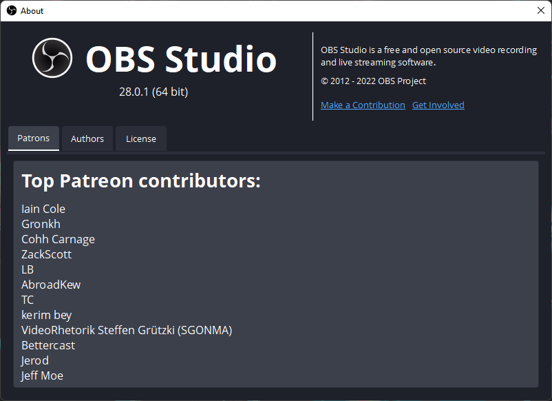
To summarize the main changes:
- Patreon Tab is shown by default
- About section got moved into a permanent location on the top right corner
- Removed Label saying "Support the OBS Project", I believe the links on their own are descriptive enough
- Layout changes to the logo, name and version
In regards to adding platform icons, I noticed that the website already has platform icons which would fit in very well:

Any thoughts?
Two suggested changes:
- Make sure that the top vertical divider is in the middle of the dialog
- Please make the left padding of the content match the right padding