frontend: Add preview/program indicators
Description
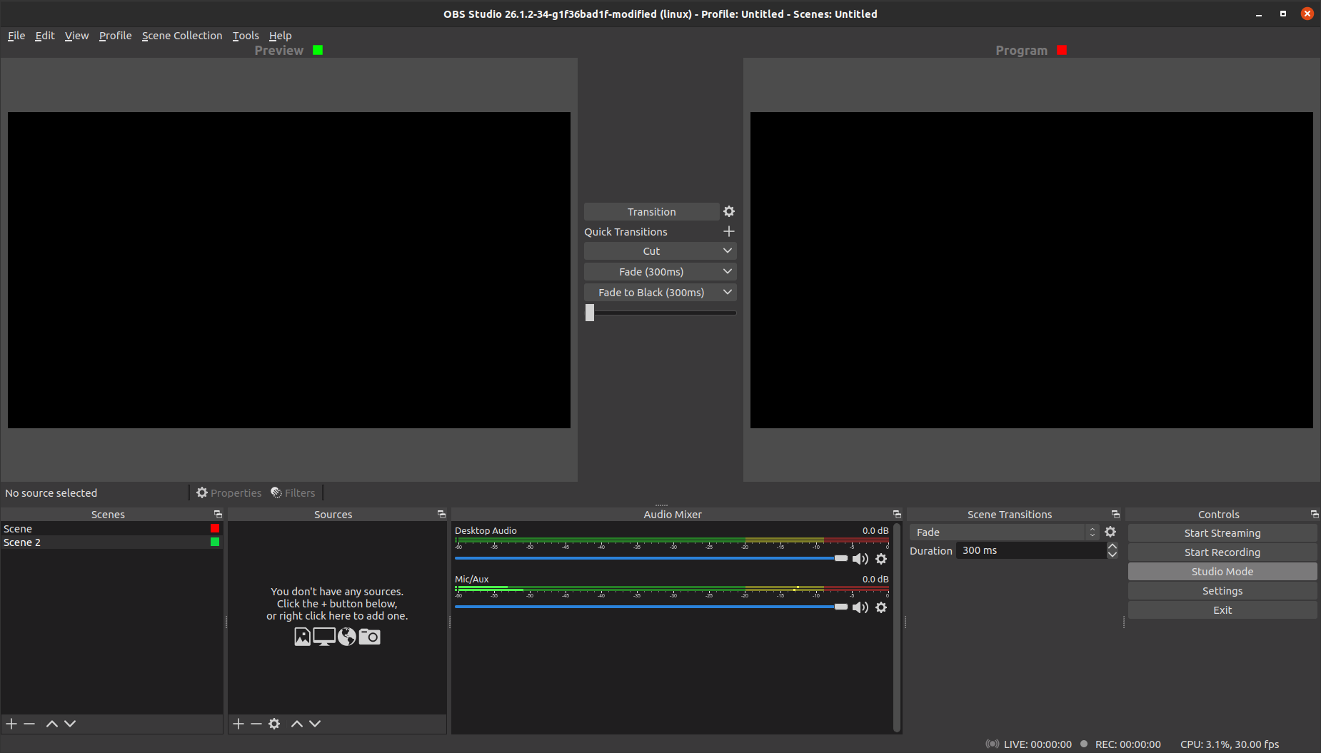
Add indicator for preview/program scene in studio mode.
Motivation and Context
Makes it easier to know what scene is the preview or program scene.
How Has This Been Tested?
Switched scenes in studio mode and made sure the icon was put in the right place.
Types of changes
- New feature (non-breaking change which adds functionality)
Checklist:
- [x] My code has been run through clang-format.
- [x] I have read the contributing document.
- [x] My code is not on the master branch.
- [x] The code has been tested.
- [x] All commit messages are properly formatted and commits squashed where appropriate.
- [x] I have included updates to all appropriate documentation.
Will users be confused by the dot vs. the selected scene as to which is the preview and which is the program? I don't think so, but wanted to see if others had thought about this.
Would it make sense to put the scene names in each panel up next to the "Preview" and "Program" text?
To match with broadcast industry tally lights, the program scene should have a red indicator (live) and the preview scene should have a green indicator (cued).
The only problem I could see with that is that a red dot may cause people to think the scene is being recorded somehow (since red dot = recording). Changing the tally indicator to a red or green square would fix that problem.
Changing the tally indicator to a red or green square would fix that problem.
Absolutely. That's a good idea.
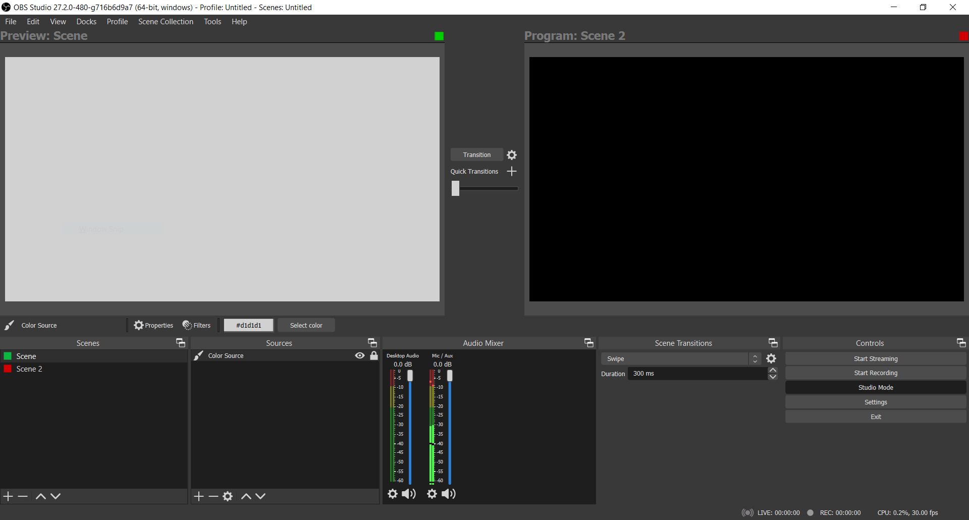
I've updated it to include indicators for the the preview and program scenes. The preview and program labels now have a red or green square next to them, so users know what they are.
Update:
could you also include the scene name? Less cognitive load than searching for it in the scene list... :)
If no can, no worries!
I know @VodBox has some work in progress stuff to change the icons in the status bar to not be color dependent for their state for accessibility reasons. I'd like to see the same done here and use an actual icon instead of two coloured boxes.
On that note, I'd also like to move us towards treating the Preview area more as an Edit area. It'll help new users understand what it is, and anyone in a professional setting won't be affected in any meaningful way by the phrasing change.
A standard pencil icon works for the preview indicator. We use feather icons already and their edit icon looks good I think (With the square)
https://feathericons.com/?query=pencil
I'm still mulling over which icon to use for Live/Program. Maybe the streaming icon we use in the status bar.
Tested on 27.2.0-beta2 on Debian 11. I like the colored squares. But when I delete a scene the color square disapear and is not transferred to the new scene automatically selected for the preview and for the program.
This PR was closed to combine with #6472 however within days it was pulled back out, and it would probably be useful to have both the text label and a visual indicator as the labels take up a lot of space and are optional in the settings.
I agree there are accessibility issues with red/green colours, however these are the industry standard and there are now configurable options for colour in the accessibility settings.
The other comment suggested that icons might be more parsable than a colour, and I think the simple answer to this is to make them an actual round dot, rather than a square one, a red circle is widely understood to be a record symbol, and combined with the indication next to the source preview and program labels as prototyped in #6472 you could easily create an understandable connection between the 2.
I'd personally propose that these dots should be to the left of the label, rather than ranged right of the video window.
@Warchamp7 Please review and let me know if we can schedule this for a release to get it off our pile or open PRs.
Not sold on this concept anymore and wanna figure out better ways to convey this.