 nuxt
nuxt
Largest image sizes are always requested regardless of screen size
I believe I am implementing this plugin incorrectly because no matter the screen width, the app I am developing always requests the biggest image size in the srcset.
As an example, I have a <nuxt-img> set as it follows:
<nuxt-img
        src='layer.src'
        sizes='xs:300px sm:500px md:700px lg:1200px xl:1920px'
        width='1920px'
        height='1080px'
        fit='outside'
        format='webp'
        quality='80' />
And in my nuxt.config.js I have:
  image: {
    screens: {
      xs: 320,
      sm: 480,
      md: 768,
      lg: 1024,
      xl: 1280,
      xxl: 1536,
      '2xl': 1920,
    },
  },
The rendered component is always like:
<img src="/_ipx/f_webp,q_80,fit_outside,s_1920x1080/assets/images/masses/art_parallax/layer6.png"
width="1920" height="1080" sizes="(max-width: 4px) 100vw, (max-width: 320px) 100vw, (max-width: 768px) 100vw,
(max-width: 1024px) 100vw, (max-width: 1280px) 100vw, (max-width: 1536px) 100vw, 100vw"
srcset="/_ipx/f_webp,q_80,fit_outside,s_4x2/assets/images/masses/art_parallax/layer6.png 4w,
/_ipx/f_webp,q_80,fit_outside,s_320x180/assets/images/masses/art_parallax/layer6.png 320w,
/_ipx/f_webp,q_80,fit_outside,s_768x432/assets/images/masses/art_parallax/layer6.png 768w,
/_ipx/f_webp,q_80,fit_outside,s_1024x576/assets/images/masses/art_parallax/layer6.png 1024w,
/_ipx/f_webp,q_80,fit_outside,s_1280x720/assets/images/masses/art_parallax/layer6.png 1280w,
/_ipx/f_webp,q_80,fit_outside,s_1536x864/assets/images/masses/art_parallax/layer6.png 1536w,
/_ipx/f_webp,q_80,fit_outside,s_1920x1080/assets/images/masses/art_parallax/layer6.png 1920w" data-v-04727e0f="">
So the srcset seems correct and the image variations are generated correctly, but in the network tab of DevTools, I see that the biggest image size is always requested no matter the screen size I set in the responsive screen mode. What could I be missing here?
I have the same issue here. Tried to test in many browsers, cleared cache, and many image extensions.
@mateusk Why do you have commas between parameters?
This is not valid HTML:
<nuxt-img
        src='layer.src',
        sizes='xs:300px sm:500px md:700px lg:1200px xl:1920px',
        width='1920px',
        height='1080px',
        fit='outside',
        format='webp',
        quality='80' />
and should look (at least) like this:
<nuxt-img
        src='layer.src'
        sizes='xs:300px sm:500px md:700px lg:1200px xl:1920px'
        width='1920px'
        height='1080px'
        fit='outside'
        format='webp'
        quality='80' />
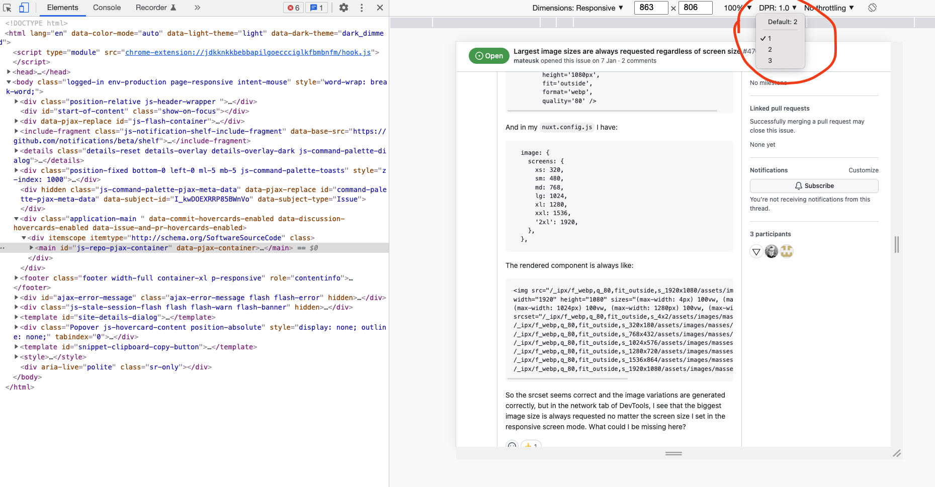
@mateusk take a look at the device pixel ratio configuration in your dev tools. Reduce it to 1 and see if the problem is gone.
@mateusk This was driving me nuts too until I ran into this post. I tried changing the DPR to 1.0 as @th1988 said, but that didn't help. It did help to know about the setting though, and that it should be set to 1.0 to make sure the browser requests a small image.
Thinking about the problem I went to my network tab and sure enough, when I shink down the responsive size in DevTools after loading the page on my desktop, it showed the source image is the larger 883 width image that was originally loaded, where according to my sizes attribute it should have been using the 320 widths. I then noticed that the image was loaded from the memory cache. I thought hm, I just loaded the desktop size page and it cached this larger image. Then I shrink the viewport, but the image size doesn't change, it still loads the same image that was cached to memory. It is possible that my browser has cached the larger image and is choosing the cached image because it is more efficient than retrieving a new image from the provider, or there may be a deeper reason like the cached image information does not have the correct srcset or sizes attributes.
I opened Dev Tools, and changed the responsive viewport width to 310 pixels or so to make sure it would request a small image size when the page reloaded next time. Then I right-clicked on the refresh button in the browser, and clicked "Empty Cache and Hard Reload", and viola, my problem was solved. Images started loading with the correct size when I reloaded them after changing the viewport size.
In the end, I am not sure what solved my problem, if it was just an image stuck in the disk cache or memory or a piece of data that was stored in the browser while developing. But in any case, my feeling is wiping the browser cache for the site you're developing will at least help you in troubleshooting what is wrong.
Hope it helps.
Not to spoil the fun for everyone, but setting DPR to 1 is hardly helpful for testing because modern mobile devices have DPR of 2, 3 or even more. It's best to write up your own component using nuxt-img programatically to handle this.
I usually set the smallest image size to whatever needs to be displayed on the mobile (so e.g. 2 x ~400px = 800px for a full-width image) and set media attribute to something like media="(max-width: 460px) 20px, 100vw" to ensure mobiles with DPR=3 always load the lowest resolution (most people can't tell between 2x and 3x images, so loading 2x on a 3x screen is enough).
@mateusk Why do you have commas between parameters?
Sorry @hyvyys , I was using Pug as markup language and adapted the code to post the question here, but forgot to remove the commas. I will edit the question to avoid confusion.
So due to project time constraints and given that I could not find a solution I ended up not using nuxt-img and writing my own image file management logic, in my case it was possible. @hyvyys, @th1988 and @ikluhsman thank you for your inputs I will give nuxt-img a try again and will report back.
Isn't this a case of the difference between 'logical pixels' and 'real hardware pixels', so device scale factor / DPI (and that DPR setting).
A device like a laptop with display scaling set to 100% but having 1920px screen resolution will probably request something close to 1920px. But an iPad with 'retina' screen is 768px wide, but will probably request something like 1536px.
Yes, changing the DPR setting to 1 will emulate a device with pure 1-to-1 pixel scaling. And yes, this is probably not what you will see in the real world. But for a reason! An iPhone with 375px wide viewing-width should require a 375x2=750px wide image, IMHO. You want to deliver the sharpness the screen can handle.
Now, to be honest, I don't know exactly what is going on.
I have sizes="xs:100vw sm:100vw md:100vw lg:100vw xl:100vw xxl:1366px". And it's a banner-style image that is full width of the viewport for most of the sizes, except it maxes out at 1366px.
If I test in the network tab (having the 'disable cache' checked like always, and refreshing after each viewport change) I see the older 'Iphone 5 / SE' device preset download the 320px wide one, while the Iphone 6/7/8 one will display the 640px version, and almost everything higher (even an Ipad mini) will download the 1366px wide one.
Now, I would expect to see a 750px wide in there somewhere for a 375px iPhone, but to be honest, it scales 'enough' for me not to look further into it.
What is in all likelihood going on: Your browser has already cached the largest version. No need to download a smaller version when it can just scale down.
Closing as this was not an issue with Nuxt Image.
@danielroe How this has been resolved and why the issue is closed?
The issue is not related to the caching and if it's related to the pixel density then can you explain how it should be used without the custom logic or some hacky ways?
Pls check this related issue.