Some of these icons are using outdated logos.
I was looking through the icon theme and found some icons that needed to be updated.
- [ ] distributor-logo-backbox
- [ ] disributor-logo-nomadbsd
- [x] distributor-logo-manjaro
- [x] distributor-logo-rhel
- [ ] duolingo
- [ ] paypal
- [ ] teamspeak
- [ ] web-deviantart
- [x] web-google
- [ ] web-pandora
- [ ] web-reddit
- [x] web-unsplash
- [ ] web-yahoo
- [ ] zegrapher
| Icon Name | New Icon |
|---|---|
distributor-logo-backbox |
 |
disributor-logo-nomadbsd |
 |
distributor-logo-manjaro |
|
distributor-logo-rhel |
|
duolingo |
 |
paypal |
 |
teamspeak |
 |
web-deviantart |
 |
web-google |
 |
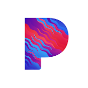
web-pandora |
 |
web-reddit |
 |
web-unsplash |
 |
web-yahoo |
 |
zegrapher |
That new Pandora icon is :fire: but is going to be a pain in the ass to do anything with numix wise
Perhaps something like this for web-pandora?

I'm not even sure if the icon wasn't updated again.

OK, maybe straight diagonal lines on the P and a coloured baseplate for a softer contrast?
I'm finding it a little difficult to pick a good base colour that works well with those stripe colours.

For the stripes i might forgo the blue and use a blue base, but it stops the logo from feeling "fresh" then, and the similarity of the shape colours make it feel more like PayPal.

I think it would look better if the stripes weren't as regular, hence the waviness in my previous comment. Maybe I could break the regularity by not having every line be parallel.
I don't think it looks all that bad. Maybe slightly lighter / less saturated colours and a significantly lighter baseplate?
Given the colours even alter in strip direction maybe there is a way building the P from blocks?
How are the waves aligned w.r.t. the pixel grid?


Maybe a bit brighter/less saturated colours on the symbol for a softer contrast and it's good to go.
I sat on it for a little while and decided I can do better. What about something like this?

It certainly looks cool but on the other hand it's a bit busy and maybe not as close to the original. I'm not sure. I'd say go ahead with the PR, show the other one as alternative and let have others chime in with their opinions.
Here you can find some more updated logos from the Google universe: https://about.google/intl/en/products/#all-products