node-red
 node-red copied to clipboard
Link arrow heads and disconnected ports
- [x] New feature (non-breaking change which adds functionality)
This is a work in progress. Sharing to get early feedback.
Two occasion requests we get are:
- add arrow heads to the wires to help indicate direction of flows
- visually distinguish between connected and disconnected node ports
This PR implements both of these things.
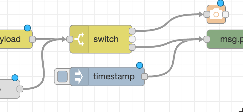
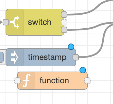
- The unconnected ports are slightly lighter. I've tried various combinations of lightness/dotted border and can't decide yet what looks right. For example:
- The arrow heads are currently hardcoded in. Before this PR merges, there will be an option to enable them via
editorThemein settings.js.
Coverage decreased (-0.08%) to 67.246% when pulling b1a706f811b03e6f3dd51e142843b67fe627819e on link-effects into f86e743ccec42fd79b217939c0131503a5eed177 on dev.
I like the filling in... but dotted outline doesn't look right on it's own (Ie no wires connected) - yet looks fine when next to ones that are... tricky.
Would be nice if the filling could light up orange when the wire it is connected to is selected as that may be easier to see than the subtle change of contrast (albeit needing a click to select wire) - WCAG etc.
Yes not gone on arrow heads so as long as they are optional... all good.
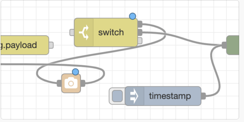
To avoid confusion, that screen shot is not what is in this PR at the moment.
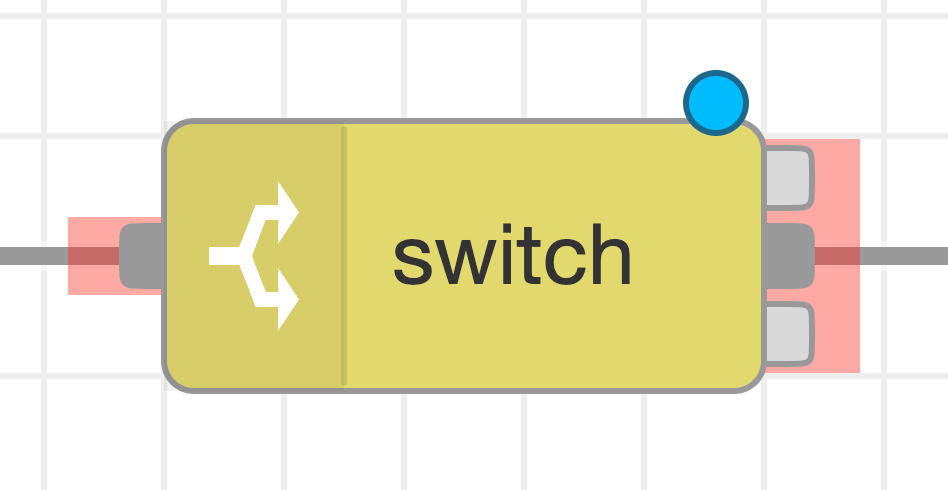
The code in this PR now does place the ports behind the node body.
To compensate for the smaller port size, the 'touch zone' that reacts to mouse/touch events for the port has been extended. In this screenshot, the touch zones are coloured red to show their relative size. That makes them much easier to interact with.
Also, the arrow head code is still in place, but is now disabled by default in the code. Not yet added a mechanism to enable it... but that's just a matter of time...
Coming back to this, I'm not sure I like this change in appearance. Needs some more work. Holding out of 2.2.0-beta.1.