 nextui-org
[BUG] - Icon Button width not working well with the "auto" prop
Describe the bug
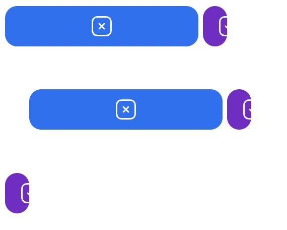
The width of buttons that only have icons without text is unpredictable when using the auto prop. In the example below, the width is too small and cuts the icon a bit. In my app, the auto prop doesn't even work (I can't reproduce it in the example).
Your Example Website or App
https://codesandbox.io/s/pensive-river-ee2pw3?file=/src/App.js
Steps to Reproduce the Bug or Issue
Add a button with an icon only and the auto prop and see the observe the width.
<Button
  icon={<TickSquare />}
  color="secondary"
  onClick={() => {}}
  auto
/>
Expected behavior
As a user, I'm expecting the icon button with the auto prop to encompass the icon with equal padding on the left and right sides of the button. Like in the documentation:

Screenshots or Videos
No response
Operating System Version
MacOS
Browser
Chrome
As a workaround, I found that removing auto and adding css={{ minWidth: "fit-content" }} works better.
<Button
  icon={<TickSquare />}
  color="secondary"
  onClick={() => {}}
  css={{ minWidth: "fit-content" }}
/>
Do you happen to know if an IconButton or change to this button is already being worked on? I'd be happy to give it a go otherwise
Hey guys sorry for the delay please upgrade to V2.
https://nextui.org/docs/components/button#icon-only