nextui
 nextui copied to clipboard
[Feature Request] Contrast in light theme
Is your feature request related to a problem? Please describe.
I admire the project and I think it is an amazing design font and few things need improvement in terms of design, for example the contrast in the secondary texts in the light theme
Describe the solution you'd like
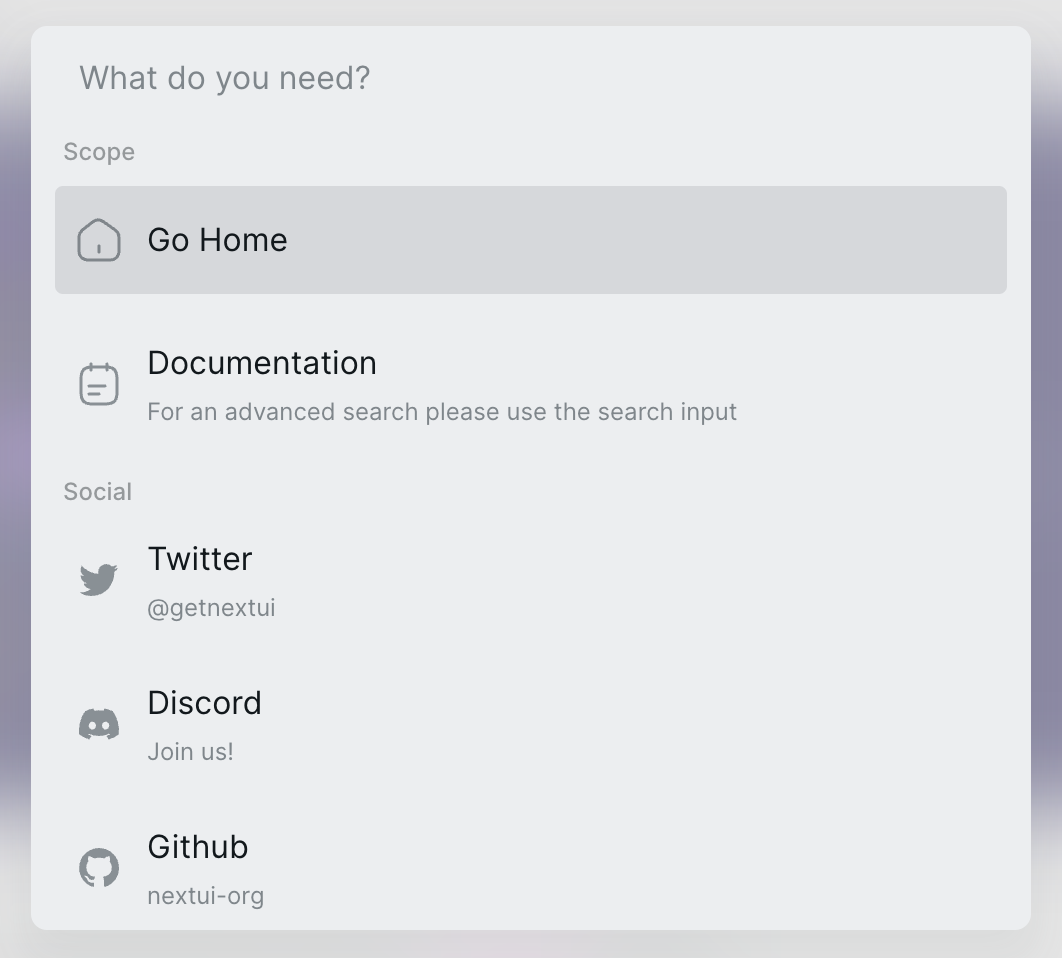
Maybe lowering the opacity of the menu would make the contrast more aligned:
Describe alternatives you've considered
I thought about changing the secondary text color of the light theme but in other places this color is great
Screenshots or Videos
current

new

I suggest that the color system of sidebar (menu) should adopt the one from search panel. The readability of search panel has improved a lot since a recent update. This move will also strengthen the consistency of the official site.
Navbar at the top is also a good reference for deciding selected / unselected style.