notes-android
 notes-android copied to clipboard
Adapt "Append to note" Icon to make it possible to differentiate from "Create new note"
I tried to find existing issues. Sorry if i failed to find it, if one exists.
Is your feature request related to a problem? Please describe.
Sometimes i use nextcloud-notes to collect links or texts related to a specific problem. I might add links from firefox - or other browsers - and want to append them to a note.
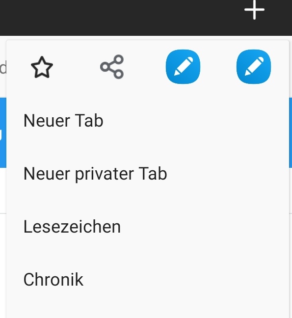
However, the icon to append to a note or to create a new note is exactly the same, making it impossible to distinguish in the UI. See screenshot in Additional Context section below.
Describe the solution you'd like A very easy solution would be to change the "Append to Note" icon, by adding a "Plus" sign to the icon, to indicate that it will "add" to something. Maybe someone more experienced in design can comment if this would be something the average user would understand. Maybe the "new note" icon would need some adaption as well to signal that it creates a new note. But for me it would be enough to just differentiate "Create new" from "Add/Append to existing"
Describe alternatives you've considered I don't see any feasible alternative (but i'm happy to hear if there is). One had to change the app / OS to show the action-item title (like "New Note" or "Append to Note" everytime somehow.
Additional context A screenshot showing the situation in my Fierfox - the two icons from nextcloud-note apps have different functionality, but share the same icon:

Yeah, i see the issue. However after reading the title i instinctively thought "Well, let's add a  to the create operation" - Apparently it ain't that easy after all :smile: Maybe add should be a
  and appending something like
  .
.
I have some concerns that the icon will get too complex and hard to "read" though if we put in too much. After all you must not forget, that the icons are adaptive icons, meaning that the shape of them can be circular in the worst case (instead of the squircle called form you have on your samsung(?) device), depending on the launcher configuration. This doesn't left much space where we can work on…
Yeah, i see the issue.
Thanks!
I have some concerns that the icon will get too complex and hard to "read" though if we put in too much
I'm no accessibility expert either, but what about colours? Not sure if there are colours that are associated with create / append. FWIW, for me the colours could be random, as long as i could differentiate the two icons ;-)
Lets see if anyone else can come up with a solution that is feasible, I'll think some more time about a suggestion...