nextcloud.com
 nextcloud.com copied to clipboard
Remove blue background/whitespace around screenshots on storage page
Check https://nextcloud.com/storage/
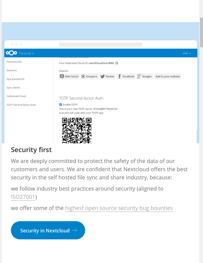
There’s the light blue background / whitespace around the screenshots. It’s rather strange as it pulls away attention from the actual screenshot, and makes it smaller.
Better would be to use the whole space that the colored part occupies to increase the size of the small screenshot. And remove the color altogether.
cc @jospoortvliet @Espina2 @vaneslie
Mhm, I actually kind of like the background color. It has already been used everywhere (for example: https://nextcloud.com/features/) and would really look boring without any kind of color. There's so much white space already on the pages and the screenshots are white as well. Just my two cents :)
I agree with @vaneslie it brings a degree of uniformity to our screenshots. Calling it a bug makes no sense, we introduced this recently and use it on all our new pages.
A big problem is that the arbitrary background makes the images even smaller on mobile:
 Considering that mobile devices are a big part (if not the most) of internet traffic, we should really male that work.
Besides, the videos are also full-width and don't have any extra frame around it. Another important thing for screenshots of the web interface sometimes is to zoom in so all is nicely visible.
The above screenshot of course is there to show: It's too small and not really visible, but with simply making the actual content wider, it would be.
What we should do and makes sense is to having those types of images set to full width on mobile. Its really difficult to us preview the output on mobile, since for we preview the results we first need to deploy on staging.
Mobile can easily be tested using browser tools, or just by making the browser window smaller.
And yeah, of course they should be full width on mobile. That includes:
- Making them 100% width so they are side to side with no whitespace
- Removing the blue around them …
- Focusing on the parts which should be highlighted, be it by cropping the screenshot or zooming the interface
Dude, I know i can make the window smaller or use the dev tools but the mobile have some ratio in how it displays the content. What sometimes look big is small. The trick is on your mobile go to the ip adress + port the server are running, but this installation redirects to localhost, that makes this impossible.
Focusing on the parts which should be highlighted, be it by cropping the screenshot or zooming the interface
Anyway, now that you talk on this there is something we can do about that, and that can works and looks good. I will test it as soon as I can.
Removing the blue around them … I like the blue background, it looks unique and give some cohesion to website. :)
We could 'just' zoom them in and hide the overflow (so as not to get scrolling) on mobile so you get a little bit of blue around but not too much. Or is that a truly crazy idea?
I quickly hacked this by setting the width to 115vw, margin-left to -13vw. But it causes a scrollbar to the right on the bottom of course...
@jospoortvliet exactly that is what I'm talking about. Now look at the picture, see that the blue around and on top of it looks stupid, remove it and we're done.
If you want some background somewhere, please only add it via CSS so we can play around with it, but let's not mess up all the screenshots so we have to retake them.
I already give my opinion so, leave you with that questions. It doesnt really matter for me
@jancborchardt pretty much all screenshots have by now been updated to this new style so removing the blue is, again, quite a bit of work. Not impossible of course, and the CSS etc is probably doable and a good idea. Then we can keep the blue background (and modify it when/however we like) on large screens and show images full width on smaller screens.
But I have to defer this to a point in time where I have the time to do it as it is a lot of work.
Yup, of course. And that "quite a bit of work" is why I recommended to not use the blue from the moment I saw it. It just makes us inflexible.
Yup, of course. And that "quite a bit of work" is why I recommended to not use the blue from the moment I saw it. It just makes us inflexible.
You seemed to object to the aesthetics of it, not the technical side - if you had pointed that out, I could have done this earlier of course.
Well, aesthetics and it also not working well on mobile should be argument enough, no? ;)
I'm convinced NOW, no doubt. Last time sadly mobile didn't come up, it was just a 'looks bad' vs 'looks nice' thing I typically don't want to get involved in...
But on mobile it clearly doesn't work well. So we have to fix this somehow and - when I have time I'll work on it.
@jospoortvliet I said it in April right up there ;) https://github.com/nextcloud/nextcloud.com/issues/446#issuecomment-296418590