news-android
 news-android copied to clipboard
Accessibility/Theming: Add another theme or allow to customize main colors
Hello!
When using this app to read a few articles, I often end up with an "after image" - I have to close my eyes then for a minute or so, so I can properly read again. You may have experienced it as well especially when reading near-white text on a near-black blackground. (See also by searching for "seeing lines after reading).
Current available themes
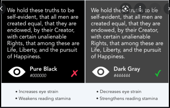
- dark - text bleeding & after image
- dark "amoled pure black" - same/worse
- white/light - too bright (and read news at late time, where darkish theme is wanted)
For comparision, Nextcloud news android with dark theme vs TT-RSS dark theme (I used this for ~10 years now without any issues)
Ideas
- Add more themes / a grey theme
- Allow to customize the effective main foreground "primary text" and background color, i.e. allow to set some hex color
For reference - ttrss reader colors - textcolor=#CCCCCC background=#383838
Generally, I don't care about the automatic Android DayNight mode stuff, so it's fine if system theme keeps toggling between "light/dark".
additional note
I understand that the contrast might be a bit hard currently. Though I personally prefer a good default over another option which needs to be maintained and tested.
A bit related to https://github.com/nextcloud/news-android/issues/642 but with focus on the content area.
Ringing in @nextcloud/designers @nextcloud/accessibility for opinions...
A bit related to 642 but with focus on the content area.
Yes main focus is on (article) content area. And it doesn't need any uber-feature like synchronizing colors from somewhere 😄 . Just either an theme inheriting dark theme (-> grey and override one or two hex values in styles.xml), or settings option to set them on our own.
@gsantner Thank you for your detailed write up. I agree with Stefan that we should have a good default. Personally I always use the OLED mode but I'm okay with adjusting the dark theme a little bit. But we'd also have to adjust them in all the other views to match them. Personally I think the darker colors look more modern (even though they might not be as perfect for eye strain etc). Would be nice to hear what the @nextcloud/designers think about this.
I agree that our background color is way too dark with the dark theme
I don't use the app and not looks like this will get attention, so closing.