Wrap text properly around due date
- Wrap text around due date
- Make sure that editing is working multiline https://github.com/nextcloud/deck/issues/865
- Set a max-width for the due date
Additional context
Hi,
Extending on my previous remarks in #2081 I would like to chip in with some suggestions.
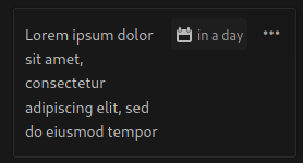
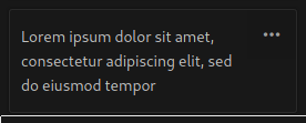
As you can see from this screenshot, the cards are beautifully formatted when there is no due date set. Especially in Dutch, you can see the due date has a long name, making the overall view look very untidy and difficult to navigate when there are many items (due to the lack of aesthetics, one tends to lose overview). This will partially be solved if the text wraps around the due date. However, this will still make the first line(s) look cramped as you can see in the screenshot.
What I noticed, is that there is not only the subject + due date on one line, but also the menu button.
- Would it be an option to move the menu button to the right-hand bottom?
- Is it an idea to decrease the height of the due date to its text size, so the subject text wraps around it for the second line?
- Another (my preferred) option would be to give the due date and subject their own line and decrease the height of the due date to its text size so it doesn't eat up so much space.
It would be nice to see a mock-up of the new view with the deck cards from my screenshot as an example, how would they look good in the new view? If it works for this use case, it would probably work well for other peoples decks as well.