 nextcloud
New sync state icons
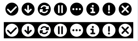
I worked on a new set of sync icons (also to fix #43). They are based on 16*16 grid, use our rounder style and don’t use the logo anymore (cause that’s very wide and caused the icon to be small). These can be used for both the tray icon as well as the sync state over the files themselves.
 Actual 16*16 size:

For the monochrome icons, the icon in the circle will be cut out of the circle, hence be transparent. For the colored one, the icon in the circle will be white to work on both light and dark backgrounds, as well as on mobile where it can overlap image previews even more.
What do you think @rullzer @pfiff45 @AndyScherzinger @tobiasKaminsky @mario @marinofaggiana will this work on desktop and mobile too? cc @nextcloud/designers
Just one question: Do we really need all the states?
- The one I never saw and would like to get rid of is the green »Download« icon. It should be the blue sync one if downloading, and the green checkmark if downloaded / synced. See also #10
- Also, what’s the difference between the info-grey and warning-yellow icon? The info-state is really strange – either there is an issue you need to look at, or it’s not an issue.
@jancborchardt Nice work! 👍 ...and yes this will work on Android while I need the source files though to create the overlay image work :)
The one I never saw and would like to get rid of is the green »Download« icon. It should be the blue sync one if downloading, and the green checkmark if downloaded / synced. See also #10
:+1: get rid of the down arrow. The sync one should also be fine for the download state on mobile devices.
Also, what’s the difference between the info-grey and warning-yellow icon? The info-state is really strange – either there is an issue you need to look at, or it’s not an issue.
Yep - get rid if this "i".
And this would also allow to not need to brand those icons anymore. Just use the default and the branded clients looks fine as well. 😉
get rid of the down arrow. The sync one should also be fine for the download state on mobile devices.
@MorrisJobke how do you distinguish between "downloaded" and "kept available offline" (as-in-constantly-kept-in-sync-with-the-server)?
@MorrisJobke how do you distinguish between "downloaded" and "kept available offline" (as-in-constantly-kept-in-sync-with-the-server)?
The little star icon?
And this would also allow to not need to brand those icons anymore. Just use the default and the branded clients looks fine as well.
Exactly. One point of course is how to distinguish between Nextcloud and other apps like Dropbox, Google Drive etc. But that’s easy, since ours is the only simple non-branded one. :) Actually quite nice.
Here’s the updated states with download icon and info icon removed, and Pause icon made grey (makes more sense than yellow cause it’s a chosen state):

Anything else? What’s the exact difference between warning and error?
Anything else? What’s the exact difference between warning and error?
warning: a file has conflicts but both states are synced error: internal server error for example
Ok - last question:
The grey 3-dot icon, is that "connecting" or what? Cause when you are connecting, we could show the blue circular arrow. And when you are offline (but no local changes) show green checkmark - when offline with local changes show the yellow (!)
Or why do we need a separate icon for that?
The grey 3-dot icon, is that "connecting" or what? Cause when you are connecting, we could show the blue circular arrow. And when you are offline (but no local changes) show green checkmark - when offline with local changes show the yellow (!)
This is also the icon if you have no folders in your sync list or when you start the app the first time, then there is the setup screen and this tray icon.
instead of using a regular circle - that IMHO does not bring into mind nextcloud at all - why not use the side circles instead?

This seems more "nextcloud characteristic" (it does, however, bring a lot of other issues, such as the size of the icons it will have to contain within, for example)
@maverick74 yep, of course I tried this out too and as you said, the size of the icons within will be much too small. The icons are based on a 16*16px grid, and the thickness of lines is only 2px already. Reducing it would be too little.
Since I wasn’t 100% happy with the »Connecting« icon (conflict with our 3-dots icon which stands for menu, and isn’t really identifiable as Nextcloud), I adjusted it to work better for a first-run experience:

I think this is the final version and I’ll prepare a pull request to replace the icons. Any last feedback @MorrisJobke @AndyScherzinger @rullzer @skjnldsv @juliushaertl @pixelipo anyone else? :)
Well... with the Nextcloud Logo as connecting-icon you introduced the brand again. The advantage of the other icon was that it was unbranded and more easy to use for providers, ... :)
Then let’s say for branded providers we can use the 3-dot-icon as the connecting one? @rullzer @jospoortvliet @MorrisJobke does that work? Maybe we can even adjust it according to the chosen icon, although that might be too much? cc @juliushaertl
If it’s too much of a hassle of course we can just go back to the 3-dot icon too. What do y’all think?
Pull request at https://github.com/nextcloud/client_theming/pull/200, please review :)
(got pointed here from #201) But I have to throw s.th. in (even the change is "done") The change not also implies updated Icons (yes, with some unfitting properties/sizing, etc as discussed in #201), but also provide a clear change in recognizability - in a bad way... I'm not able to recognize it as the sync icon anymore neither to assiociate it with "nextcloud" or a "product" and perhaps others think/feel the same?
@jds2726 "minimalistic" doesn't mean to throw away any UX (not saying I'm a expert). Even a (sorry) loveless, boring cloud icon doesn't improve anything if you ask me. If any cloud service provider will update their Icon to a cloud icon, we'll end up in a hell of coloured cloud icons (wink Microsoft)
I think the icons before were far way meaningful even they were not perfect and had their own problems - especially the branding
so: thank you @jancborchardt for the efford and the change and to throw in s.th. to think about ;)
But honestly, I really hope anyone has the time and the skills to improve this "icon set" one more time. Unfortunately: as a typical dev, I'm not in ;/ I was just able to express what I "feel"
@childnode yes, I agree that in theory the icons before were better, that's why I made them. :) However in practice they lead the important part of the icon – the indicator itself – to be way too small, because of the logo being quite wide and this very small when put in a square.
I will experiment with the state icons overflowing the logo or being outside of it.
hi @jancborchardt , yeah that's why I said
… were not perfect and had their own problems - especially the branding yes, I read about the problems ... nothing to swear ..
to post s.th. productive: at least on (Mac)OS X the "schema" for tray icons seems to me:
- (hard outline), unfilled for disabled state
- light grayed for inactive
- white (or sometimes animated) for active
- colored in error mode, even on b&w theme
some related resources
- https://developer.apple.com/library/content/documentation/General/Conceptual/ExtensibilityPG/Finder.html
- https://developer.apple.com/macos/human-interface-guidelines/overview/visual-index/
windows, gnome, KDE .... perhaps s.o. else does know ;)
we should avoid conflicts with system icons:
- https://developer.apple.com/macos/human-interface-guidelines/icons-and-images/system-icons/
- windows, gnome, KDE .... perhaps does s.o. else know where to find the resources ;)
To give this discussion a new drive I just created some new proposals. As I myself am using Ubuntu with the dark standard theme the icons are on a dark background but can of course be changed easily.
Version 1: combining the logo and the current state icons.
I changed the yellow slightly so it looks less mustardish.
 16px:
16px:
 Here are the files separatedly: nextcloud-icons-new1.zip
Version 2: simple mono icons with nextcloud branding.
The inactive logos are both semi-transparent and the active logo simply shows the logo instead of being green and attention seeking.
I'm not fully sure what cases the warning is for so it might make sense to make it red also for using it in more than one OS. The shapes are all combined, making the logo transparent and eases integration (Ubuntu paints every icon white making a white circle out of the logo of the current client).
 16px:
16px:
 Here are the files separatedly: nextcloud-icons-new2.zip
Personally I'd prefer version 2 but the kind of version 1 had been proposed and integrates the icons we already had. Maybe this could be a solution to #201 and and update to #200
Well my sugestion would be the old ones for the colored version:

And the new ones for the mono:
All the icons already exist and should be easy to activate
@MegaV0lt you said so before. Using different icons for color and mono is not the best solution. My second approach would serve as mono and color at the same time and would integrate well in most environments.
One option could also be to allow custom icon sets to be included additionally to the existing...
Hey everyone!
Since 16px icons seems like the hardest design task, I concentrated on that. If I get +1 from two or more people, I will make versions for all statuses.
Suggestions for colored:


Suggestions for monochrome:


Comments: I feel like in @schokonsti 's version 1 the circles block too much of the nextcloud logo, so I made them smaller for the color version. For the monochrome version, we have too many circles going on already, so I just took the symbol (e.g. checkmark) and made the stroke a little wider (to 1,2px) and adjusted the position so it looks in balance.
Also, do we really need that many statuses? I feel it's a little confusing for the end user. As a user, I would expect three statuses: "Everything is great!" / "I am doing something, but things are great!" / "There is a problem!" .. with more information in the tooltip. Should I open a separate bug report to discuss this?