react-native-whc-loading
 react-native-whc-loading copied to clipboard
Published
20 hours ago •
 netyouli
netyouli
A react native module to show loading ui, it works on iOS and Android.
react-native-whc-loading
A react native module to show loading ui, it works on iOS and Android.


Content
- Installation
- Demo
- Getting started
- API
- Contribution
Installation
- 1.Run
npm i react-native-whc-loading --save - 2.
import Loading from 'react-native-whc-loading'
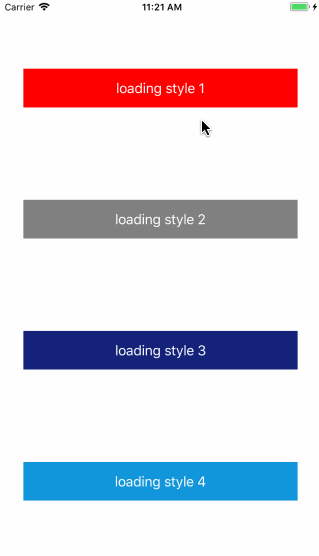
Demo
Getting started
Add react-native-whc-loading to your js file.
import Loading from 'react-native-whc-loading'
Inside your component's render method, use Loading:
 render() {
         return (
             <View style={styles.container}>
                 ...
                 <Loading ref="loading"/>
             </View>
         );
 }
Then you can use it like this:
 /// show loading ui
 this.refs.loading.show();

 /// close loading ui
 this.refs.loading.show(false);
 /// or
 this.refs.loading.close();
Or use show prop control show/hide
render() {
          return (
              <View style={styles.container}>
                  ...
                  <Loading show={true/false}/>
              </View>
          );
  }
Basic usage
render() {
        return (
            <View style={styles.container}>
                <TouchableHighlight
                    onPress={()=>{
                        this.refs.loading.show();
                    }}>
                    <Text>Start Loading</Text>
                </TouchableHighlight>
                <Loading ref="loading"/>
            </View>
        );
    }
Custom Loading
render() {
        return (
            <View style={styles.container}>
                <TouchableHighlight
                    onPress={()=>{
                        this.refs.loading.show();
                    }}>
                    <Text>Start Loading</Text>
                </TouchableHighlight>
                <Loading
                    ref="loading"
                    image=require('../path/imagename.png')
                    backgroundColor='#ffffffF2'
                    borderRadius=5
                    size=70
                    imageSize=40
                    indicatorColor='gray'
                    easing=Loading.EasingType.ease
                />
            </View>
        );
    }
API
| Props | Type | Optional | Default | Description |
|---|---|---|---|---|
| image | PropTypes.any | true | null | Custom loading image |
| backgroundColor | PropTypes.string | true | '#ffffffF2' | Custom loading background color |
| borderRadius | PropTypes.number | true | 5 | Custom loading ui border radius |
| size | PropTypes.number | true | 70 | Custom loading ui height width |
| imageSize | PropTypes.number | true | 40 | Custom loading image size |
| indicatorColor | PropTypes.string | true | 'gray' | Custom default loading indicator color |
| easing | PropTypes.func | true | Easing.ease | Custom loading image animation type |
| Method | Type | Optional | Description |
|---|---|---|---|
| show(bool) | function | true | show a loading ui |
| close() | function | - | hide loading ui |
Contribution
Issues are welcome. Please add a screenshot of bug and code snippet. Quickest way to solve issue is to reproduce it on one of the examples.
Pull requests are welcome. If you want to change API or making something big better to create issue and discuss it first.
MIT Licensed
 netyouli