 naturalcrit
Awkward flow in navbar when brew title is long
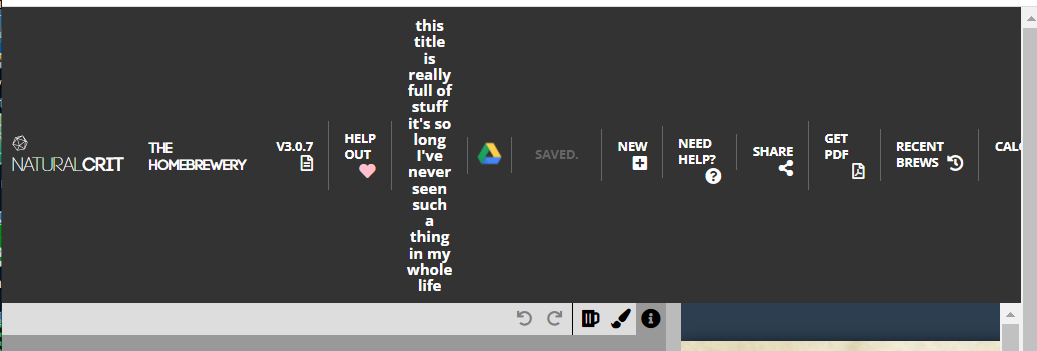
This is a minor thing that's bothered me for awhile, sorry to open an issue on it: When a brew title is long, and goes to two lines, the navbar height increases but the nav items come out looking odd.

A simple solution is to make the nav items flexboxes, and vertically center the fontawesome icons. It looks like this:

And with single line title:

The CSS changed is this:
nav .navItem {
	-webkit-transition: background-color .25s ease;
	-moz-transition: background-color .25s ease;
	-o-transition: background-color .25s ease;
	transition: background-color .25s ease;
	padding: 8px 12px;
	cursor: pointer;
	background-color: #333;
	font-size: 10px;
	font-weight: 800;
	color: white;
	text-decoration: none;
	text-transform: uppercase;
	line-height: 13px;
	display: flex;  /* added these three items */
	align-items: center;
	justify-content: center;
}
I can create a PR quickly if interested. I looked at it in both Chrome and FF.
What about instead applying text-overflow: ellipsis; to the title? I'd prefer if we can avoid the navbar resizing at all. It can be a very annoying problem where the title is just on the border of being too long, and then when auto-save kicks in and changes from save to saving... suddenly the whole row juts down for a couple seconds and then pops back up.
The navbar can still go to two rows, though, if the window is narrow. So I think my suggested flexbox option is still appropriate even if ellipsis is added.
I'm not sure I've seen the save/saving... thing happen. Right now just playing with it (in the production app) I can get my title really close to the 'full' space, and any changes trigger "Save Now", then a second passes before "Saving..." and then to "Saved.". At that final step, the cell doesn't get any smaller. I might just suck at reproducing it though. But it could be fixed by setting a min-width on that item? Or if it's a flex item, flex: 0 0 50px (exactly pixel count TBD).
Also I see now in my screenshots that the saved item is not centered (or at least doesn't appear to be, though it might centered in whatever div it is in). Obviously that can be fixed.
Mmmm... the save thing might have already been handled in an old PR. We have a width set to 106px so thats probably not an issue anymore.
The navbar can still go to two rows, though, if the window is narrow.
Ok, you can go ahead with this then.
Still might be nice to have ellipses or something else kick in at a certain point so we don't get this kind of thing:
yeah, good point. Maybe ellipsis combined with a minimum width for that item or something. Or, a max character count for titles? Though that's a little heavy handed and probably not a good idea.
I will make a PR for this tonight unless you just add it to master before I can.