seaborn
 seaborn copied to clipboard
Suggestion: categorical scatter plot showing distribution with large datasets
I wonder if there is a way to show the distribution of data points in a categorical scatter plot with large datasets, where the width of the distribution of data points is proportional to the number of individual points at that Y value (like in the "standard" graph below)?
I'm aware that stripplot can plot all the points but it's difficult to show the distribution with large datasets (like the "expanded" graph). swarmplot typically gives "smile" shapes and is not suitable for large datasets (like the "classic" graph). violinplot shows the distribution but does not plot all the data points.
Thanks for the great package!
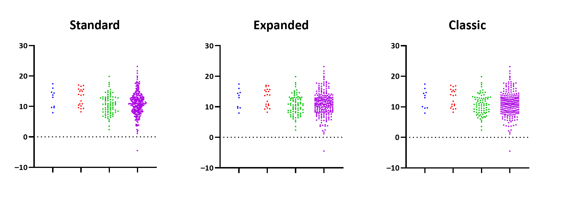 (Image source: https://www.graphpad.com/guides/prism/latest/user-guide/using_graphing_each_replicate.htm)
 (Additional example image source: https://www.graphpad.com/guides/prism/latest/user-guide/better-looking-graphs.htm)
One way I have seen this done is to make a stripplot where the width of the jitter is proportional to a kernel density estimate. That seems principled, but would not be easily implemented with the current seaborn internals. But, to be honest I don't feel like the three options here give me a particularly good understanding of what the actual shape of the distribution looks like besides "symmetric and lepokurtotic" ... there's sort of a fundamental upper limit on how much information you can convey about large datasets while preserving the representation of individual datapoints (but maybe 'symmetric and leptokurotic is enough?).