mui-x
 mui-x copied to clipboard
 mui
mui
[pickers] Add new desktop time picking experience
Fixes #4483
- [x] Add option to render "digital clock" using "select list"
- [x] Support
digitalview renderer onDesktopTimePickerandDesktopDateTimePicker - [ ] Add desktop time views renderer
- [ ] Correctly handle toolbar behaviour with
digitalview type - [ ] Update docs
- [ ] Update tests
Localization writing tips :writing_hand:
Seems you are updating localization :earth_africa: files.
Thank you for contributing to the localization! :tada: To make your PR perfect, here is a list of elements to check: :heavy_check_mark:
- [ ] Verify if the PR title respects the release format. Here are two examples (depending if you update or add a locale file)
[l10n] Improve Swedish (sv-SE) locale [l10n] Add Danish (da-DK) locale
- [ ] Update the documentation of supported locales by running
yarn l10n - [ ] Clean files with
yarn prettier.
Netlify deploy preview
Netlify deploy preview: https://deploy-preview-7958--material-ui-x.netlify.app/
Updated pages
- docs/data/date-pickers/digital-clock/digital-clock.md
- docs/data/date-pickers/time-clock/time-clock.md
- docs/data/date-pickers/time-picker/time-picker.md
- docs/data/date-pickers/validation/validation.md
- docs/data/migration/migration-pickers-v5/migration-pickers-v5.md
These are the results for the performance tests:
| Test case | Unit | Min | Max | Median | Mean | σ |
|---|---|---|---|---|---|---|
| Filter 100k rows | ms | 671.8 | 1,401.2 | 671.8 | 961.98 | 264.501 |
| Sort 100k rows | ms | 733.9 | 1,512.9 | 1,512.9 | 1,172.32 | 298.897 |
| Select 100k rows | ms | 299.6 | 322.7 | 317.5 | 313.74 | 8.854 |
| Deselect 100k rows | ms | 159.3 | 396.6 | 216.9 | 247.84 | 84.106 |
Generated by :no_entry_sign: dangerJS against a927e81103e8161a70bcdd268caaac4af13fae83
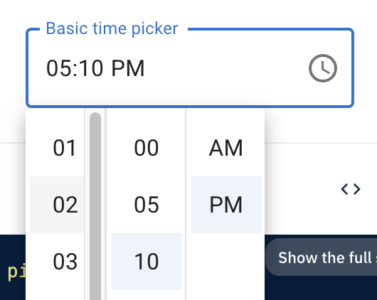
@gerdadesign Could you have a look at the live time picker and date time picker examples and comment on the UX behavior?
The main I see:
- Should the
meridiemselection be in the selectable views flow?- should we only close the picker after it is changed/confirmed?
- current rough implementation uses a similar approach to the mobile (v5) clock picker, where
am/pmtoggle is independent between the picker lifecycle—if you did not change it before selecting the last section (minutes by default)—the picker will be closed
- Or should we go with what is currently in the examples: closing the picker when the last section is selected (if a value is already present—also close when selecting the last section right after opening the picker without selecting the prior section)?
- Should we support these new views on mobile and static pickers?
- Should we handle toolbar behavior on the digital (select options) picker? And if yes? How? Would clicking time sections do nothing?
This pull request has conflicts, please resolve those before we can evaluate the pull request.
![github-actions[bot] avatar](https://avatars.githubusercontent.com/in/15368?v=4 "Published by a pub.dev verified publisher")
I'd like to have your opinion on the following diff:
Oh, that looks great! ❤️ Want me to include it with this PR? Or are you planning on making the change with one of your PRs? 🤔
I think it can be included in this PR :+1:
We just need to be careful to pass the focused to the correct input in multi input pickers.
I'm wondering if there is a way to prevent this additional view complexity. Could we set the renderer dynamically in the component?
I was also debating on the best approach on how to manage the different views and I don't think I'm happy with the current approach, but it works. 🙈
The issue that I was trying to avoid/overcome is the fact that the digital single option list view technically has only one view, hence, after doing a single selection the picker is automatically closed without much fuss.
But what do we do with the digital clock with sections per time format part?
If that would still be a digital view—we'd need some hacks on how and when to close the picker. 🤷
If that would still be a digital view
I'm proposing the opposite: use the hours / minutes / seconds views for both UIs.
Don't create new views at all.
I think the best approach is to keep the views abstract from how the UI is organized, because it allows users (and us) to create very different ways of picking dates without creating new views.
If tomorrow we (or the users) create a date-time picking UI that looks like your mono-column time-picking UI (to a doctor booking system where we just list the available time slots for example), for me we should just create a new renderer and call it for every existing views.
If we start creating a digital view for when we have 1 list of all times, then to be consistent we will have to create a new digital-date-time (or named differently) for this new view.
Same thing if tomorrow we want to move the month and year picking UI to be selects inside the DayCalendar header.
It also has the benefit to keep the logic gravitating around the views (your change to the toolbar, the generation of the field format, etc...) simple since the list of the views is always the same.
Replying to @joserodolfofreitas comments.
I was wondering if we should snap the selection on the top like ant-design. I noticed there's a mechanism that sometimes snaps the selection in the center, but it doesn't feel completely consistent, and miss aligning with AM/PM kinda defeats its purpose.
Good observation. The current behavior is to scroll the selected item if it doesn't fit in the visible area. That code might need tweaking, or a rethink, as you mentioned. We could either:
- only scroll the selected items into view when the picker is opened;
- snap-scroll in a similar fashion how
ant-ddoes it; What do you think about it @gerdadesign?
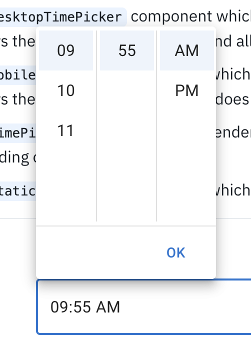
It seems only clicking on minutes closes the modal; This is a bit confusing, particularly when you're editing a value. We should have an OK button for users to exit when editing the field, and I believe we should close the modal when all the sections are completed or all the sections are selected on the same "session" in the case of editing.
The behavior is technically identical to the time clock—the picker is closed when a value in the last view is selected, except am/pm, which can be toggled at will while the picker is open. Any ideas on the best UX in this regard @gerdadesign?
Related to this: I think we shouldn't auto-select 'AM' and let it be the last-- although I think auto selecting "00" minutes on the first input is fine. EDIT: this gets trickier when time value also requires seconds or doesn't require meridian. We probably can't provide good behavior without an OK button for some situations.
Are you sure? Even ant-d pre-selects the am option. 🤔 Which side of 12 hours would you be changing if am/pm was not selected until you do it? 🤔
I do agree that having a toolbar would probably make more sense, but would we still accept (close the picker) once the last view is selected?
@gerdadesign what's your take on this? 🤔
Btw, will users be able to set actions like in the date picker?
slots: {{ actionBar: { actions: ["accept"] },}}
Of course, it can already be done. Just add this snippet slotProps={{ actionBar: { actions: ['accept'] } }}. 😉
The question is—should we add it by default as discussed in the previous section? 😃
Keyboard use inside the UI is great once you're focused there, but after opening the UI with keyboard, navigation is still on the field, except for meridian input, which works as expected.
Great observation, did not fix it, thanks for reminding me. 👌
There's also a difference regarding navigation. UI requires tab to move to next section, while field navigate with left and right arrows.
Eventually, the fields will probably no longer navigate with arrow keys just as in this spinbutton example. IMO, technically, using Tab to navigate between sections is more appropriate. We didn't do it for the fields, because of the lack of a11y support (blind visibility as to where you are) and the fact that the tabulation could take ages before you exit one field depending on the format. 🙈
Not directly related to this PR, but I personally expected this UI to open on focus. There are a lot of topics around this discussion: consistency between components, what should be the default, if we should create a prop to configure this behavior and etc. But I'd like to raise the flag here, because we need to start getting alignment on this.
Good point. It would probably make sense to have this behavior, where you would still be able to change time in the field with its keyboard navigation options but be able to use the picker behavior if you prefer the mouse. 🤔 But that's definitely a separate topic and one that should be changed throughout the components. Now only the range picker works like that, so we ought to align towards having that behavior for every picker or fix the range picker behavior to be in line with other pickers. 🤔
This pull request has conflicts, please resolve those before we can evaluate the pull request.
Design (look & feel) feedback:
There's also a difference regarding navigation. UI requires tab to move to next section, while field navigate with left and right arrows.
My initial guess, as an end-user, was that it's a composite widget like in https://www.telerik.com/kendo-react-ui/components/dateinputs/timepicker/ so that it works with the arrow key, but it probably doesn't matter, this panel if for the mouse users, not the keyboard users.
It seems only clicking on minutes closes the modal; This is a bit confusing, particularly when you're editing a value. We should have an OK button for users to exit when editing the field, and I believe we should close the modal when all the sections are completed or all the sections are selected on the same "session" in the case of editing.
I agree that the auto close on the minute's selection feels wrong as the default.
The equivalent on https://mui.com/material-ui/react-autocomplete/#playground to customize this UX behavior is the autoSelect prop, or disableCloseOnSelect depending on when the onChange event triggers with the time picker.
Not directly related to this PR, but I personally expected this UI to open on focus. There are a lot of topics around this discussion: consistency between components, what should be the default, if we should create a prop to configure this behavior and etc. But I'd like to raise the flag here, because we need to start getting alignment on this.
The equivalent on https://mui.com/material-ui/react-autocomplete/#playground to customize this UX behavior is the openOnFocus prop.
Maybe more margin right should be reserved ahead of time for the scrollbar:
Or maybe we can customize it to reduce its size as Andrew did in https://github.com/mui/mui-x/issues/8339#issuecomment-1479637963. I don't know.
should we only close the picker after [the meridiem] is changed/confirmed?
I do think we should click AM / PM before closing. It's less friction for one extra click vs the selector closing prematurely.
snap-scroll
Yes! In the original prototype, sticking the selected to the top of the scrollable area was the intention.
The behavior is technically identical to the time clock—the picker is closed when a value in the last view is selected, except am/pm, which can be toggled at will while the picker is open. Any ideas on the best UX in this regard?
Hmm, I'm not sure we have evidence to support this in either direction, but I do think having the option to add an OK button is valuable. I'm sure some people will want it.
Related to this: I think we shouldn't auto-select 'AM' and let it be the last-- although I think auto selecting "00" minutes on the first input is fine. Are you sure? Even ant-d pre-selects the am option. 🤔 Which side of 12 hours would you be changing if am/pm was not selected until you do it? 🤔
I think we should be consistent here — either nothing is preselected and you must actively choose 09:00:00 AM OR if someone initially clicks "09", the rest of the columns are auto-selected, but don't auto-close (until they confirm either by a toolbar OR by selecting the final column (whether that's AM/PM or the final seconds in 24-hr time).
It would probably make sense to have this behavior, where you would still be able to change time in the field with its keyboard navigation options but be able to use the picker behavior if you prefer the mouse. 🤔
Agree! This was also the initial intention — to be able to switch between keyboard/mouse if you wish.
My initial guess, as an end-user, was that it's a composite widget like in https://www.telerik.com/kendo-react-ui/components/dateinputs/timepicker/ so that it works with the arrow key, but it probably doesn't matter, this panel if for the mouse users, not the keyboard users.
My benchmark for navigation is usually something more a11y friendly. In this case, it would be the date picker spinbutton example. But if the majority is voting for Left/Right arrow navigation support—we can go with it as well. I do agree, that it might be expected given how the current field navigation works, but it might not be like that forever. 😃
I agree that the auto close on the minute's selection feels wrong as the default.
The equivalent on https://mui.com/material-ui/react-autocomplete/#playground to customize this UX behavior is the
autoSelectprop, ordisableCloseOnSelectdepending on when theonChangeevent triggers with the time picker.
It's just the same default as in v5 (clock picker), by default, selecting a value in the last view closes the picker regardless of am/pm toggle if closeOnSelect is not overridden.
But yes, I do agree, that given how the digital clock looks it is not that intuitive. The native time picker does not close the view automatically at all (at least on MacOS Chrome).
So, I see two options:
- change the default of
closeOnSelecttofalseonTimePickerandDateTimePickerso that the view would never close automatically (easiest to implement and sort of makes sense given native picker behavior) - add in some spaghetti code handling the case of closing the view only when
am/pmis clicked (if it's turned on)
I'm clearly in favor of option 1 given the mentioned criterion. 🙈 🤷
Not directly related to this PR, but I personally expected this UI to open on focus. There are a lot of topics around this discussion: consistency between components, what should be the default, if we should create a prop to configure this behavior and etc. But I'd like to raise the flag here, because we need to start getting alignment on this.
The equivalent on https://mui.com/material-ui/react-autocomplete/#playground to customize this UX behavior is the
openOnFocusprop.
This is a more broad topic that needs a separate issue and thinking through on how to handle all the pickers, those are two drastically different behaviors in case of pickers.
Maybe more margin right should be reserved ahead of time for the scrollbar:
Or maybe we can customize it to reduce its size as Andrew did in #8339 (comment). I don't know.
I'm not sure about adding a bigger margin. It's already not that small and even bigger than in the design. What's your take on it @gerdadesign? Regarding the styled scrollbar—it could make sense, but not having support on Firefox seems a bit incorrect, at least relying on it... I'll also test to see how it looks on Windows.
should we only close the picker after [the meridiem] is changed/confirmed?
I do think we should click AM / PM before closing. It's less friction for one extra click vs the selector closing prematurely.
Agreed, but given the two choices provided and discussed in https://github.com/mui/mui-x/pull/7958#issuecomment-1487394204, which one would you prefer?
snap-scroll
Yes! In the original prototype, sticking the selected to the top of the scrollable area was the intention.
Do you think that we should go with locking the scroll to the top, or something a bit less controlled, like the native Chrome (MacOS) implementation seen here? In native time pickers, the scroll position is adjusted only when the picker is opened.
Hmm, I'm not sure we have evidence to support this in either direction, but I do think having the option to add an OK button is valuable. I'm sure some people will want it.
That is already a feature supported out-of-the-box given our pickers architecture. 😉
I think we should be consistent here — either nothing is preselected and you must actively choose 09:00:00 AM OR if someone initially clicks "09", the rest of the columns are auto-selected, but don't auto-close (until they confirm either by a toolbar OR by selecting the final column (whether that's AM/PM or the final seconds in 24-hr time).
The second option is easier to implement, but I'll look into the feasibility of only showing the section as selected once it has been done by the user. Just a note, that the native time picker is different in this case as it preselects the current time, once the view is opened. 🤔
It would probably make sense to have this behavior, where you would still be able to change time in the field with its keyboard navigation options but be able to use the picker behavior if you prefer the mouse. 🤔
Agree! This was also the initial intention — to be able to switch between keyboard/mouse if you wish.
I'll just re-iterate that we already agreed that this is a separate behavior topic, which should apply and be discussed in relation to all the pickers. Because in its current form, the DateRangePicker does have the behavior we are talking about, while all the other single select pickers have the "dialog" behavior, where the interaction and focus are put on the picker view. 😉
That is already a feature supported out-of-the-box given our pickers architecture.
Maybe we could change the default visibility of this button on the desktop time picker
That is already a feature supported out-of-the-box given our pickers architecture.
Maybe we could change the default visibility of this button on the desktop time picker
Sure. But what about DateTimePicker then? 🤔
I guess we could add it to both. But I did not think about the consequences in depth tbh
@gerdadesign Do you think we should do something with this edge-case layout (DateTimePicker with tabs shown (hidden by default) and ampm turned off)?

I've experimented with a hybrid timeStep prop type of number | ((view: TimeView | 'single-column') => number); and think that it creates some edge-cases (in regards to resolving when to render single or multi-column view), which I'm not sure are worth introducing.
const timeStep = defaultizedProps.timeStep ?? 5;
// what if the user is not correctly resolving `timeStep` with `minutes` view provided?
const resolvedTimeStep = typeof timeStep === 'number' ? timeStep : timeStep('minutes');
My proposal would be to keep the existing timeStep?: number prop for now and optionally introduce secondsStep and milisecondsStep in the future if needed, and they'd be only used if were provided, otherwise, we'd fallback to timeStep.
What do you think about it @joserodolfofreitas?
Maybe it has already been reported But I would be in favor of having a more compact design. Because right now, on small desktop it's overflowing when the input is centered, and the bigger the UI, the more the mouse has to travel (see point 6 in #7440)
The modal is 410px high, compared to 271px on AntDesign.
This is looking great so far! Thank you for all your work @LukasTy 🙌
Styles
Scrollbar
- I'm wondering if I'm missing something here, but I would expect this to work like the scroll bar for lists. (Chrome; Mac) thumb visible when actively scrolling on invisible track
-
Size
But I would be in favor of having a more compact design.
Agreed. This feels a bit too large in height.
Divider
- Since we have some vertical dividers, can we include a horizontal divider before the action bar?
-
~Numbers Can also have the numbers loop around when scrolling? So if you were at 58 minutes, but wanted 03, you could just scroll up instead of all the way down?~
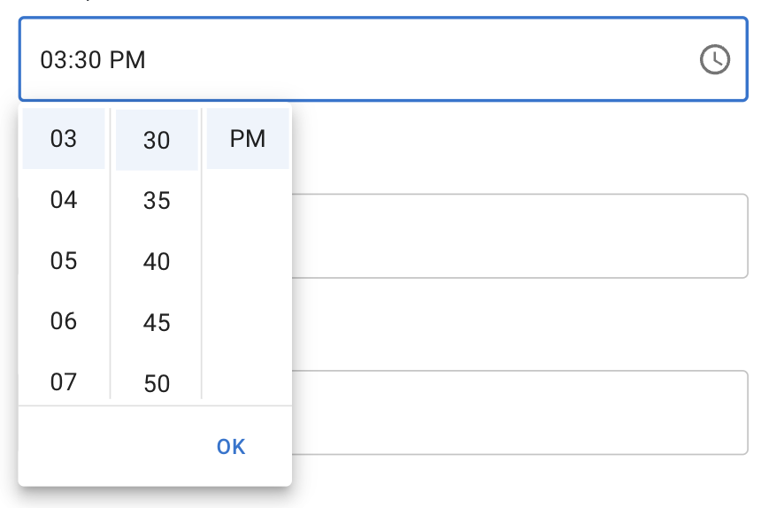
Close behavior
- change the default of closeOnSelect to false on TimePicker and DateTimePicker so that the view would never close automatically (easiest to implement and sort of makes sense given native picker behavior)
- add in some spaghetti code handling the case of closing the view only when am/pm is clicked (if it's turned on) I'm clearly in favor of option 1 given the mentioned criterion. 🙈 🤷
- Of the options you listed @LukasTy, it seems like the best option is to not auto-close the modal and require to click outside or OK in the action bar.
Snapping
Do you think that we should go with locking the scroll to the top, or something a bit less controlled, like the native Chrome (MacOS) implementation seen here? In native time pickers, the scroll position is adjusted only when the picker is opened.
- There's a couple considerations here. Originally, the thought behind locking the selected to the top was to bring it closer to the date & it's quicker to read. There are also already established patterns of highlighting the selected row, sometimes as a scrollwheel, sometimes as just a highlight.
- One other consideration is that when the picker opens up to the top of an input, sticking to the top will actually be furthest away from field, but with a shorter height this feels much better than in the current height.
-
- I'm also noticing that you see the animation when you open up the modal again. Is it possible to not have that scrolling animation except for when actively changing the values?
This pull request has conflicts, please resolve those before we can evaluate the pull request.
Replying to @gerdadesign comments:
- I'm wondering if I'm missing something here, but I would expect this to work like the scroll bar for lists. (Chrome; Mac) thumb visible when actively scrolling on invisible track
As we've discussed, I'm waiting for your guidance on whether to stick with trying to build a custom scrollbar (which will not work in Firefox) or just ditch the idea and stick to the default (current look for a single-column digital clock).
But I would be in favor of having a more compact design.
Agreed. This feels a bit too large in height.
I have made the following changes:
- reduced a section item width by 4 px
- reduced the time picker container height to 225 px (so that both single-column and multi-column would by default show an incomplete next item)
- increased padding on single-column digital clock item by 4px to align with the height (40px as per design) of multi-column digital clock
- Since we have some vertical dividers, can we include a horizontal divider before the action bar?
I've added a bottom border, but currently it is visible regardless if the picker has actions or not. If we want the border to only be shown when the picker has any actions (action bar should be shown), then I'll need to do more tinkering to achieve that. 🙈
- Of the options you listed LukasTy, it seems like the best option is to not auto-close the modal and require to click outside or OK in the action bar.
This was already the behavior I've went for. 👌
- There's a couple considerations here. Originally, the thought behind locking the selected to the top was to bring it closer to the date & it's quicker to read. There are also already established patterns of highlighting the selected row, sometimes as a scrollwheel, sometimes as just a highlight.
- One other consideration is that when the picker opens up to the top of an input, sticking to the top will actually be furthest away from field, but with a shorter height this feels much better than in the current height.
As we've discussed, I'm waiting for your decision on what to do with this behavior. Do we keep it as is, remove it or come up with something different? 🤔
- I'm also noticing that you see the animation when you open up the modal again. Is it possible to not have that scrolling animation except for when actively changing the values?
Fixed to not animate the scrolling on initial render (when picker is opened). 😉
Of the options you listed LukasTy, it seems like the best option is to not auto-close the modal and require to click outside or OK in the action bar.
The way I was thinking we'd have another closing condition: When the user selects every section of the time picker, the modal is closed. What do you think, gerdadesign and LukasTy?
I had that kind of implementation done previously. It was a bit hacky but doable.
In such case, we would no longer need to specify closeOnSelect={false} in case a MultiSectionDigitalClock is used.
But would it still make sense to have the OK action by default?
I do not have the strongest opinion on this one, I can only comment that the current solution has a bit cleaner implementation. 😉
One of the remaining usability issues I noticed, and that could be improved with an auto-closing strategy: moving the mouse from top to bottom to click the ok button makes the experience slower in comparison. After using it a few times, it quickly became a prominent pain. Making the modal shorter mitigates this a bit. But with a date time picker, where we may want to keep the same height of the calendar, the mitigation will likely be less effective.
Yes, I can only agree, that if we go with the currently proposed DateTimePicke design, then your previously suggested default behavior would IMHO be a bit smoother UX. 🤔
But would it still make sense to have the OK action by default?
Yes. I don't see a conflict with having an auto-closing strategy and the OK button to fall back on, when for example, you want to accept the current value(during editions, or given that minutes and meridian is already pre-selected)
- Yes, ship implementation only for the
TimePickerinitially. - No, for me we should not add prop that can only be used in custom renderer that are not even design to be used in this scenario.
- Yes
- I would go for the best UX here, even if it required ugly code (that can be improved in the future).
I see we're aligned already, but to answer the "compromise" questions:
- Do we ship the digital clock renderer only on
TimePickerand leaveDateTimePickerfor a later time/PR after the design has been finalized and DateTimeRange behavior is possibly explored and decided on?
Yes. It makes sense to ship the time picker earlier.
- Do we add the new props to
MobileTimePicker? If we don't finalize usage of theDigitalClockon mobile, then maybe it makes sense to not have the props on that component as well? But no one would stop users from specifying the new digitaltimeViewRenderersfor theMobileTimePicker, hence, some users might be in a problem, where they insist on using the renderer, but TS does not allow for the new expected props to be passed to it... 🤷
Support for the digital clock on mobile can also come later.
- Do we keep the
StaticTimePickerbehavior as is (usingTimeClock) for the time renderer regardless of thedisplayStaticWrapperAsprop value?
I'd say we'll have to respect "displayStaticWrapperAs" soon, but we can keep StaticTimePicker as is for now.
- What kind of default behavior do we want for select/closing?
- Should the time picker default to having an
acceptbutton and not close by default after selection (unlesscloseOnSelectis true)? - Should the time picker have the same defaults—close by default after all sections are selected? In this case we either need a
meridiemview or ugly code to handleampm="true"case.
I think we should have an accept button by default, but we should include an auto-closing strategy (I see this is the current intended behavior on the current implementation. 👍)
- Wait for all the little design/UX (colors, scrolling after selecting, etc.) questions that are being looked at by Gerda.
Yes, but not necessarily "all". As I understand, most of them seem very minor changes and can be tackled on the initial release. Depending on the scope of the remaining ones, we can create new issues for them. If waiting for feedback becomes the only blocker to release, we can consider releasing it.
Regarding the auto-closing strategy, there seem to be a few small cases that are not covered. For example, in the following sandbox, it won't auto-close if I select minutes and then hours, but it will if I select two values in the minute section. https://codesandbox.io/s/competent-lamarr-g9l078?file=/demo.tsx I suppose that checking for the selection in every section was not the best way to go. What are the implemented conditions?
Good observation. This is a regression and was working as expected previously. Will fix it. 😉 The idea is that the picker closes when the last section/view is selected, hence, if you open the picker, move to minutes and select them—it should close if there is no meridiem view.
On another point, I noticed that shift+tab doesn't navigate to the previous section but to the selection on the current section. Is this an intended behavior?
It's the behavior of the MenuList component, both the selected and the currently selecting items have tabindex="0", hence, when you do Shift + Tab and there is a selected item before the currently selecting one—the focus will first jump to it, before jumping to the previous section when doing the same combo again.
This might be a case that would need adjustment given the a11y requirements 🤔
This pull request has conflicts, please resolve those before we can evaluate the pull request.
This pull request has conflicts, please resolve those before we can evaluate the pull request.
This pull request has conflicts, please resolve those before we can evaluate the pull request.