 mui
mui
[docs] New page for the pickers: Validation
Closes #5539 Part of #5565
- [x] Create a new page explaining the global behavior of the validation and how each prop works
- [x] Remove validation examples scattered across the doc
- [x] Add a back link section on every component page
A few points I would like feedback on:
- Do you like UI to display the same behavior on several components ?
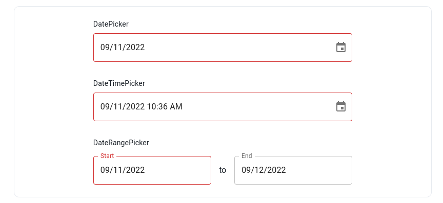
I did not use the label prop since DateRangePicker does not have a top level label.
Once we have something clean, I would like to bring the same spacing / sizing to the other date range picker demos where we need a top level label
And we will have a lot of other demos with the same logic. For me it's a lot smoother to just make an example with each component rather than adding a sentence like "this prop is supported by X, Y and Z" (when the example is simple of course).
-
I did one section per prop instead of grouping them. It causes some redundancy (
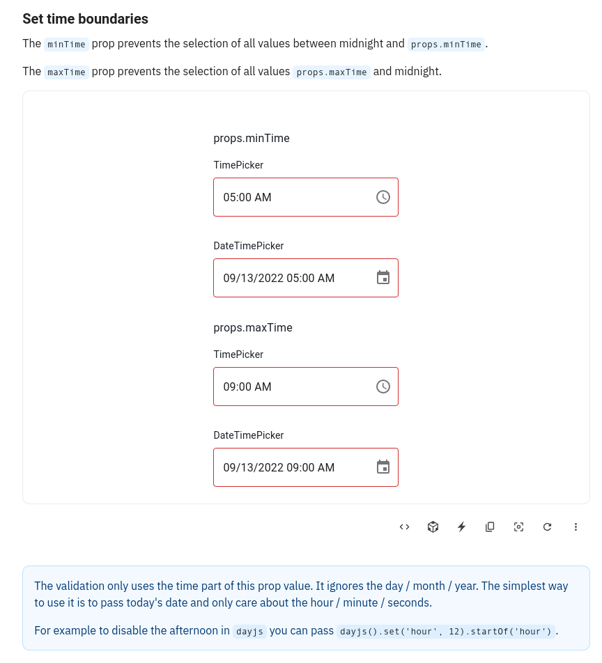
minTime/maxTimefor instance). But I liked the idea of having a page very easy to understand. On each big section "Date validation" / "Time validation" / "Date and time validation" props as ordered from the less customizable to the most customizable (boolean => date => callback). -
I would like to add a very light one line table on each section with the signature of the prop. That's something I would like us to discuss at some point, how to bring the typing information related to the current page to our readers ? If we just add links to the API page of each component at the bottom, it will not be easy to use (you have to pick the right component and find back your prop among dozens of others).
-
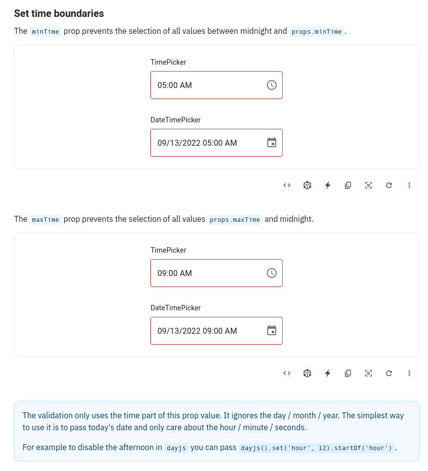
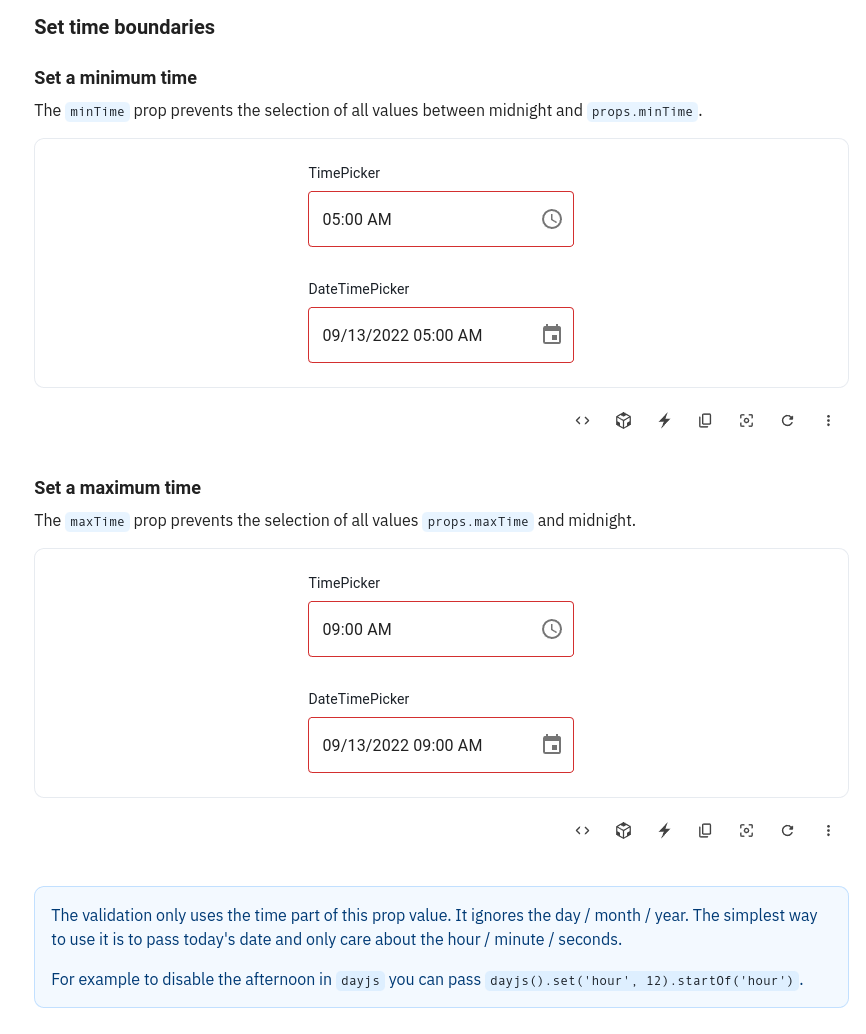
I added notes for quirks users might fall in. For instance the fact that
shouldDisableDatewill not disable fully disabled months. Do you see others ? I would like feedback on the warnings inminDateTime/maxDateTime, are they clear enough to explain what's the difference withminTime/maxTime?
These are the results for the performance tests:
| Test case | Unit | Min | Max | Median | Mean | σ |
|---|---|---|---|---|---|---|
| Filter 100k rows | ms | 498.4 | 809.9 | 683.7 | 676.36 | 118.697 |
| Sort 100k rows | ms | 519.4 | 1,010.9 | 672.1 | 763.12 | 163.16 |
| Select 100k rows | ms | 173.3 | 273.3 | 217.4 | 227.78 | 37.602 |
| Deselect 100k rows | ms | 118.3 | 232.6 | 188.9 | 181.68 | 39.054 |
Generated by :no_entry_sign: dangerJS against a5e436bb8f1bb0b9373709fccc39c99c82367554
This pull request has conflicts, please resolve those before we can evaluate the pull request.
![github-actions[bot] avatar](https://avatars.githubusercontent.com/in/15368?v=4 "Published by a pub.dev verified publisher")
- About the UI components, I like it. It allows to directly experiment the different components.
Just a problem with the clock picker in "Rendering of invalid values" because it's a 12h clock so the invalid hours do no appear. I assume it works the morning when it's on AM by default
- About having one section per prop, it may be a bit too much. When I see too many examples that are simples, I tend to say "okay, this page is about trivial stuff I can skip". Maybe the props could be grouped 2 by 2, such that each section bring a new information.
About demo it could be interesting to have somewhere displayed wat it the min/max date. Otherwise we have to open the code to know what's the value of minDate
-
Why not, might be a bit tricky to do the matching. Let me think that it could be interesting to have anchor in the table such that we could link to specific line in the API pages
-
Time examples seems clear. Is their a reason why using
dayjs().set('hour', 18).startOf('hour')instead ofdayjs('2022-01-01T18:00')?
Just a problem with the clock picker in "Rendering of invalid values" because it's a 12h clock so the invalid hours do no appear. I assume it works the morning when it's on AM by default
I think I just have to set a date instead of null to force to the afternoon.
- Time examples seems clear. Is their a reason why using dayjs().set('hour', 18).startOf('hour') instead of dayjs('2022-01-01T18:00')?
In the doc, I say that the simplest approach is to take today's date an totally ignore the date. So in the example I uses today. But we could say "pick an arbitrary date" and use an example like yours. I just want to be coherent between the two.
I tend to say "okay, this page is about trivial stuff I can skip"
Do you think most of our doc users really read our doc linearly and skip some pages ? For me the main use case was more "I need to disable my component for all non-working day, it's not obvious with me IDE autocompletion, let's look at the doc". I never read a doc upfront.
And in this use case, I like docs with small sections because it makes it very easy to just go to the one I need.
Grouping together minTime / maxTime, minDate / maxDate, minDateTime / maxDateTime and disableFuture / disablePast would be fine to me because I guess the sections remain small enough.
But I would personnally only do it for very highly related props (I would not group shouldDisableMonth and shouldDisableDate / shouldDisableYear for instance because they have different warnings).
Grouping together minTime / maxTime, minDate / maxDate, minDateTime / maxDateTime and disableFuture / disablePast would be fine to me because I guess the sections remain small enough. But I would personnally only do it for very highly related props (I would not group shouldDisableMonth and shouldDisableDate / shouldDisableYear for instance because they have different warnings).
We agree on that point
About missing elements, it could be good to remind how to display a custom error message
@alexfauquette a few grouping proposal
- One section with each prop in its own demo. The warning / info notes are shared at the bottom of the section
- One section with each prop in its own sub-section and own demo. The warning / info notes are shared at the bottom of the section
- One section with a single demo
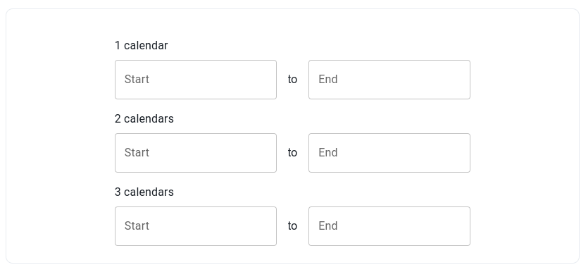
I really don't like this one because if we want to add a static picker on some sections (when it helps understanding) Then the demo will become very hard to read.
And we can't do 2 columns on the demo because of the range pickers who take to much space.
About missing elements, it could be good to remind how to display a custom error message
Done
And we can't do 2 columns on the demo because of the range pickers who take too much space.
I would be in favor of two columns even if it implies not putting the date range picker. But I'm curious about the opinion of others on this topic
How would you demonstrate the behavior on the date range picker / fields then ?
This pull request has conflicts, please resolve those before we can evaluate the pull request.
And we can't do 2 columns on the demo because of the range pickers who take too much space.
I would be in favor of two columns even if it implies not putting the date range picker. But I'm curious about the opinion of others on this topic
@LukasTy @joserodolfofreitas @samuelsycamore what is your opinion on this ?
And we can't do 2 columns on the demo because of the range pickers who take too much space.
I would be in favor of two columns even if it implies not putting the date range picker. But I'm curious about the opinion of others on this topic
what is your opinion on this ?
After discussing more about this with Alex, I'm in favour of 2 components per row if it fits the demo case, and maybe even 3, if it would apply to Date Picker, Time Picker and DateTimePicker.
For range picker case - if we need two inputs for the demo, then sure, put them in different rows, but if we could have a single input - wouldn't it fit two date range picker examples?
In any case, we should make sure, that the solution is responsive and on narrow screens we'd still get 1 column per row. 🤔
For range picker case - if we need two inputs for the demo, then sure, put them in different rows, but if we could have a single input - wouldn't it fit two date range picker examples?
Not sure to understand this one The date range picker has two inputs.
For range picker case - if we need two inputs for the demo, then sure, put them in different rows, but if we could have a single input - wouldn't it fit two date range picker examples?
Not sure to understand this one The date range picker has two inputs.
Never-mind my ramble 🤦
I haven't had a good look at the new validation docs yet before commenting.
I've proposed a layout option via comment to have 2 regular picker inputs and one range picker in 2 separate rows.
Regarding one range picker input suggestion—I got mixed up with the upcoming DateField implementation. 🙈
To give some context before the retro we discussed the extreme case of TextField demonstrations
I personally find those issues with tons of examples very messy and hard to use.
This pull request has conflicts, please resolve those before we can evaluate the pull request.
This pull request has conflicts, please resolve those before we can evaluate the pull request.
This pull request has conflicts, please resolve those before we can evaluate the pull request.
On another note, I'm not entirely sure about the term "boundaries". I'm thinking there might be other more common terms users might use on searches like "limits", or even simply min and max date. https://trends.google.com/trends/explore?q=date%20boundaries,date%20limits,date%20constraints,date%20validation
No strong opinion, limit is fine for me