mui-x
 mui-x copied to clipboard
 mui
mui
[data grid] Improve column menu
Duplicates
- [X] I have searched the existing issues
Latest version
- [X] I have tested the latest version
Summary 💡
The list of options in the column menu is extensive. Now with #213 coming, the list of operations available in the column will increase again.
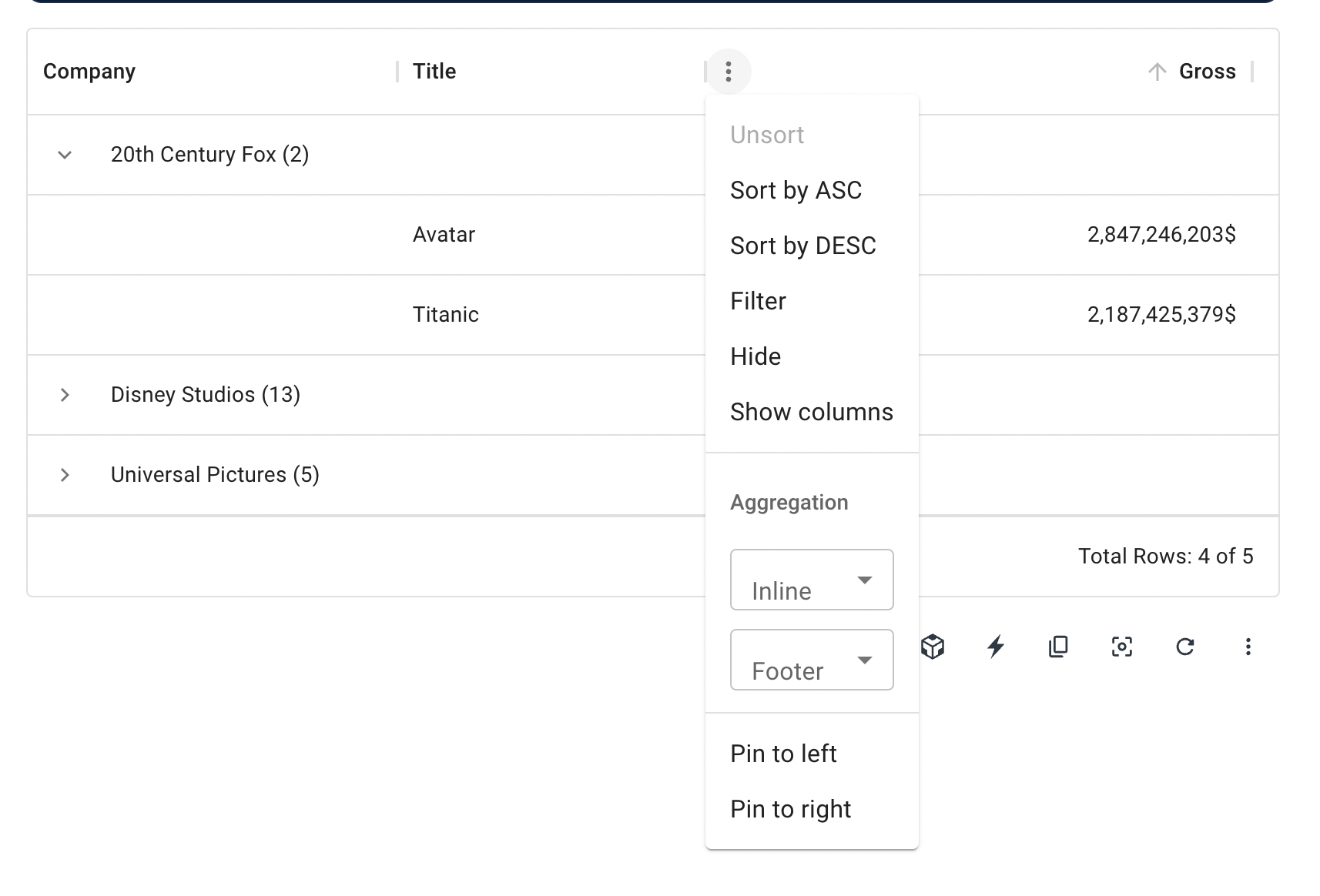
We need to reorganize the menu by exploring better ways to display all the possible operations with the columns.
Examples 🌈
I did a visual prototype breaking the vertical line and experimenting to group the different operations as an initial proposal. But glad to see other proposals too.
Motivation 🔦
- Improved usability by displaying the available operations in semantic and visual groups.
- Improved visual.
Order ID 💳 (optional)
No response
I liked the proposal. Some menu items clearly can be grouped, like those for sorting and column pinning, others I don't know if it's worth. We could offer both versions and let users configure how they should be rendered. We could have:
<DataGrid componentsProps={{ columnMenu: { condensed: true } }} />
Then, each menu item component, e.g. SortGridMenuItems, receives this condensed prop and renders the items horizontally or vertically, if the prop is false (default). If we want to also allow nested menus we could have a string prop to configure which type of layout to use:
<DataGrid componentsProps={{ columnMenu: { layout: "submenu" } }} /> // "vertical" (default) | "horizontal"
The layout prop as well as the first prop is forwarded to the menu item components. If the user wants a vertical layout on some but the horizontal on other, this prop can be used individually when creating a custom menu:
<GridColumnMenuContainer
  hideMenu={hideMenu}
  currentColumn={currentColumn}
  ownerState={{ color }}
  {...other}
>
  <SortGridMenuItems onClick={hideMenu} column={currentColumn} layout="horizontal" />
  <GridFilterMenuItem onClick={hideMenu} column={currentColumn} layout="vertical" />
  <GridColumnPinningMenuItems onClick={hideMenu} column={currentColumn} layout="submenu" />
</GridColumnMenuContainer>
https://github.com/mui/mui-x/issues/3571 also contains some benchmarks.
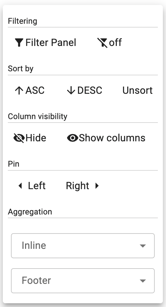
Jumping off from the prototype above, here are some additional explorations:

Some notes and open questions:
- Should we only include "Hide column" while the column is being shown? Currently, the only way to retrieve a hidden column is to toggle it on in the "Columns" button in the toolbar.
- Should we spell out "Ascending" and "Descending"? ASC and DESC take up less space, but spelling it out is more aligned with everything else & clearer.
- Do we need the word "Clear" next to each X icon at the end of the rows? Is showing "Clear" on hover enough?
- When a filter/sort/pin/etc is active, should it use the accent color within the menu to show that some action has been applied?
- alternative: bold type + 100% black color; keep the accent color only for aggregation?
- Aggregation select field to match the "standard" style used throughout vs "outline" style
- Should we change the external-facing name from aggregation to something more recognizable? (Compute, Calculate, Formula, etc)
- Pin icon is rotated +30 degrees and -30 degrees — can we rotate the interior shape and keep the bounding box the same square size as other icons?
Fuller exploration in Figma.
My personal favorite is the most compact version displaying active options with the accent color. (Edit:) but the bolder black avoid some problems in dark mode. It might be a more elegant option.
- Should we only include "Hide column" while the column is being shown? Currently, the only way to retrieve a hidden column is to toggle it on in the "Columns" button in the toolbar.
We have discussed that a couple of times, Perhaps we can solve this for v6. I think it makes sense to remove "Show columns" from the menu column, as it's not symetrical with "Hide Column" and it's not really intuitive that the option is available on a column menu.
- Should we spell out "Ascending" and "Descending"? ASC and DESC take up less space, but spelling it out is more aligned with everything else & clearer.
The full word is definitely clearer, but after the first couple of usages, the concepts are probably fully understood and the space the full word takes might become more of a nuisance. Overall I think ASC and DESC is common enough, and the short versions feel more adequate for usage over a long period of time.
- Do we need the word "Clear" next to each X icon at the end of the rows? Is showing "Clear" on hover enough?
Same argument as before: Adding the word might be clearer at a first look, but over time it doesn't add much value. Adding the word is definitely clearer, but after a couple times using the column menu, the "clear" word is not necessary anymore
When a filter/sort/pin/etc is active, should it use the accent color within the menu to show that some action has been applied?
Makes a lot of sense to me, Highlighting the operation is a nice way to provide feedback on user interactions.
- Aggregation select field to match the "standard" style used throughout vs "outline" style
Makes sense to me. Regarding the name, it might make sense to discuss at #213.
- Pin icon is rotated +30 degrees and -30 degrees — can we rotate the interior shape and keep the bounding box the same square size as other icons?
Writing a "pre-answer" yes, but it needs the team's confirmation.
edit: Nice work!
Thanks for the detailed prototype !
I think we should build this new version with customization in mind. It should be fairly easy to:
- Add a new section like "Pin to"
- Fully override the rendering of a section or of all sections (to render something similar to the screenshot in https://github.com/mui/mui-x/issues/5307)
- Disable / Remove a section or a button (right now we have
disableColumnFilteranddisableColumnSelector, I think we should replace them with something generic) - Change the labels (basic l10n topic, that one should be easy)
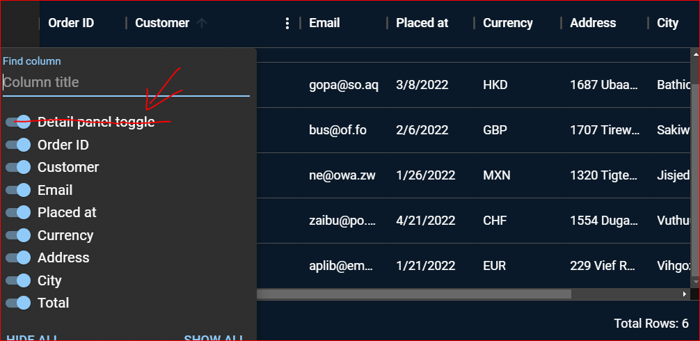
I need to hide i.e. "Details panel toggle" in columns menu. I do not want to show it in menu. I want this panel ((+/-) column) to be always visible. Will or is it possible?
@konrazem, there's currently not a lot of ways to customize the column visibility panel. But there's another GitHub issue that will handle a refactory of this sub-component. I'm curious to understand more about your use case. Could you please follow up the conversation there?
@cherniavskii made an important point during our meeting: The "X" for clear makes a direct analogy with the clear in the Filter panel. We should think of something with the meaning of "reset" instead, perhaps a different icon, or the "reset" text
@m4theushw pointed out that, in the case of filtering, it's not clear which interaction opens the filter panel. It's also not clear what to expect from the "clear" button. Will it clear the field or turn the filtering off?
cc/ @gerdadesign
There's also a couple problems with the "bold" option as well First, we can't make the icons bold, and then making a text bold changes the font size, which could entail layout changes. The alternative for a bold option seems to be an accent in "black".
Regarding the point raised by @cherniavskii, after discussion @gerdadesign and I concluded that it makes more sense to replace the x on the filter panel than here. The clear button in that panel will be replaced by a "delete" (the tooltip already stands with "delete"), with a trashcan icon. We can do that on a separate issue, perhaps with https://github.com/mui/mui-x/issues/6419.
Personally I agree, that selected options should not be bold, but the primary color (mainly for the reasons written by @joserodolfofreitas). Sort ASC/DESC should be clear to all users who have worked with Excel before, and it will look better on devices with a smaller display (I don't see any struggle for anyone in it, especially when it contains an icon).
As per our recent discussion with @gerdadesign, we made a few adjustments to the colors (mostly icon colors) as per the standard theme colors and now we are mostly aligned with the theme.
Thoughts on Interface:
@gerdadesign suggested making the new column menu the default one and keeping the old one optional. We discussed compact, advanced, sleek, visual, etc as possible names for the new variant and simple for the old one, but they didn't seem great so we ended up calling it default and the old one simple 😄 Let me know if you have better ideas though.
I also feel it's a good idea to show the new one by default, as it is more usable and intuitive. For backward compatibility, the users will be able to switch to the previous variant either by using componentsProps of columnMenu component, or some prop like simpleColumnMenu on Grid but the latter will not allow adding more variants in the future if needed, so I'd like to go with:
interface GridColumnMenuVariant = 'default' | 'simple'

<DataGrid componentsProps={{ columnMenu: { variant: 'simple' } }} /> // variant: 'default' if not passed
variant could have also been named layout but layout seems more aligned with standard layouts like horizontal, vertical, etc so I think variant suits more with these names.
By default, this prop will traverse down the tree automatically but if users wish to have the old variant partially, we could follow the solution @m4theushw suggested, by individually passing the props to each MenuItemComponent:
<GridColumnMenuContainer
  hideMenu={hideMenu}
  currentColumn={currentColumn}
  ownerState={{ color }}
  {...other}
>
  <SortGridMenuItems onClick={hideMenu} column={currentColumn} variant="simple" /> // old variant
  <GridFilterMenuItem onClick={hideMenu} column={currentColumn} /> // new variant by default
  <XYZMenuItem onClick={hideMenu} column={currentColumn} /> // new variant
</GridColumnMenuContainer>
@joserodolfofreitas Do you think making the new variant as default could impact some users in a negative way? (I suspect not though, as anyways it's a v6 so if even there's a catch, we can add this to the migration guide)
Also, kindly explain a bit about the second desirable customization Hiding default option from the list, does that refer to the options like Unsort, Ungroup etc that we have in the simple variant?
As I understand it, the word variant has a very specific meaning in the core packages.
It describes a different design for the same component, but with exactly the same features and size.
So if I understand what default / simple do, I would not call those variants. :+1:
Or at least check with the core
Do you think making the new variant as default could impact some users in a negative way?
No, I agree there's no reason to keep the old column menu by default, given we're developing it during v6 alpha.
As for the variant name, Maybe instead of using variant names, we can consider exporting a different component to replace the default behavior using a component slot. Something like:
´´´ components:{{ columnMenu: simpleColumnMenu }} ´´´
Does that make sense to you?
In term of tree shaking, 2 components is better indeed (not a huge gain compared to the size of the grid though).
At first glance I prefer this approach
As I understand it, the word variant has a very specific meaning in the core packages.
I see, yeah seems like variant has a specific meaning in many core components. Then may be either using layout keyword or simple as boolean could be more appropriate.
<DataGrid componentsProps={{ columnMenu: { layout: 'default | simple' } }} />
or
<DataGrid componentsProps={{ columnMenu: { simple: 'true | false' } }} />
As for the variant name, Maybe instead of using variant names, we can consider exporting a different component to replace the default behavior using a component slot.
In term of tree shaking, 2 components is better indeed (not a huge gain compared to the size of the grid though).
Seems a good idea and more scalable too but I feel the business logic for these two variants is almost shared and this might end up in replicated code.
Also, for Pro and Premium packages, we are injecting MenuItems in columnMenu pipe processor from respective hooks based on certain parameters. Not sure how well it will perform with standalone components for both the cases approach.
Seems a good idea and more scalable too but I feel the business logic for these two variants is almost shared and this might end up in replicated code.
These menu components should be dump, meaning no complex inside them. If they have some logic we could create an API method abstracting it.
I would keep 2 components since it requires less work than doing 1 component and always having to check which "variant" is active.
Does that refer to the options like Unsort, Ungroup etc that we have in the simple variant?
Thanks for asking, @MBilalShafi. The menu should be customizable in the sense that developers can add their own itemOptions to the menu. In the same way, but in reverse, they might want to hide the options that are already there.
An example of a use case: As a developer who implemented a custom filter panel above the grid, I want to not list the Filter button on the column menu.
Perhaps "Hiding" was a bad choice of word, I'm rephrasing it on the issue description. Essentially the idea is that developers have a choice of which item options are listed in the column menu.
Does that refer to the options like Unsort, Ungroup etc that we have in the simple variant?
Thanks for asking, @MBilalShafi. The menu should be customizable in the sense that developers can add their own itemOptions to the menu. In the same way, but in reverse, they might want to hide the options that are already there.
An example of a use case: As a developer who implemented a custom filter panel above the grid, I want to not list the
Filter buttonon the column menu.Perhaps "Hiding" was a bad choice of word, I'm rephrasing it on the issue description. Essentially the idea is that developers have a choice of which item options are listed in the column menu.
Hi,
I am working on a MUI column menu options and my requirement is to remove "Manage Column" option from the menu list only for one column. could you please suggest something on this. TIA
Hi @PayalVerma21, thank you for using MUI X Data Grid.
You could achieve something like that by hiding a menu item conditionally (i.e. for a specific column) from Columns Menu.
Here's an example where columnMenuColumnsItem has been disabled for the commodity column.
Note that this hides both Hide column and Manage columns items from the menu since they are grouped under a single slot (i.e. columnMenuColumnsItem). If you still want to keep the Hide column item, you may want to override the item instead.
Hi @PayalVerma21, thank you for using MUI X Data Grid.
You could achieve something like that by hiding a menu item conditionally (i.e. for a specific column) from Columns Menu.
Here's an example where
columnMenuColumnsItemhas been disabled for the commodity column.Note that this hides both
Hide columnandManage columnsitems from the menu since they are grouped under a single slot (i.e.columnMenuColumnsItem). If you still want to keep theHide columnitem, you may want to override the item instead.
Hi @MBilalShafi ,
Thank you so much for the quick response. I was stuck since this afternoon, I will definitely gonna try this. Thanks again :)