 mui
mui
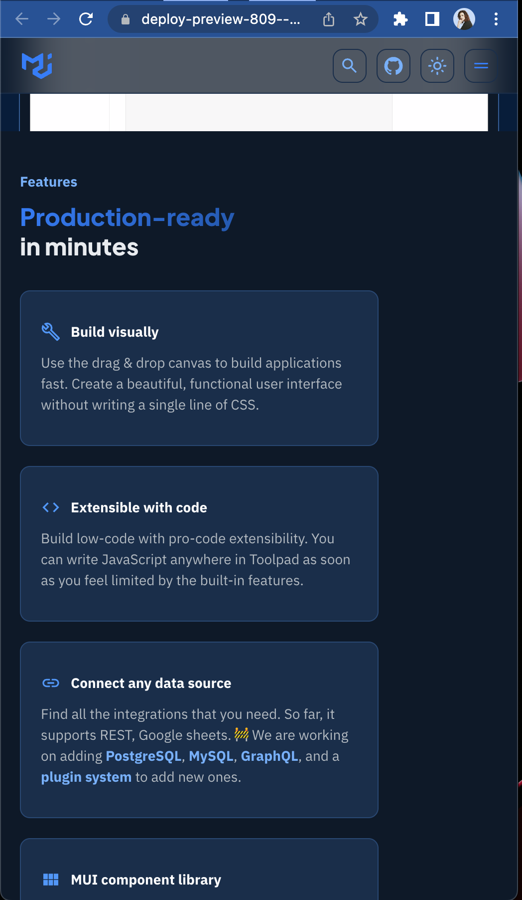
[website] Landing page
- Changed the theme to the finally selected version
- Closes #477
- Closes #806
- Also to merge https://github.com/mui/material-ui/pull/33937
- Created a separate PR so that we can have the orange version live, for a live comparison (blue) with the previous (orange) version
Preview: https://deploy-preview-809--mui-toolpad-docs.netlify.app/toolpad/
Your Render PR Server URL is https://toolpad-pr-809.onrender.com.
Follow its progress at https://dashboard.render.com/web/srv-cbuc1gv9re0i72n68nj0.
![render[bot] avatar](https://avatars.githubusercontent.com/in/14658?v=4 "Published by a pub.dev verified publisher")
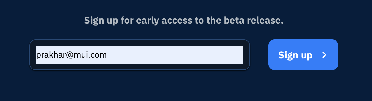
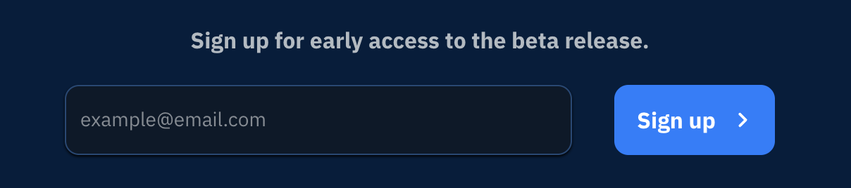
When adding email ID, the text box doesn't look good. Can we keep the original color ?
When adding email ID, the text box doesn't look good. Can we keep the original color ?
Is this happening when you select an email through autocomplete, or in all cases?
Is this happening when you select an email through autocomplete, or in all cases?
Just checked, only happening during autocomplete.
This is looking great so far! Just some small differences I'm noticing in design vs preview:
| Design | Preview | Notes |
|---|---|---|
 |
 |
I noticed the email signup in the bottom footer had 10px spacing between the input and the button. Just updated this (from 20px) in design! After seeing the live page, I'm also wondering if this CTA should be in pure white instead of grey in dark mode to give it a little more contrast? |
 |
 |
The video in design has rounded corners with a border and is anchored to the bottom of the section below it. This is mimicking the design pattern of the previews in other sections of the site. Perhaps this adjustment may help with the gap with the above section as well? |
| Use cases | Use Cases | From our style guide and the example on the Templates page, this should be lower case |
 |
 |
The borders at the bottom of the rows right above the row header, should not be visible. The current pricing page does this. |
| no Commercial column background | Commercial column background | I had originally removed this because there were only 2 plans columns at the moment, so it seemed like it didn't need the additional separation indicator. I'm open to keeping the background though! In its center position on the Pricing page, the borders look fine, but they seem a little messy when the column is on the edge. Perhaps it may be a little cleaner without a border? |
Design Preview Notes I noticed the email signup in the bottom footer had 10px spacing between the input and the button. Just updated this (from 20px) in design! After seeing the live page, I'm also wondering if this CTA should be in pure white instead of grey in dark mode to give it a little more contrast? Use cases Use Cases From our style guide and the example on the Templates page, this should be lower case The borders at the bottom of the rows right above the row header, should not be visible. The current pricing page does this. no Commercial column background Commercial column background I had originally removed this because there were only 2 plans columns at the moment, so it seemed like it didn't need the additional separation indicator. I'm open to keeping the background though! In its center position on the Pricing page, the borders look fine, but they seem a little messy when the column is on the edge. Perhaps it may be a little cleaner without a border? I've addressed these, do check them out.
Design Preview Notes The video in design has rounded corners with a border and is anchored to the bottom of the section below it. This is mimicking the design pattern of the previews in other sections of the site. Perhaps this adjustment may help with the gap with the above section as well?
Edited Here's what that looks like: (I think it's much better, thanks for prodding me to do this!)
https://user-images.githubusercontent.com/19550456/185884209-4157de42-121a-4423-81bd-94088413de0d.mov
This update looks great! 👏 Thank you 😀
Only other question I have is in when looking on mobile, the Use cases cards and features extend to full width as expected, but they do not when I'm on desktop and pull in the width of the screen.
How do we feel about this update we discussed of moving the Upvote CTA banner into the features section?
It breaks convention of the alternating background colors, which may make more sene when we add more sections. Until then, this break in convention may be a nice way to still group the overall features vs the pricing vs the hero.
Looks good! Based on what we discussed today, I think it's safe to make this change in a follow-up PR along with some other changes to the cards (adding a "Learn more" link/Upvote link per card). We should be good to merge this from my side pending a review of the content from @prakhargupta1.