material-ui
 material-ui copied to clipboard
 mui
mui
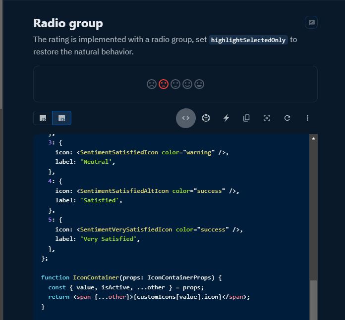
[Rating] add isActive prop to IconContainerComponent
Fixes https://github.com/mui/material-ui/issues/35563
This PR adds isActive prop that can be extracted via IconContainerComponent. This prop tells wether a specific rating item is currently active.
First ever PR, so feedbacks are greatly appreciated, especially on how to improve my PR. Two things I'm not sure about;
- The guide says to add test, but I'm not sure how to since I'm only adding a prop, and AFAIK there are no tests for every single props.
- I changed the documentation to show what I made, but it doesn't have any effect (isActive prop is not used). To show its effect, I would need a new example, which I think is not necessary because it's not a common occurance. So hopefully it's fine.
- [x] I have followed (at least) the PR section of the contributing guide.
Netlify deploy preview
- docs/data/material/components/rating/rating-pt.md
- docs/data/material/components/rating/rating-zh.md
- docs/data/material/components/rating/rating.md
Bundle size report
Generated by :no_entry_sign: dangerJS against 018ec687112873d9c98f13fc5465a61c7a454bfd
@ZeeshanTamboli sorry to tag you, but I think @siriwatknp is busy. Could you maybe be the reviewer instead? I just don't want this PR to go unnoticed
Added:
- new example on documentation page for using
isFilledProp on Component supplied toIconContainerComponent - new test to make sure that isFilled prop is sent to the Component Prop
@nicolas-ot Thanks for you work. But now that I think of it, we should not support such a feature without a proper real world use-case. See https://github.com/mui/material-ui/issues/35563#issuecomment-1552604929. I would also suggest working on more pressing issues regarding the Rating component - https://github.com/mui/material-ui/issues?q=is%3Aopen+is%3Aissue+label%3A%22component%3A+rating%22+sort%3Areactions-%2B1-desc
@nicolas-ot Thanks for you work. But now that I think of it, we should not support such a feature without a proper real world use-case. See #35563 (comment). I would also suggest working on more pressing issues regarding the Rating component - https://github.com/mui/material-ui/issues?q=is%3Aopen+is%3Aissue+label%3A%22component%3A+rating%22+sort%3Areactions-%2B1-desc
@ZeeshanTamboli I think the answer to your question would be the same as the answer to the question what is the proper real world use-case of IconContainerComponent prop. I would guess it's to give the user more flexibility on controlling the rating icons (e.g. a different whacky meme for each item).
In this example MUI Docs, you can see that as an alternative to isFilled prop, a styling is used to make the color gray. I would suggest here that isFilled serve as an alternative, so that user can controll the component directly without needing to change the style manually.
const StyledRating = styled(Rating)(({ theme }) => ({
  '& .MuiRating-iconEmpty .MuiSvgIcon-root': {
    color: theme.palette.action.disabled,
  },
}));
Your point is valid. The isFilled prop would be useful to provide a custom component for the rating item based on the filled state, plus the custom component can have custom styles, while the classes can only be used to override the styles. However, IMO, I still think we should wait for a proper real world use case. Otherwise, we are adding features nobody is using and thus compromising the increase of bundle size (even though it would be very minimal). Let's wait for the reporter's reply.