material-ui
 material-ui copied to clipboard
 mui
mui
[Joy] Add `CircularProgress` component
- [x] I have followed (at least) the PR section of the contributing guide.
Done:
- Initial implementation
- Playground demo
- Props:
color,size,variant: 'indeterminate' | 'determinate', etc; To be more discussed with Jun and Danilo
To do:
- Add tests
- Improve demos/implementation with Jun and Danilo's feedback
Preview: https://deploy-preview-33869--material-ui.netlify.app/joy-ui/react-circular-progress/
@mui/joy: parsed: +2.00% , gzip: +1.83%
Generated by :no_entry_sign: dangerJS against 5807b80e15a71a8fe4f8c8dac813585cb5a28aad
@danilo-leal
A question: we mention determinate and indeterminate in the introduction-how would I go about it to controlling the component so I have one or the other? Is that done through a prop?
Yes, through a prop called variant at the moment, but I think we should change the name to something else to reduce confusion since variant is used often in other Joy components for theme values. Maybe a prop called determinate that can be either true or false? It can be false by default.
Also, maybe we should document size and color (even though they're on the Playground there already) just for the sake of consistency?! Other components have those sections too.
I agree. Will do that!
@danilo-leal I dig the idea of a boolean determinate prop! 👌
Done! Can you suggest some ideas for demos?
@danilo-leal @hbjORbj Does it make sense to not follow the Material Design look and feel?
Here is a simpler version using div + border:
https://user-images.githubusercontent.com/18292247/184580113-7d48b19a-1af3-4bd2-aa2a-78f6554135e7.mov
https://mui.com/joy-ui/react-link/#common-examples
Variant
Let's add the global variant to CircularProgress. I think it is useful for composition:
<Button startIcon={<CircularProgress variant="soft" />}>
- The ring should use
theme.vars.palette[ownerState.color]['${ownerState.variant}Bg'] - The progress should use
theme.vars.palette[ownerState.color]['${ownerState.variant}Color']
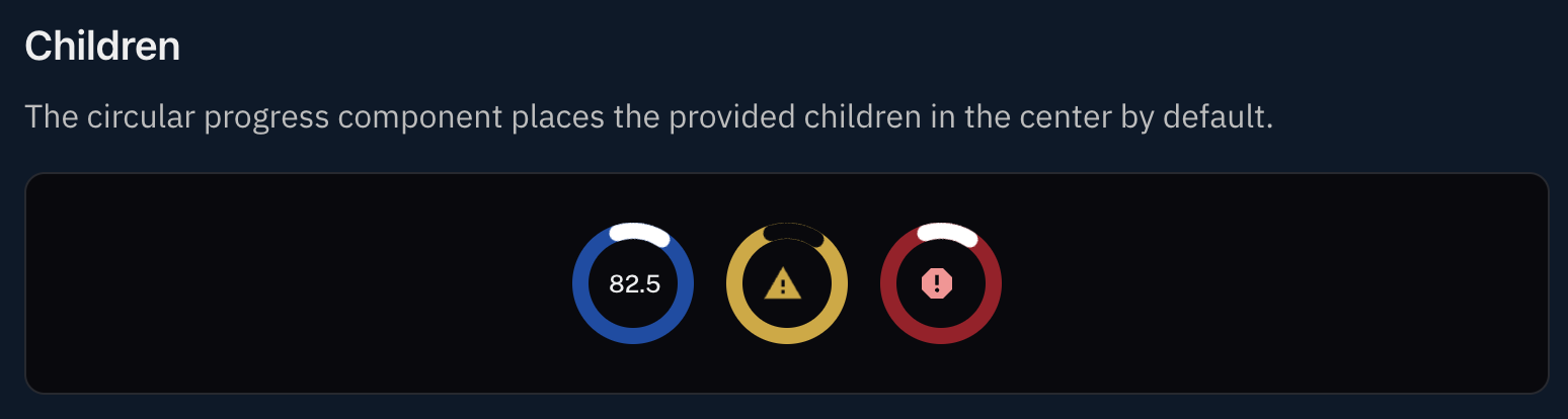
Children
I think it should be possible to place a child center by default. It is quite a common use case. https://www.pinterest.com/pin/480337116518704364/
Please add a demo for this as well.
CSS variables
For whatever design the CircularProgress looks like, it should contain these generic variables:
- let's add
--CircularProgress-sizethat can be customized by the parent{ width: 'var(--CircularProgress-size, 32px)', } - let's add
--CircularProgress-thicknessthat can be customized by the parent as well. - I think
--CircularProgress-speedto control how fast it moves is worth trying.
Please add a CSS variables demo.
Hey, Jun @siriwatknp , I addressed all your feedback except one: I am not sure how to go about implementing determinate prop. Can you help me with that?
@hbjORbj Looks like my proposed solution, using a border, would not work for Determinate progress. Seems like using svg with stroke-dasharray and stroke-dashoffset is the best approach so far.
@hbjORbj Here is a working POC using SVG https://codesandbox.io/s/poc-circular-progress-3dffpd?file=/index.js
@hbjORbj Another review
implementation
-
The track or progress is cut off when
thicknessis not the same value: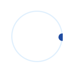
I suggest mixing CSS
minormaxto therproperties of the track and progress slots. The result should be like this: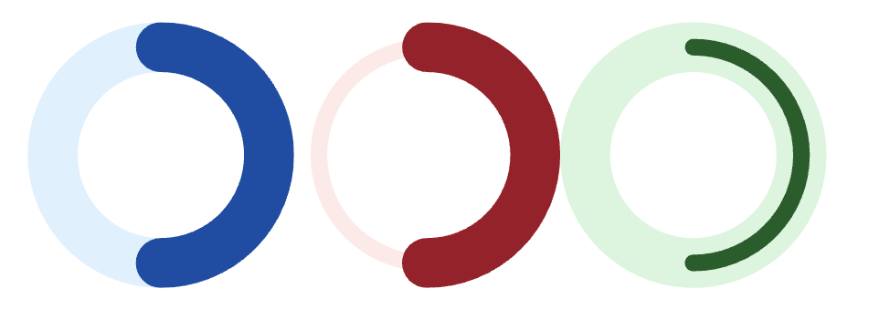
left: equal thickness middle: track thickness < progress thickness right: track thickness > progress thickness
-
The
--CircularProgress-speedis not used. Maybe changing it to--CircularProgress-indeterminateDurationis more direct?
Playground
- add
determinateswitch
Demos
Please add these demos
- determinate progress similar to Material UI
- Children (text in the middle of the circle)
- CSS variables section
This is looking great @hbjORbj and @siriwatknp! Awesome work!
Pushed a couple of refinement changes and the only thing that's standing out to me is the icon children being slightly misaligned-I've tried adding justifyContent: 'center' but that didn't appear to solve 🤔
Sweet, thanks @hbjORbj, it looks good now! I see we're centralizing them using specific values for each CircularProgress size. Have you verified if that works out if you change the icon's size?
@danilo-leal
I verified that it works out if we change the component (circular progress)'s size, but not the icon's size. Just confirmed that it breaks with varying the icon's size. Hmm, I am not sure how to best about this. Any idea @siriwatknp Jun?
@danilo-leal
I verified that it works out if we change the component (circular progress)'s size, but not the icon's size. Just confirmed that it breaks with varying the icon's size. Hmm, I am not sure how to best about this. Any idea @siriwatknp Jun?
FYI, I am trying alternative way, will share soon.
Changes from me
-
fix the rotation degree to let the progress starts from the top
-
rename the slot to be more meaningful from
circle1, circle2totrack, progress(similar to Switch, Slider) -
Reduce the default size values to match other components, e.g. IconButton, Button
-
Make the
svgabsolute so that the children of the CircularProgress can stay at the center using flexbox. -
update the outline styles to be consistent with other components (using border):

-
add some more useful variables:
--CircularProgress-circulation,--CircularProgress-linecap. -
fine-tune the track and progress stroke:
https://user-images.githubusercontent.com/18292247/189306590-36282e70-d0a1-4bf7-b3dc-1e5e62480893.mov
-
Make the CircularProgress's size adaptable to Button, IconButton, and Link.
Sorry for commenting after merge, I don't have time these days to follow progress on GitHub, but happened to spot this while looking for something else.
A few thoughts (I haven't read the discussion here if they've already been covered):
- What do you think about slowing down the default speed? 0.5s seems a bit frenetic. 1s feels much more calm. This could perhaps be configurable by a prop?
- Outlined feels like it should have an inner outline, so that the track itself is outlined.
- The color of the spinner doesn't appear to match the color selected in the Playground.
- It might be nice to have (an option of?) a linear gradient on the spinner so that it fades towards the tail, along the lines of this:

- It isn't possible to adjust CSS variables with the keyboard. (On which note, when can we expect @siriwatknp's number input to be migrated to MUI? 😁 It's the most requested component! )
What do you think about slowing down the default speed? 0.5s seems a bit frenetic. 1s feels much more calm. This could perhaps be configurable by a prop?
No problem!
Outlined feels like it should have an inner outline, so that the track itself is outlined.
Agree, that's a better outlined.
The color of the spinner doesn't appear to match the color selected in the Playground.
Yeah, the swatch should follow the variant. Will fix it in a separate PR.
It might be nice to have (an option of?) a linear gradient on the spinner so that it fades towards the tail, along the lines of this:
Good suggestion but I think it will be a customization example, not a built-in style. Will try to add it soon.
It isn't possible to adjust CSS variables with the keyboard. (On which note, when can we expect @siriwatknp's number input to be migrated to MUI? 😁 It's the most requested component! )
Yeah, I think we should start the NumberInput on MUI Base soon. cc @michaldudak
There is a growing list of components we should create in MUI Base :) Let's set priorities on the next product meeting.