material-ui
 material-ui copied to clipboard
 mui
mui
[docs] Support live demo editing
- [x] I have followed (at least) the PR section of the contributing guide.
Preview: https://deploy-preview-32107--material-ui.netlify.app/components/buttons/
a POC to add live editing for components docs, using react-runner
Code highlighting keeps the same, and with that we don't need a loader to load the demos anymore, just run the code
Fix #26476.
There is an ongoing effort to make the demos editable: #30873 and #29885.
@michaldudak Sorry I didn't know that, but you can see my change is much smaller and simpler than that PR, and that PR doesn't support SSR
@bharatkashyap could you take a look at this and coordinate your efforts?
@michaldudak can you reopen it and I'll fix the failing builds, and then you can compare, at least it works well locally for Button/Autocomplete, builds fail probably because I missed some imports
Thanks for working on it. I was able to try it out locally. A few minor issues (there may well be others):
- The preview isn't editable.
- The JS code is replaced with TS code.
- The editor has a keyboard focus indicator when selected by mouse.
- A bunch of symbols have an wiggly underline as if they're incorrect.
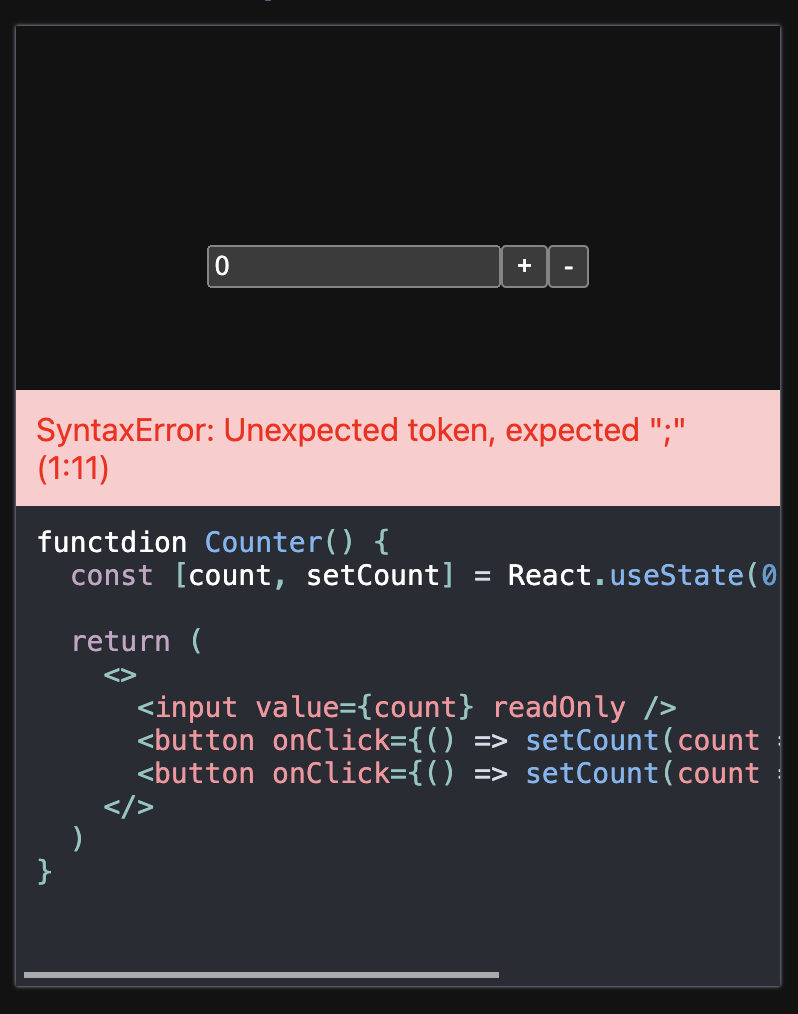
- It has a memory leak:
error
<--- Last few GCs --->
[95270:0x1049e0000] 86058467 ms: Mark-sweep (reduce) 1984.0 (2036.8) -> 1977.3 (2030.3) MB, 1116.6 / 0.0 ms (average mu = 0.269, current mu = 0.139) allocation failure GC in old space requested [95270:0x1049e0000] 86059705 ms: Mark-sweep (reduce) 1977.3 (2029.3) -> 1977.2 (2030.0) MB, 1237.9 / 0.0 ms (average mu = 0.164, current mu = 0.000) allocation failure GC in old space requested
<--- JS stacktrace --->
FATAL ERROR: Ineffective mark-compacts near heap limit Allocation failed - JavaScript heap out of memory 1: 0x10130c5e5 node::Abort() (.cold.1) [/usr/local/bin/node] 2: 0x1000b2289 node::Abort() [/usr/local/bin/node] 3: 0x1000b23ef node::OnFatalError(char const*, char const*) [/usr/local/bin/node] 4: 0x1001f68c7 v8::Utils::ReportOOMFailure(v8::internal::Isolate*, char const*, bool) [/usr/local/bin/node] 5: 0x1001f6863 v8::internal::V8::FatalProcessOutOfMemory(v8::internal::Isolate*, char const*, bool) [/usr/local/bin/node] 6: 0x1003a47e5 v8::internal::Heap::FatalProcessOutOfMemory(char const*) [/usr/local/bin/node] 7: 0x1003a628a v8::internal::Heap::RecomputeLimits(v8::internal::GarbageCollector) [/usr/local/bin/node] 8: 0x1003a19b5 v8::internal::Heap::PerformGarbageCollection(v8::internal::GarbageCollector, v8::GCCallbackFlags) [/usr/local/bin/node] 9: 0x10039f2e0 v8::internal::Heap::CollectGarbage(v8::internal::AllocationSpace, v8::internal::GarbageCollectionReason, v8::GCCallbackFlags) [/usr/local/bin/node] 10: 0x10039fc92 v8::internal::Heap::CollectAllAvailableGarbage(v8::internal::GarbageCollectionReason) [/usr/local/bin/node] 11: 0x1003adaae v8::internal::Heap::AllocateRawWithRetryOrFailSlowPath(int, v8::internal::AllocationType, v8::internal::AllocationOrigin, v8::internal::AllocationAlignment) [/usr/local/bin/node] 12: 0x100374fc7 v8::internal::FactoryBasev8::internal::Factory::NewFixedArrayWithFiller(v8::internal::Handlev8::internal::Map, int, v8::internal::Handlev8::internal::Oddball, v8::internal::AllocationType) [/usr/local/bin/node] 13: 0x1005f5a50 v8::internal::OrderedHashTable<v8::internal::OrderedHashMap, 2>::Rehash(v8::internal::Isolate*, v8::internal::Handlev8::internal::OrderedHashMap, int) [/usr/local/bin/node] 14: 0x1006e18cf v8::internal::Runtime_MapGrow(int, unsigned long*, v8::internal::Isolate*) [/usr/local/bin/node] 15: 0x100a81a79 Builtins_CEntry_Return1_DontSaveFPRegs_ArgvOnStack_NoBuiltinExit [/usr/local/bin/node] error Command failed with signal "SIGABRT".
I presume these are all fixable. Other than that it appears to work as expected, so the main considerations vs the alternative is bundle size. react-runner is using sucrase, so that's a good sign.
@mbrookes Thanks for trying, I have no idea why the builds failed, I can build & export successfully locally, regarding the issues, right now it's just a POC, and ofc we can fix them, but for the first one I'd prefer keep JSX preview uneditable, live editing is just a complement not necessary, so it's fine to provide the very basic functionalities as before, if you want try by themselves, then expand it to full mode
As I mentioned in the description, probably we can reduce the build time a lot by removing the demos builds and use react-runner's JIT to run them, right now it's super slow, I didn't dive in deep, but we can make the markdown loader super simpler without black magic
but for the first one I'd prefer keep JSX preview uneditable
This is on the "must have" list, but ofc no need to add it until this approach is proven.
@bharatkashyap Could you have a look?
I've reran the netlify build with success this time: https://deploy-preview-32107--material-ui.netlify.app/ Of the top of my mind, some of things this PR is missing is that can explain the reduced complexity compared to the existing PRs:
- Preview editing is missing
- It's not loading the
react-runnerasynchronously - It supports only four dependencies
react,@mui/material,@mui/icons-material,@mui/lab. How do you plan to support all the dependencies all of the demo's are using while simultaneously avoiding to load them on every page?
@nihgwu This is a promising approach, based on the bundle size of react-runner versus jarle.
As @mbrookes mentioned, making the JSX preview editable is pretty much a must have (which is why #30873 loads the editor and runner on first load, whereas the earlier #29885 loads these components after user input and swaps out the original, static preview).
Also, #30873 has a way to not statically import all the dependencies at once like this one does at present (as @Janpot mentioned). I'm sure we can take this ahead if you take a shot at addressing these two issues
@Janpot @bharatkashyap aysnc loading is never a problem for react-runner 😉 , checkout this demo, probably I should work on #30873 but revert all the changes on the variable orders if you do need live editing of JSX preview, though I still don't like the idea, as it's not the real code it's running against
OK, the problem with async module resolution is that you are not allowed to import other components other than the components included in the initial code
 And it doesn't support SSR
Initial loading of all packages would be a problem for MUI as it's really huge
And it doesn't support SSR
Initial loading of all packages would be a problem for MUI as it's really huge
The problem with live editing of JSX preview, apart from the above one, the implementation in #30873 is not good as it's simply replacing the JSX part from the raw code, which means the JSX code and row code are highly coupled, and you can't make any mistake when editing them, not even a whitespace, if you do need that, of cause I can inject those components into scope instead of imports, but I think we can postpone it for following PRs, @oliviertassinari WDYT?
Regarding the bundle size, the biggest one is @mui/icons-materials 662.2KB, then @mui/materials 128KB, and then @mui/lab 39KB, I think it's fine to load the later two directly, but lazy loading icons, and use placeholder in initial rendering (we can still import icons already in raw code), then I think it should be fine for the bundle size impact given the fact we are already using part of them in other pages for layout, and we are using Service Worker to cache the resources, I think it's a better UX then only support a limited components which already imported in raw code, the problem is that if user is exploring the demo of Button with Icon, and want to try other icons, but it's simply impossible with #30873 's approach
Of cause I can use the same strategy as #30873 to import on-demand by the loader
UPDATE: Never mind, I've switched to on-demand imports 🎉
@nihgwu Happy to see you push our previous explorations on the problem further. We had a look at it with @bharatkashyap, we are happy to continue with this PR to close #26476.
Here are what seems to be missing before we can merge this PR:
- [ ] The default focus outline aesthetic doesn't look great, I think that we could personalize it to match the docs design

- [ ] The undo (CTRL+Z) and redo shortcuts don't work. It's frustrating.
- [ ] The caret is not visible when the code is empty
- [ ] The error handling logic could be improved. I think that it's frustrating to have its caret moves as soon as an error is done. I would advocate for keeping the code above the caret stable, doing it like https://sancho-ui.com/components/button/.
I have just rebased on HEAD.
OK, the problem with async module resolution is that you are not allowed to import other components other than the components included in the initial code
Only allowing to import existing components used in the demo sounds great. This feature is meant for a quick editing, it's not CodeSandbox.
@oliviertassinari yes I'm aware of the undo issue(it's a bug in use-editable), intended to fix when this PR is approved to continue(probably switch back to react-simple-code-editor in my early commit) , regarding error handling, what about showing it in the button of demo?, the problem with in sancho-ui is that it's highly possible to be hidden from the viewport
Also I have a stashed change in local to remove the compile the demoComponents as now the demo is fully served by react-runner, I think it would decrease the build time a bit
the problem with in sancho-ui is that it's highly possible to be hidden from the viewport
For the code preview is limited to 10 lines, so it won't be an issue, and for the code once expanded, then we could think of a small indicator to signal that there is a bug (no layout shift) and maybe to reduce the height of the code so the error shown at the bottom is more likely to be visible.
I mean like the following, then there won't be any layout shift, and editor's focus won't be distracted to 3 places
What I mean by layout shift is the ability to type code, without being distracted. When you write a new line, until you finish it, it won't be valid, but this error should not distract the developer, IMHO.
@oliviertassinari I've moved the error to bottom
BTW I've moved demo compilation, we can remove demoComponents from page source code, I want to change it in a follow up to keep this PR small, or should I just change it in this PR? I can rename it to demoScope and use it instead of demos.scope
Or we add a live: boolean to Demo then we can decide if it's served by react-runner or compiled by babel, anyway this could be done as a followup
@nihgwu There's a lag when editing large demos, for example. For me, there's a delay between editing the code and the change appearing in the preview.
This also shows up in the #30873, so it might not be a react-runner issue
@bharatkashyap looks OK on my laptop, probably we can move the data to another file to reduce the highlight time, and focus on component itself
@nihgwu The approach looks good to me (react-runner with async imports and editable JSX previews borrowed from #30873). There will be a significant bundle size jump with editable JSX previews, @michaldudak could you chime in on this aspect: Is it an acceptable trade-off?
Did we reach a settlement around the positioning of the error? Should be a good idea to create a list of pending issues in a commone on the PR and merge it post closure.
@bharatkashyap why do you think there will be a significant bundle size increase? No we only import the used modules as before, so the only addition is react-runner + react-simple-code-editor, which is about 43kb, and that's unavoidable, unless you won't to lazy load them, then it won't support SSR
Regarding the error position, it's very similar to what we have for form inputs in Mui, at the bottom of input control, and if we have other concerns we can always address them as a followup
@nihgwu Looks good to me (incl. bundle size shift) and my personal preference for the error position notwithstanding.
@siriwatknp @mnajdova This PR has merged the implementation approach from #30873 and replaced jarle with react-runner. I think we can consider it as the best candidate for merging and mark the other two (#30873, #29885) as closed. Looking for your opinions on this.
Overall looks good. Few things that probably could be improved.
- Should we by default add all imports valid from the @mui packages in the scope? Will this affect perf? I feel it is limiting not being able to import a component that has not been in the initial code.
- The error message is a bit distracting, appearing on each key stroke. Could we debounce it?
- I feel like the error message design could be improved (for example using red background with white text) cc @danilo-leal can give better feedback on this by me :D
Great job @nihgwu
Few more thought I had after trying it a bit more.
- When you click to edit the preview code, should we automatically open and show the whole code for the demo?
- As this is a new feature, should we maybe show a small message somewhere around the demo code when we hover over it to indicate that it is editable? The mouse changes to cursor, but will this be enough of a indicator?
@mnajdova
Should we by default add all imports valid from the https://github.com/mui packages in the scope?
https://github.com/mui/material-ui/pull/32107#issuecomment-1104444006
The error message is a bit distracting, appearing on each key stroke. Could we debounce it?
Ofc we can debounce, not sure if it's really need though
@mnajdova
When you click to edit the preview code, should we automatically open and show the whole code for the demo?
https://github.com/mui/material-ui/pull/24640#issuecomment-770206949
Regarding expanding the code editor when clicking the inline preview, I doubt it's an option we can release. The inline preview allows easy copy and paste. It's no longer possible. The scroll position and cursor position state is lost at mouse down.
I think the cursor and scroll position could be fixed (from what I recall when looking at it last year), but not the copy issue, so I switched to the editable preview instead.
On a related note, should the "Copy the source" button copy the edited source rather than the original? Not sure if anyone actually uses that button – personally my instinct would be to highlight the needed code and CmdC (Ctrl-C). We might have stats in Google Analytics if that action is tagged, but I haven't checked.
I noticed also that edits in the preview are lost when opening the full source, but it might be nice to maintain them. (To be fair, my attempt didn't.)
Do we need a "reset source" button if the code has been edited, or is page reload good enough?
@nihgwu
Ofc we can debounce, not sure if it's really need though
I think it would be nice to have, but the reality is that most if the time, hesitating to think will cause react-runner to throw up the error. I like that react runner doesn't replace the working demo with an error the way that Jarle does though.
It would be good to try debouncing to see how it feels compared to without. You could use https://github.com/mui/material-ui/blob/master/packages/mui-material/src/utils/debounce.js
@mbrookes I don't add debounce to achieve insanely instant feedback on editing, and the last working demo will still available even there is error, but if you like that, I'll add it
On a related note, should the "Copy the source" button copy the edited source rather than the original?
TBH this button is confusing to me, I'd expect I'll copy the JSX preview on preview mode, but it doesn't, and if we changed the code, what would we expect when click editing in CSB or StackBlitz? So I just left it as it was, if you have other idea, you can pick it up in a followup
I noticed also that edits in the preview are lost when opening the full source, but it might be nice to maintain them. (To be fair, my attempt didn't.)
Personally I don't like the idea, for me they are completely two different things, why should we maintain the editing state, and how? and should we maintain the state on collapsing?
Do we need a "reset source" button if the code has been edited, or is page reload good enough?
There is a Reset Demo button at the end of toolbar, and it does the job
I don't add debounce to achieve insanely instant feedback on editing
I guess it depends on whether it's possible to distinguish between immediate rendering of valid code, and debouncing feedback on error.
I'd expect I'll copy the JSX preview on preview mode
I wondered about that as well. Personally I'd be keen to get rid of the button if we have analytics data that supports that it isn't heavily used vs select/copy.
why should we maintain the editing state, and how?
Why? Because to me it breaks expectations not to. If I edit some code in a code editor, and zoom, scroll or otherwise change my view, I wouldn't expect to lose my changes, so neither should we here. I don't understand the "how?" question though.
and should we maintain the state on collapsing?
Why not? We already extract the preview, so it's just a case of applying that algo to the edited demo. However I doubt that will be a common concern, so we could wait for someone to raise it.
I guess it depends on whether it's possible to distinguish between immediate rendering of valid code, and debouncing feedback on error.
Good suggestion, I'll make the change
Why? Because to me it breaks expectations not to. If I edit some code in a code editor, and zoom, scroll or otherwise change my view, I wouldn't expect to lose my changes, so neither should we here. I don't understand the "how?" question though.
For me if we do that then it breaks my expectation ;p. For me I think we are editing two different files. I asked how as IMO it's super tricky to do that, for example, we can use any valid form to write the demo in preview mode, like coping the full code to preview mode, then what should we do on expanding? How to merge the state? And if you have a closer look at current implementation to support JSX preview live editing, it's not a simple replacement
we can use any valid form to write the demo in preview mode, like cop[y]ing the full code to preview mode
The code preview is still dependent on the surrounding code, so that would just result in an error.
How to merge the state?
The same way it's done for the code preview to be rendered – simply open that modified code in the editor. Or am I missing something obvious?
@mbrookes ~~no it's not, e.g. I change the code in preview mode to export default () => <Button />, it will show a button, but not inline JSX anymore, how to surround it?~~ I'm wrong on this
Should we merge the change on changing language then? I don't think that's viable
The same way it's done for the code preview to be rendered
not that simple, the JSX preview code is extracted manually in source code format, like ButtonDemo.tsx.preview, and in order to support JSX live editing, we removed the leading space and replace the matching part in full code, I don't think there is a easy way to apply changed JSX code to full code while keeping correct indent, ofc we can make it, but I doubt if it's worth to do that
Should we merge the change on changing language then?
If you mean between TS and JS, then no, I don't think that's practical.
I don't think there is a easy way to apply changed JSX code to full code while keeping correct indent
Prettier could fix the indent. This may have been done already in a previous iteration, but I'm not sure about it.
@mbrookes Are you sure to include a package with 123KB just for that? I've checked it's not implemented in. previous iterations, also even it's fine to save changes on expanding, but it's not on collapsing, as in full mode we are free to change any place not only the JSX preview part, that means we need to keep 3 copies, JSX preview code, surrounding code in JS and surrounding code in TS, and assemble them accordingly, in my mind nothing is impossible, but as I said I doubt if it's worth to do that, it's way to make it too complicated
I can't see any real blockers at this moment. Can we move to a final review on this one? cc @siriwatknp
A couple of usability/accessibility issues:
- No keyboard focus indicator
- It isn't possible to escape from the editor with the keyboard; focus is trapped. Tab inserts tabs, Esc does nothing.
The error message could use more space between it and the ad below:
@mbrookes There is keyboard focus indicator, highlighted border, and Esc works to exit the editing mode
I'm definitely not seeing a keyboard focus indicator (highlighted border).
You're right, Esc does work, but it doesn't always return focus to the correct place. (It returns to the top if you hit Esc after you have typed something.) Previous iterations had the same issue though.
react-runner lacks this nice accessibility feature from Jarle. I've opened an issue.
@mbrookes I'm trying to address your latest feedbacks, and I noticed that the focus indicator is hardly noticeable in light mode, and I haven't came with a nice solution in this case
Regarding the a11y feature, actually it has nothing to do with react-runner itself, you can see in this PR, I'm using react-simple-code-editor directly
I noticed that the focus indicator is hardly noticeable in light mode
There's no keyboard focus indicator in dark mode either. It's the same whether focused with keyboard or mouse. (And looking at the code I see why. It isn't supported.)
In #24640:
Mouse:
Keyboard:
https://github.com/mui/material-ui/pull/24640/files#diff-4b49623cbefb6df3dac2ad985fd8d5ff5b4cac7f3b526397ad35d42cc80248c9R64-R78
@bharatkashyap may have iterrated on this in his attempts.
I'm using react-simple-code-editor directly
Ah, right. I'd forgotten that I had some logic to emulate the behaviour of Jarle: https://github.com/mui/material-ui/pull/24640/files#diff-4b49623cbefb6df3dac2ad985fd8d5ff5b4cac7f3b526397ad35d42cc80248c9R51-R62
@nihgwu I can tab to it, but then I can't edit the content.
"pls check again" 😁
"Tab through" works, so that's progress, possibly... tab-through when it isn't possible to edit the editor content is effectively back to basics.
@mbrookes if you read the last commit you will find you can enter editing mode by press Enter, if you think it makes sense to support entering editing mode by any key, I'm fine to support it. And addressed other feedbacks in that change, so I don't think it's "effectively back to basics" 😉
if you read the last commit
I don't think most users would come and read the commit. 😁 The hint helps. Perhaps it should use aria-live?
if you think it makes sense to support entering editing mode by any key, I'm fine to support it
Since it's what the native textarea supports I think that's best. The behaviour of https://deploy-preview-30873--material-ui.netlify.app/components/buttons/ (which emulates Jarle) feels most natural to me.
@eps1lon Any thoughts on this?
I don't think most users would come and read the commit.
Sorry I mean reviewers
Since it's what the native textarea supports I think that's best.
But textarea doesn't capture Tab, personally I'd love the current behaviour, less mental burden on how tab works, but I'd say it's not critical for this PR, we can always improve it later, better performance, and better a11y support
Sorry I mean reviewers
The point being that, as implemented, the behaviour was not intuitive. If the only way to understand what's happening is to review the code, something's wrong. The Jarle-like hint added since definitely helps, but if we have to depend on it, it suggests that something still isn't quite right.
But textarea doesn't capture
Tab
No, which can be a frustration in its own right, but I understand the tradeoff for a general text input. For code, the behaviour that allows Tab to be used for indents once editing has commenced, with Escape to break the focus trap makes perfect sense.
we can always improve it later, better performance, and better a11y support
The problem with "move fast and break things" is that someone has to remember to come back and fix them, especially when the person that broke them has moved on to other things. Since we already know what good looks like, let's do it right first time.
The point being that, as implemented, the behaviour was not intuitive. If the only way to understand what's happening is to review the code, something's wrong. The Jarle-like hint added since definitely helps, but if we have to depend on it, it suggests that something still isn't quite right.
I understand your point, and I agree the previous behaviour is not intuitive as I was just trying to address your feedbacks first and then we can make it better, so I added the hint later, my point is that as a reviewer it's a bit frustrating to come with the conclusion that something is not working while the author said feedbacks are addressed (though not in the best state) and is anticipating positive feedbacks on the changes
The problem with "move fast and break things" is that someone has to remember to come back and fix them, especially when the person that broke them has moved on to other things. Since we already know what good looks like, let's do it right first time.
I agree to do it right at first time, I've tried my best follow the code convention and learned to use MUI in this PR and kept the style as before, and I also tried to keep the change minimal, it would be super graceful to see the MUI core team to help improving this PR (like @oliviertassinari did), which will make it into better shape sooner
OK, I just took a look how it works in Jarle and previous PR #30873 and wanted to follow the behaviour, I'm sorry I still don't like the way it works, why the first Enter should be swallowed while the caret is flickering, the tab index will be reset if you made some change, not saying the changing hits on different states, what is tab-to-indent?
Anyway, if you insist on the Jarle way, I'll make the change, just want to hear a second confirm 😄
why the first Enter should be swallowed
Agree, it would perhaps be better if it both captures focus and starts editing the text. I had only tried typing to start editing in Jarle, which behaves as expected.
the tab index will be reset if you made some change
Since my earlier feedback, that doesn't appear to be a problem with your implementation.
not saying the changing hits on different states
Sorry, I don't know what this means.
what is tab-to-indent?
This doesn't seem like a genuine question.
just want to hear a second confirm
Yep, I'd be glad to hear a second opinion on this. I did tag an authority on accessibility, but he's not as active on MUI these days, so I'm not going to ask again. Perhaps one of @mui/core has an opinion (preferably more evidence backed than mine)?
not saying the changing hits on different states what is tab-to-indent?
I mean mental burden, Jarle shows different hints to teach what to expect on different states(hovering/clicking/tabbing/focusing/editing), and need to take great care on how tab works, I think enter/exit editing mode is easier to master, I know tab-to-indent's obvious but I'll still curious to read the doc to make sure the exact behaviour
Since it's what the native textarea supports I think that's best. The behaviour of https://deploy-preview-30873--material-ui.netlify.app/components/buttons/ (which emulates Jarle) feels most natural to me.
+1 for enter or any other key press to start the editing mode. Agree on having escape focus back the editor and allowing to continue with the tab order. This way we are not interfering with the tab order and also make it easier & faster for people to edit the code.
What about I disable tab-to-indent so it works exactly the same as textarea? Then we don't need the hack at all
TBH I don't think it's a severe blocker, and only allow entering edit mode by pressing Enter could avoid mistake by accident, live editing is an extra bonus not a required feature for documentation
What about I disable tab-to-indent so it works exactly the same as textarea? Then we don't need the hack at all
Why go again one step back? I would say it should behave exactly as it behaves now, just allow editing on other key press not just enter. I think it's great that we allow tab to indent as the editor is for code after all.
But, I agree with you if this is the final thing to be resolve, I would ask what resonates with most of the people and just try to go with that one at the start. @mui/core please share your thoughts so that we can push this effort live 🚀
@mnajdova I just tried to allow start editing on pressing any key, but I found it's not ideal as I don't focus the textarea on Tab, so we don't know where the key will be inserted
Think about it, there are two options: one is what I provide here, another one is similar to Jarle, that when you tabbed to the editor, then show a hint Press any key to enable tab-to-indent, and then after you changed the code, the hint changes to Press ESC to disable tab-to-indent, and the hint will be shown no matter you are using keyboard or mouse, and you need to wonder what is tab-to-indent
I just found AriaKit is using the same strategy I used here, it's never the same as a native textarea as we capture tab for indent here
After some thinking I think we should rather give it a go to the currently implementation. It's better what I've already seen done in other libraries (like Chakra UI), and in general is going in the right direction. I would like to see feedback on this from the community. We can always adjust the implementation if people find it confusing. cc @mui/core any final thoughts/blockers you see?
One last thought :D Should we maybe show the press esc to exit all the time while we are editing?
One last thought :D Should we maybe show the press esc to exit all the time while we are editing?
The case is that if you only use mouse, the message it a bit useless, anyway you are always free to make it work in your preferred way
We found a few issues with the current version when trying it out:
- The demos don't scroll, which blocks merging this PR
Video
https://user-images.githubusercontent.com/19550456/176666767-8663a10d-1dcc-46e5-b71d-eb62b8a6f8e5.mov
-
The error is not visually grouped with the editor
-
The hint on pressing the "Esc" character says "Press Esc to exit" but this is redundant and misleading, so we can remove it
We added two PRs to fix these issues and unblock merging this:
- https://github.com/nihgwu/material-ui/pull/1
- https://github.com/nihgwu/material-ui/pull/2
There is an unresolved question as well:
- Because of this change, the "Copy" button is missing from any demo that is editable. Should it be present, or should it only show in cases of HighlightedCode which are non-editable? In my opinion the latter situation behaves like a useful distinction on hover between code blocks which are editable and those which aren't.
@bharatkashyap thanks for the update, I think the scrolling issue is caused by recent updates, it worked before, and thanks for your contribution, that's what I'd like to see to move forward 👍 BTW you are welcome to change this PR directly instead of creating PR to my fork
@bharatkashyap Sorry I reverted your change and used another approach, as I need to add the copy code button which style is highly coupled with the MarkdownElement, or I have to add a bunch of styles to the code editor
@nihgwu I am taking a final look. Overall, it looks great. Thanks for this amazing improvement!
Pushed some refinements:
- Error appearance inside the code block (at the top). I think this is a better UX when the code block is large and it does not create a layout shift.
- Make copy button hotkey works when hover on the code block.
- Fix margin in the mobile view

@mui/x Can someone try this PR on the X docs? Do you see any blockers for merging this one?
@mui/x Can someone try this PR on the X docs? Do you see any blockers for merging this one?
Let me check that
I've checked it on my branch https://github.com/cherniavskii/material-ui-x/tree/react-runner and here's what I've found:
- First issue I've encountered was unrelated to this PR and can be solved locally by modifying
node_modules/@mui/monorepo/docs/src/modules/components/AppNavDrawer.js(I've opened a PR to fix it https://github.com/mui/material-ui/pull/33467) - On
/x/react-data-grid/layout/page live editing worked just fine without any issues - On
/x/react-data-grid/column-definition/next.js fails to compile with the following error:
./data/data-grid/column-definition/column-definition.md?@mui/markdown:13:0
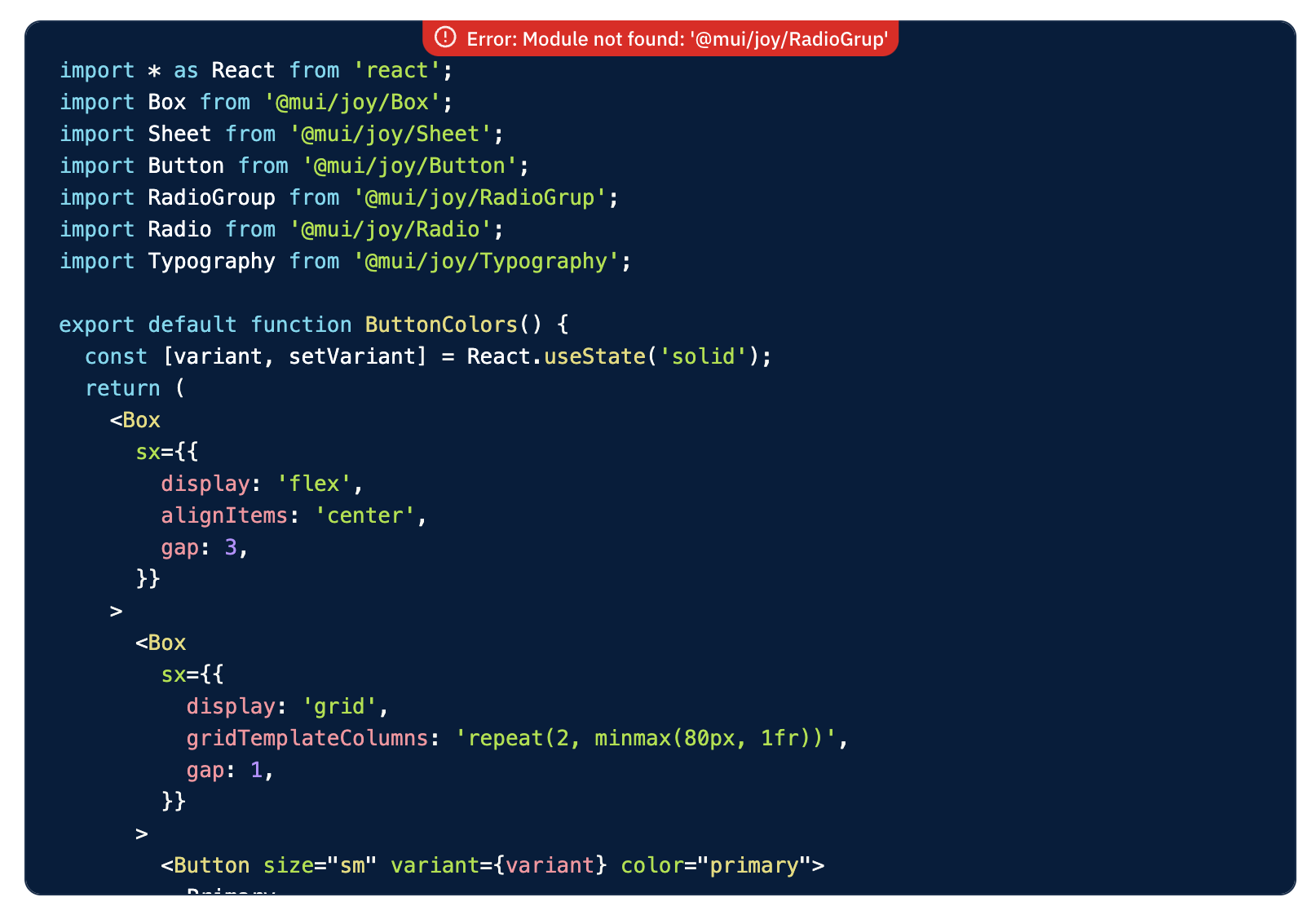
Module not found: Can't resolve 'docsx/src/modules/components/SelectorsDocs'
Import trace for requested module:
./pages/x/react-data-grid/column-definition.js
https://nextjs.org/docs/messages/module-not-found
It's probably related to docs/packages/markdown/loader.js, but I'm not sure what's the cause of this issue.
@cherniavskii I tried your branch, this will fix the module resolving issue
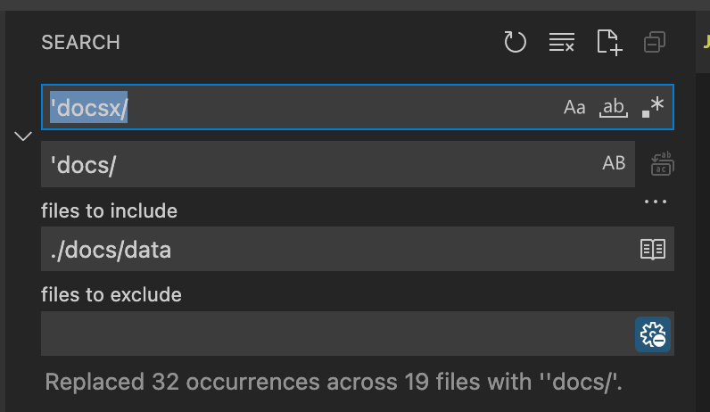
The case is that previously we used webpack alisa, but now only Babel is used, but I found we have alias for Babel as well, don't know why it doesn't work yet
@cherniavskii I tried your branch, this will fix the module resolving issue
The case is that previously we used webpack alisa, but now only Babel is used, but I found we have alias for Babel as well, don't know why it doesn't work yet
Yeah, it does the job but I have no idea why 🤷🏻♂️
But it works only in development, yarn docs:build fails:
yarn docs:build
yarn run v1.22.17
$ yarn workspace docs build
$ cross-env NODE_ENV=production next build --profile
warn  - Profiling is enabled. Note: This may affect performance
Using React.StrictMode.
info  - Skipping validation of types
info  - Disabled SWC as replacement for Babel because of custom Babel configuration "babel.config.js" https://nextjs.org/docs/messages/swc-disabled
info  - Creating an optimized production build
Failed to compile.

./data/data-grid/events/events.md?@mui/markdown
Module not found: Can't resolve 'docs/src/modules/components/MarkdownElement' in '/Users/andrew/workspace/mui-x/docs/data/data-grid/events'

Import trace for requested module:
./pages/x/react-data-grid/events.js

./data/data-grid/events/events.md?@mui/markdown
Module not found: Can't resolve 'docs/src/modules/components/HighlightedCode' in '/Users/andrew/workspace/mui-x/docs/data/data-grid/events'

Import trace for requested module:
./pages/x/react-data-grid/events.js

./data/date-pickers/getting-started/getting-started.md?@mui/markdown
Module not found: Can't resolve 'docs/src/modules/components/HighlightedCode' in '/Users/andrew/workspace/mui-x/docs/data/date-pickers/getting-started'

Import trace for requested module:
./pages/x/react-date-pickers/getting-started.js


> Build failed because of webpack errors
error Command failed with exit code 1.
info Visit https://yarnpkg.com/en/docs/cli/run for documentation about this command.
error Command failed.
Exit code: 1
Command: /usr/local/bin/node
Arguments: /usr/local/lib/node_modules/yarn/lib/cli.js build
Directory: /Users/andrew/workspace/mui-x/docs
Output:

info Visit https://yarnpkg.com/en/docs/cli/workspace for documentation about this command.
error Command failed with exit code 1.
info Visit https://yarnpkg.com/en/docs/cli/run for documentation about this command.
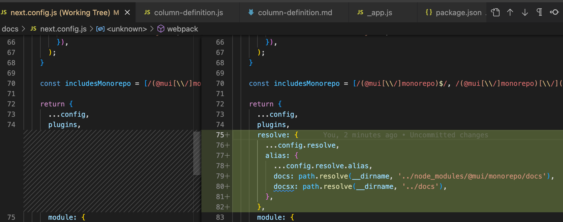
@cherniavskii OK it indeed related to webpack config, the following config does the work
So I think we are OK to merge this PR?
@cherniavskii OK it indeed related to webpack config, the following config does the work
So I think we are OK to merge this PR?
Yes, I confirm that it works for both docs:dev and docs:build 🎉
Thanks!
Making progress!
The keyboard focus indicator (blue outline) is now present both when hovering over the editor and when it's selected, which is a step backwards since https://github.com/mui/material-ui/pull/32107#issuecomment-1092173585. It should only present when the editor is tabbed into.
@mbrookes That's not a step back, it's intended, you can see MUI TextField behaves the same with slightly different outline as the code editor is always dark
@mbrookes what do you mean? I just checked even the official DS behaves the same way https://material.io/components/text-fields, BTW does that really matter? even the comment box I'm using for this replay has the selected outline
does that really matter?
Yes, or I wouldn't ask you to fix it. Having a keyboard focus indicator when not keyboard focussed is not a great user experience.
@mbrookes Are you serious? Even the bare native input has the focus indicator when not keyboard focused, try it out by yourself, I'm not an good at a11y, but I learn instead of intuition
Having a keyboard focus indicator when not keyboard focussed is not a great user experience.
@mbrooke How the focus style is currently implemented in this PR seems identical to how the platform behaves and MUI's components behave by default. So I think that we are good, that it's not something we should change. Another example https://github.com/WICG/focus-visible/blob/ea5722da398ae6cdc3bb23251486e07985d5e2e4/src/focus-visible.js#L48-L59
which is a step backwards.
@mbrooke It seems to be a false statement. Since there are pushbacks in this direction, I think that it would be great to provide supporting materials that would expand on why it's a step backward.
How the focus style is currently implemented in this PR seems identical to how the platform behaves
Not true:

(Although that example lacks a keyboard focus indicator, which we should fix.)
and MUI's components behave by default
Asked and answered - we don't use the native Material Design appearance for the docs. And also not true – the text field has a much more subtle appearance on hover.
By all means make it more subtle when hovered and not keyboard focused, but the current appearance is not aesthetically pleasing, or in keeping with the overall docs theme. cc @danilo-leal
@mbrookes I don't understand, what are we talking about? Could you detail the current behavior that you think that we should change as well as what should be the expected one? I feel that we are not talking about the same thing. Thanks
I have resolved the comments that are about the focus. At minimum because they starts to clutter this PR main comment area. It would be better as a comment in a line of code so we can then resolve the whole discussion once done.
@mbrookes please see https://youtu.be/ilj2P5-5CjI I think that it explains well why the current implementation of @nihgwu is optimal. The rational is that when you focus an input, keyboard or click, you gonna spend some time on it, you might get interrupted and forget where you focus was. It's not the case, with a button, only when you use the keyboard that you need the focus indicator. Feel free to comment on the relevant line of code with more details if you think there is still an opportunity for improvement.
Sorry spent another hour trying to find the correct colours but failed, as it's different from TextInput, and it's always dark, I think the current colours works well in both dark and light mode, feel free to change to your taste
@mbrookes please see https://youtu.be/ilj2P5-5CjI
I did, thanks, and it reinforces what I've been saying all along. (You did watch it before you posted it, right?)
I did, thanks, and it reinforces what I've been saying all along.
Still don't understand what you wanted here
@oliviertassinari my answer to https://github.com/mui/material-ui/pull/32107#pullrequestreview-951032470
- we can't do much on that unless we switch to another editor, I saw you also raised similar questions in that repo
- It exits without this PR, don't have a quick clue to fix it
- Fixed in my latest commit
- I also noticed that, that's the current behaviour without this PR, and the fix will be large so I didn't do that
- We have new line in our raw code, so I want to remove via css, but I changed to another approach
- Don't quite understand the diff as for SSR we produce the same result and then hydration
- I updated slightly
@nihgwu
- we can't do much on that unless we switch to another editor, I saw you also raised similar questions in that repo
I have edit rights on the repository and on npm: https://www.npmjs.com/package/react-simple-code-editor. I could make simple changes, the only problem, I might not have the time, running MUI should be more important 😁. In any case, it's not a blocker, more for MUI's maintainer to look into.
- Don't quite understand the diff as for SSR we produce the same result and then hydration
I would assume that it's about the hydration that takes more time with the live editor. My suggestion would be to the first hydrate with a static version, deferring the live editor to a later point in time. Ideally, we could selectively delay hydration. Maybe it's something we could do in a follow-up.
I would assume that it's about the hydration that takes more time with the live editor. My suggestion would be to the first hydrate with a static version, deferring the live editor to a later point in time. Ideally, we could selectively delay hydration. Maybe it's something we could do in a follow-up.
We should make sure of this before merging. If the time is significant, we should improve it in this PR. However, I don't have time to dedicate to this 🥲.