 mui
mui
[List] Allow adding multiple secondary actions
Duplicates
- [X] I have searched the existing issues
Latest version
- [X] I have tested the latest version
Summary 💡
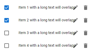
The ListItem component provides a property for setting a secondary action. This works fine if you only add a single IconButton, but if multiple buttons are added, the content of the ListItem can overlap with the left IconButton. This is caused by the padding of the ListItem which is set to a fixed 48px if a secondary action is set.
The secondary action should allow setting an array of IconButtons. Depending on the length of the array, the padding should be calculated. As an alternative, it could also be a fragment which is checked for the amount of IconButtons inside it.
A workaround at the moment would be to override the padding, but I think it would be much more convenient to have this handled by mui, especially because this is not directly documented.
Examples 🌈
Current Behavior:
Code Sample
New Behavior:

Motivation 🔦
We have applications which often contain lists of objects which can be edited or deleted. To allow both actions, we add two IconButtons to the list items (see example above). Our application is mainly used on desktop browsers, so we have enough room for both buttons to be displayed all the time.
I have already tried to implement this, and it looks to be easy to support this case. If you think this feature could be integrated into mui I could create a PR. 😊
Hey @DanielBretzigheimer, thanks for dropping the request! I totally agree we should do this, it seems something intuitive to support. Though I only think we could experiment using text-overflow displaying an ellipsis instead of breaking the line. But anyway, this is a conversation for the PR. Feel free to open it!
cc @siriwatknp to think about Joy as well having the same feature — think we touched the List component recently, right?!
@danilo-leal I could not find a perfect solution yet. This is because the action has position absolute which there is no way for the child ListItemButton to know how much padding-right it should have.
<ListItem secondaryAction={...two icon button}> // when ListItem receive secondaryAction, it forces ListItemButton to have specific padding-right (48px)
  <ListItemButton>
    ...
  </ListItemButton>
</ListItem>
The best approach I have so far for Joy is using CSS variables to make customization easier but you still have to manually specify the actual width.
<List sx={{ '--List-item-endActionWidth': '64px' }}> // you have to manually custom the width equal to the action
  <ListItem endAction={...}> // you can add elements many as you like
    <ListItemButton>...</ListItemButton> // the padding-right will account for --List-item-endActionWidth
  </ListItem>
</List>
Isn't it better just to keep the old (deprecated) API ListItemSecondaryAction instead?