ResponsiveGrid_Flutter
 ResponsiveGrid_Flutter copied to clipboard
 muhammad369
Responsive Grid Layout for Flutter
responsive_grid
Responsive Grid Layout and List for Flutter
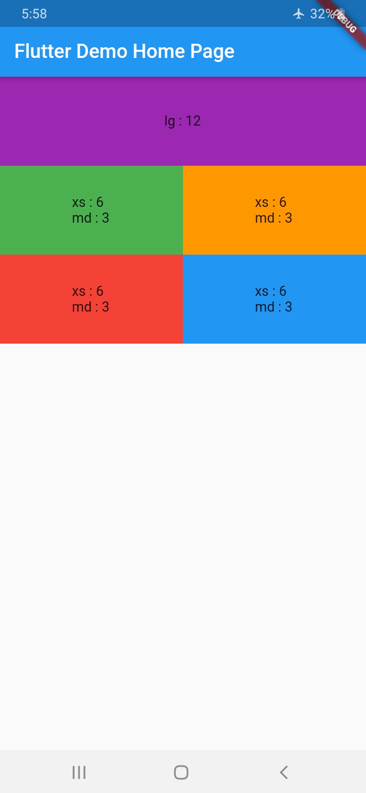
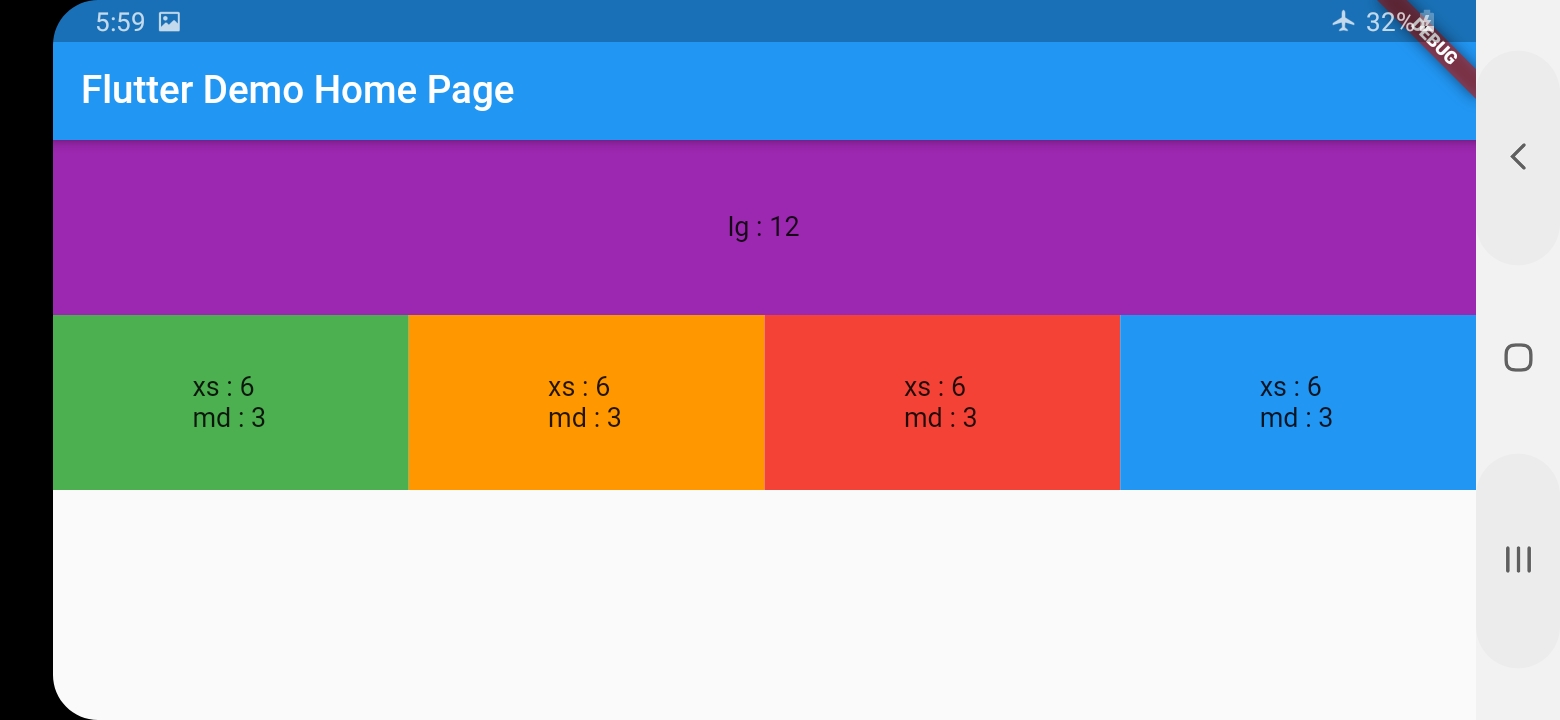
Responsive Grid Layout
With ResponsiveGridRow and ResponsiveGridCol you can get the same behavior of bootstrap Grid System
Give every col the width it shall occupy at every size category assuming the total width is 12
        ResponsiveGridRow(
          children: [
            ResponsiveGridCol(
              lg: 12,
              child: Container(
                height: 100,
                alignment: Alignment(0, 0),
                color: Colors.purple,
                child: Text("lg : 12"),
              ),
            ),
            ResponsiveGridCol(
              xs: 6,
              md: 3,
              child: Container(
                height: 100,
                alignment: Alignment(0, 0),
                color: Colors.green,
                child: Text("xs : 6 \r\nmd : 3"),
              ),
            ),
            ResponsiveGridCol(
              xs: 6,
              md: 3,
              child: Container(
                height: 100,
                alignment: Alignment(0, 0),
                color: Colors.orange,
                child: Text("xs : 6 \r\nmd : 3"),
              ),
            ),
            ResponsiveGridCol(
              xs: 6,
              md: 3,
              child: Container(
                height: 100,
                alignment: Alignment(0, 0),
                color: Colors.red,
                child: Text("xs : 6 \r\nmd : 3"),
              ),
            ),
            ResponsiveGridCol(
              xs: 6,
              md: 3,
              child: Container(
                height: 100,
                alignment: Alignment(0, 0),
                color: Colors.blue,
                child: Text("xs : 6 \r\nmd : 3"),
              ),
            ),
        )
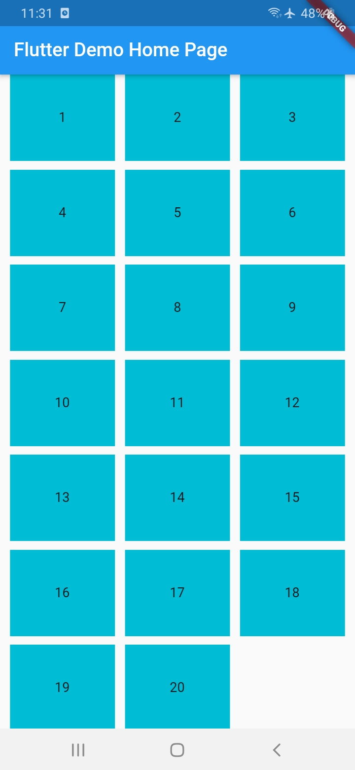
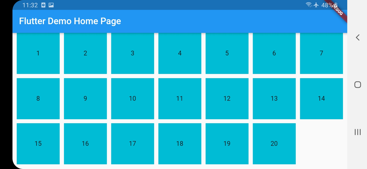
Responsive Grid List
ResponsiveGridList works differently in that you only specify a desired width for the items and spacing, and it will decide how many items shall fit in a line, and the width of the item and spacing will change (only small change) to fill the entire width
    ResponsiveGridList(
        desiredItemWidth: 100,
        minSpacing: 10,
        children: [
          1,
          2,
          3,
          4,
          5,
          6,
          7,
          8,
          9,
          10,
          11,
          12,
          13,
          14,
          15,
          16,
          17,
          18,
          19,
          20
        ].map((i) {
          return Container(
            height: 100,
            alignment: Alignment(0, 0),
            color: Colors.cyan,
            child: Text(i.toString()),
          );
        }).toList()
    )
Override breakpoints
Add before attach App widget
ResponsiveGridBreakpoints.value = ResponsiveGridBreakpoints(
  xs: 600,
  sm: 905,
  md: 1240,
  lg: 1440,
);
 muhammad369