Url bar not identical with chrome
Hey there, just a small issue. Seems like the url bar is not quite identical with the chrome url bar. The blue border color on Firefox is more intense and the font color of the preview text is too bright.
Firefox:

Chrome:


This is probably not something I'm going to fix. Firefox uses the OS-configured selection colour for elements such as the urlbar and this makes more sense to me than Chrome's approach, so while it might not look exactly like Chrome I believe it's better for it. You can always tweak your selection highlight colour in your OS (e.g. Windows 10 or macOS) to match Chrome's.
EDIT: Oh, but the text colour is something we can do something about. I'll look into it.
Oh yeah I just see that the constant variables --toolbar-field-background-color and --toolbar-field-focus-border-color are being used for the border. Sorry 'bout that!
Looks good now 🙏
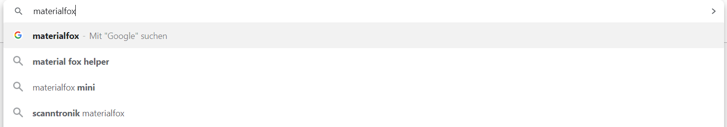
Search results seem to have the same issue.
Chrome:
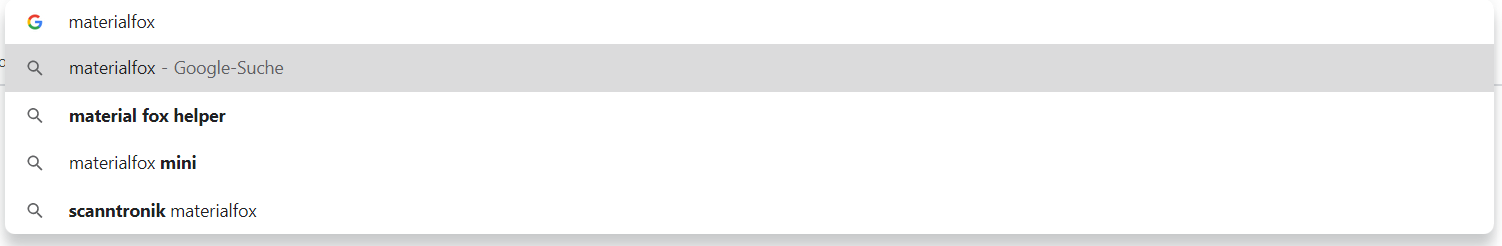
Firefox: