quillnote
 quillnote copied to clipboard
Move down whole UI (bottom oriented)
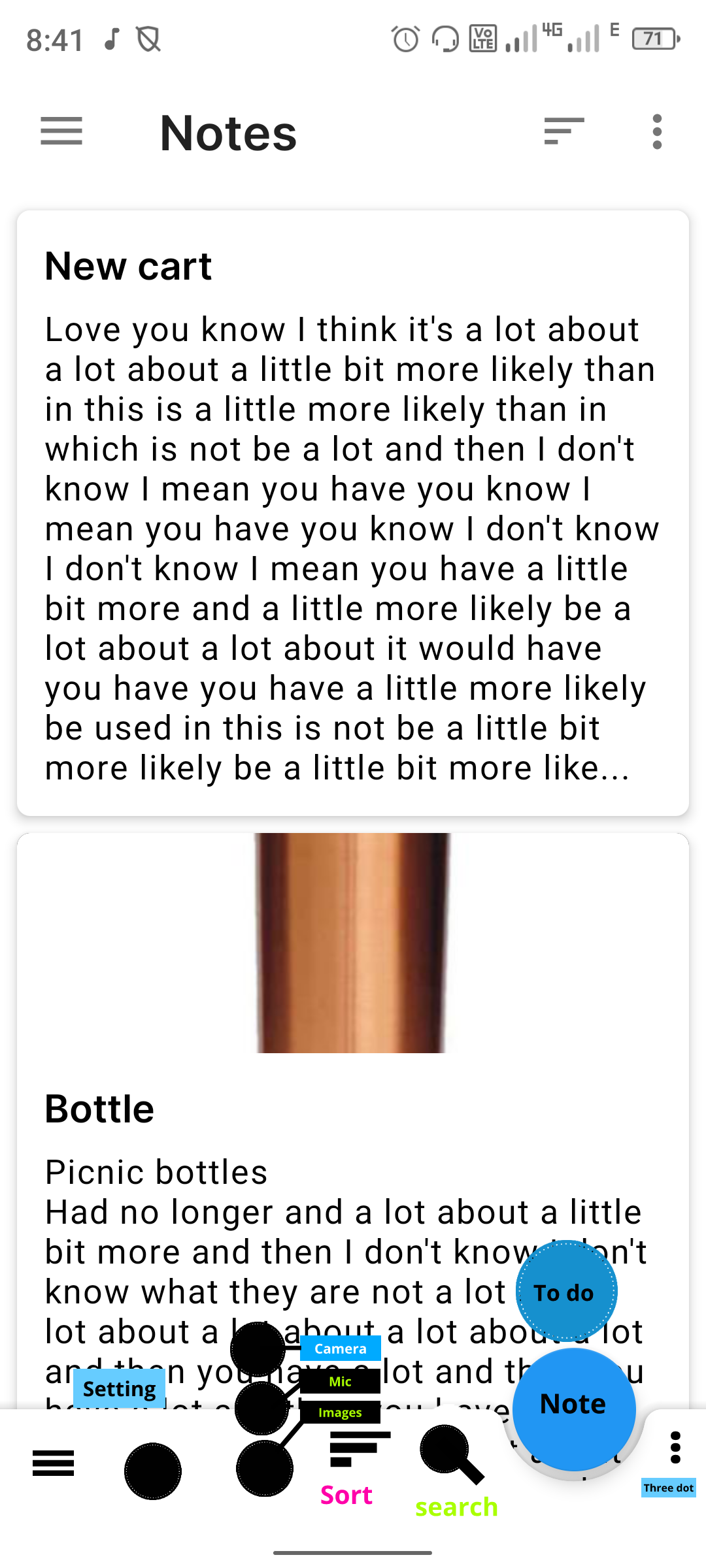
Please sir move down hamburger menu, three dots, search bar, sort menu and Merged note & todo/task together in one tab and merged camera, mic, image together in one tab (popup)

I think many people would find the bottom to be cluttered that way and it would gathering together dissimilar functions too. Maybe this could be an option that is configurable in the settings instead.
Yeah, you are right but now phn screen are too big. Please sir work on it at least hamburger menu & search icon
I would at least prefer the search button at the bottom. I don't think people change sorting or the view mode that often, but they do search for things in the notes.