svelty-picker
 svelty-picker copied to clipboard
 mskocik
Simple date & time picker in svelte
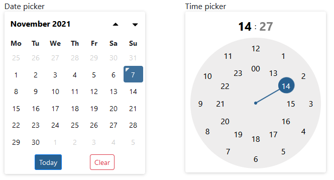
📆 Svelty Picker 
Simple date & time picker implemented in svelte.
Features:
- datepicker
- timepicker (with meridian support)
- various formatting options
- keyboard navigation
- includes
<input>element - easily themable
- restriction by start and end date
- validator action for
<input>usingsvelte-use-forms(optional) - custom element
⚙️ Install
npm install svelty-picker
👀 Example
<script>
  import SveltyPicker from 'svelty-picker'

  let myDate = '2021-11-11';
</script>

<SveltyPicker inputClasses="form-control" format="yyyy-mm-dd hh:ii" bind:value={myDate}></SveltyPicker>
Try yourself in REPL.
📓 Options
| Property | Type | Default | Description |
|---|---|---|---|
| name | string |
date |
html attribute for underlying <input> element |
| disabled | bool |
false |
html attribute for underlying <input> element |
| placeholder | string |
null |
html attribute for underlying <input> element |
| required | bool |
false |
html attribute for underlying <input> element |
| value | string |
null |
string representation of selected value |
| initialDate | Date |
null |
initial date object, if you prefer that to value |
| startDate | `string | Date` | null |
| endDate | `string | Date` | null |
| pickerOnly | bool |
false |
Picker is always visible and input field is then hidden, but still present |
| theme | string |
sdt-calendar-colors |
css class defining css variables |
| mode | string |
auto |
restrict picker's mode. Possible values: `auto |
| format | string |
yyyy-mm-dd |
Format of entered date/time. See format settings for available options |
| weekStart | number |
1 |
number in range 0-6 to select first day of the week. Sunday is 0 |
| inputId | string |
`` | id attribute for input element |
| inputClasses | string |
`` | input css class string |
| todayBtnClasses | string |
sdt-action-btn sdt-today-btn |
today button css classes |
| clearBtnClasses | string |
sdt-action-btn sdt-clear-btn |
clear button css classes |
| todayBtn | bool |
true |
Show today button |
| clearBtn | bool |
true |
Show clear button |
| clearToggle | bool |
true |
Allows to clear selected date when clicking on the same date when in mode='date' or mode='auto' resolving to 'date' |
| autoclose | bool |
true |
Hides picker after selection is done. If mode includes time picker, it closes automatically only after minute selection |
| i18n | object |
en |
localization object, english is by default |
| positionFn | function |
internal |
function used to position picker. Used as action. Acceps following object: { inputEl, visible}, where visible is visible parameter & inputEl is underlying <input> element |
| validatorAction | array |
null |
Bind validator action for inner <input> element. Designed to be used with svelte-use-form. |
Note: Properties starting by theme to i18n are configurable globally by overriding it in globally available config
import { config } from 'svelty-picker';

// set new locale
config.i18n = {
  // my localization object
}
// default for all pickers in the app
config.todayBtn = false;
Format settings
Date format can be defined under formatType property. It has two options: standard and php, where
standard is the default.
standard format settings:
| Format | Description | Example |
|---|---|---|
d |
day of the month without leading zeros | 1 to 31 |
dd |
day of the month, 2 digits with leading zeros | 01 to 31 |
D |
short textual representation of a weekday (i18n.daysShort) | Mon through Sun |
DD |
long textual representation of a weekday (i18n.days) | Sunday through Saturday |
S |
English ordinal suffix for the day of the month, (i18n.suffix) | st, nd, rd or th. Works well with d |
m |
numeric representation of month without leading zeros | 1 to 12 |
mm |
numeric representation of the month, 2 digits with leading zeros | 01 to 12 |
M |
short textual representation of a month, three letters (i18n.monthsShort) | Jan through Dec |
MM |
full textual representation of a month, such as January or March (i18n.months) | January through December |
yy |
two digit representation of a year | 99 or 03 |
yyyy |
full numeric representation of a year, 4 digits | 1999, 2003 |
h |
hour without leading zeros - 24-hour format | 0 - 23 |
hh |
hour, 2 digits with leading zeros - 24-hour format | 00 - 23 |
H |
hour without leading zeros - 12-hour format | 1 - 12 |
HH |
hour, 2 digits with leading zeros - 12-hour format | 01 - 12 |
i |
minutes, 2 digits with leading zeros | 00 - 59 |
ii |
alias for i |
00 - 59 |
s |
seconds, 2 digits with leading zeros | 00 |
ss |
alias for s |
00 |
p |
meridian in lower case ('am' or 'pm') - according to locale file (i18n.meridiem) | am or pm |
P |
meridian in upper case ('AM' or 'PM') - according to locale file (i18n.meridiem) | AM or PM |
t |
timestamp in milliseconds (although milliseconds are always 0). For timestamp in seconds use php format |
php format settings:
| Format | Description | Example |
|---|---|---|
d |
Day of the month, 2 digits with leading zeros | 01 to 31 |
D |
A textual representation of a day, three letters | Mon through Sun |
j |
Day of the month without leading zeros | 1 to 31 |
l |
A full textual representation of the day of the week | Sunday through Saturday |
N |
ISO 8601 numeric representation of the day of the week | 1 (for Monday) through 7 (for Sunday) |
S |
English ordinal suffix for the day of the month, 2 characters | st, nd, rd or th. Works well with j |
F |
A full textual representation of a month, such as January or March | January through December |
m |
Numeric representation of a month, with leading zeros | 01 through 12 |
M |
A short textual representation of a month, three letters | Jan through Dec |
n |
Numeric representation of a month, without leading zeros | 1 through 12 |
Y |
A full numeric representation of a year, at least 4 digits | 0787, 1999, 2003 |
y |
A two digit representation of a year | 99 or 03 |
a |
Lowercase Ante meridiem and Post meridiem | am or pm |
A |
Uppercase Ante meridiem and Post meridiem | AM or PM |
g |
12-hour format of an hour without leading zeros | 1 through 12 |
G |
24-hour format of an hour without leading zeros | 0 through 23 |
h |
12-hour format of an hour with leading zeros | 01 through 12 |
H |
24-hour format of an hour with leading zeros | 00 through 23 |
i |
Minutes with leading zeros | 00 to 59 |
s |
Seconds with leading zeros | 00 |
U |
timestamp in seconds. For timestamp with miliseconds use standard format |
CSS variables
/** defaults */
.sdt-calendar-colors {
  --sdt-primary: #286090;
  --sdt-color: #000;
  --sdt-bg-main: #fff;
  --sdt-bg-today: var(--sdt-primary);
  --sdt-bg-clear: #dc3545;
  --sdt-today-bg: #1e486d;
  --sdt-clear-color: #dc3545;
  --sdt-btn-bg-hover: #eee;
  --sdt-btn-header-bg-hover: #dfdfdf;
  --sdt-clock-bg: #eeeded;
  --sdt-clock-bg-minute: rgb(238, 237, 237, 0.25);
  --sdt-clock-bg-shadow: 0 0 128px 2px #ddd inset;
  --sdt-shadow: #ccc;
  --sdt-disabled-date: #b22222;
}
🗯️ Events
Component emits input, change and blur events.
inputis dispatched on<input>element therefore you can get current value like from every native event:changeevent is using Svelte'seventDispatcher, therefore triggered event containsdetailproperty
<script>
function onInput(event) {
  console.log(event.target.value) // logs currently selected date or empty string
}

function onChange(event) {
  console.log(event.detail) // logs currently selected date or null
}
</script>

<SveltyPicker on:input={onInput} on:change={onChange}></SveltyPicker>
🌐 Localization
By default date picker uses english locale. And at the moment there are only en and de localizations available
(PRs for additional locales are more than welcome).
So if you want to change it to german (or other locale in the future), use this:
<script>
  import SveltyPicker from 'svelty-picker.svelte';
  import { de } from 'svelty-picker/i18n';
</script>

<SveltyPicker i18n={de}></SveltyPicker>
Global locale setting
You can also change locale globally through setting i18n property in global config like below. So all pickers created
AFTER this setting has been changed, will be in the new locale.
<script>
  import SveltyPicker, { config } from 'svelty-picker';
  import { de } from 'svelty-picker/i18n';

  // all pickers in the app will have german locale set
  config.i18n = de;
</script>

<SveltyPicker></SveltyPicker>
Adding additional locales
Localization file has following structure.
// default i18n structure
export const en = {
  days:        ['Sunday', 'Monday', 'Tuesday', 'Wednesday', 'Thursday', 'Friday', 'Saturday', 'Sunday'],
  daysShort:   ['Sun', 'Mon', 'Tue', 'Wed', 'Thu', 'Fri', 'Sat', 'Sun'],
  daysMin:     ['Su', 'Mo', 'Tu', 'We', 'Th', 'Fr', 'Sa', 'Su'],
  months:      ['January', 'February', 'March', 'April', 'May', 'June', 'July', 'August', 'September', 'October', 'November', 'December'],
  monthsShort: ['Jan', 'Feb', 'Mar', 'Apr', 'May', 'Jun', 'Jul', 'Aug', 'Sep', 'Oct', 'Nov', 'Dec'],
  meridiem:    ['am', 'pm'],
  suffix:      ['st', 'nd', 'rd', 'th'],
  todayBtn:    'Today',
  clearBtn:    'Clear',
  timeView:    'Show time view',
  backToDate:  'Back to calendar view'
}
🏆 Thanks to:
- Bootstrap datepicker for some internal date and format handling
Licence:
MIT
 mskocik