EDEngineer
 EDEngineer copied to clipboard
Published
20 hours ago •
 msarilar
Suggestion: UX improvement - Right hand pane layout
The contents of the right hand panes are not immediately obvious in the scope of their contents without the need to manipulate the red splitter bar first.
Observations
- Reset the window position from settings
- Note that no content apart from the column headers is displayed initially
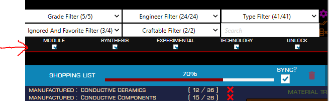
- Manipulating the red splitter bar is required, but not obvious, before the scroll bars in the top and bottom right hand panes are enabled.
- Once the splitter bar has been moved downward, it reveals that the Blueprints below.
The need for the splitter to be moved before the scrollable content is revealed, and that there is far more content in the top pane than initially shown is not obvious, nor particularly intuitive.
Suggestions
- Move the position of the splitter down as the default window layout so that it reveals the partial contents of the top pane, therefore leading the user to further discovery.
- Enable scrollbars for both right hand panes by default, or indicate that there is more viewable content through a visual cue such as ellipses or arrows.
Related to issues #444 and #490