SmartAlarm
 SmartAlarm copied to clipboard
New Logo for SmartAlarm
Hi,
I'm designing for open source projects, expanding my portfolio. I want designing an icon for your project. There are a few ideas in my mind, I hope you accept and I do them. If you have an idea, please let me know. In this way we create a icon.
Best Regards.
Hi @Yasujizr, Happy to hear that you are interesting in this project. I am open for new changes, so free feel to contribute. We can discuss your ideas for new icon here.
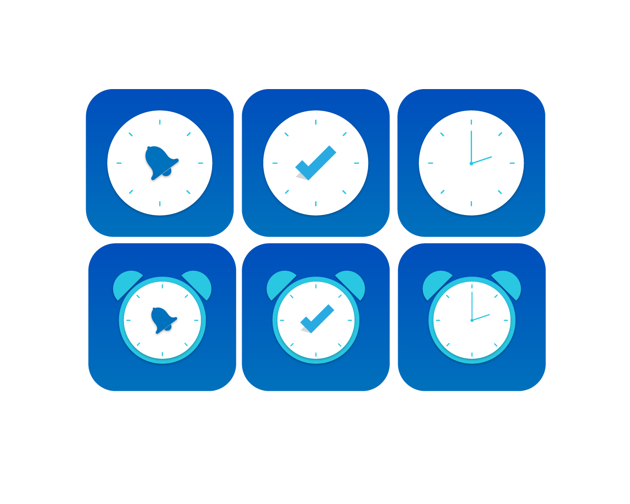
@Yasujizr yes, I also like one in the middle of the last row. What do you think about the icon colors comparing to the main theme(style) in the app screenshots ? Can you try it with some gray color and orange check mark (some colors to represent one common style in icon and in the app). Or we can consider changing main theme of the app (I think in some close future it will be absolutely necessary update or change the design of this app).
Actually it seems like UI / UX update is required for the application. If you want, I try to design. But this is my first experience on the subject. I do not know how to write a code.
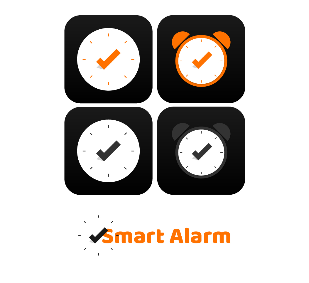
I've updated the logo for you. I made samples in two different colors as Black-Gray and Black-Orange. I think Blue color is more suitable for sleeping. Black and Gray also seem appropriate.
If you are interesting in such task we can try to do it together. Your part of the task will be to design UI, for example by making some sketches of screens with values of colors, sizes of particular elements. And after my task will be to implement it in code. As you said previously blue color suits better for alarm clock and it's true. I had choose gray color for this app because it's not bright, so it's looks nicer when the lights turned off.
I understand. It's the right choice. Which one do you currently choose from the logos? According to him, I will create a PR and add it to Read.me. Then let's look at what pages will be for the UI. According to this, we can see how many designs we need.
I think for now orange icon(second one in the first row) will be more notable comparing to gray icons. You can create a pull request and upload icons generated with this online tool (to have all sizes and hi-res icons) rommannurik.github.io.
I don't fully understand your answer :
According to him, I will create a...
you wanted to provide some link under "him"?
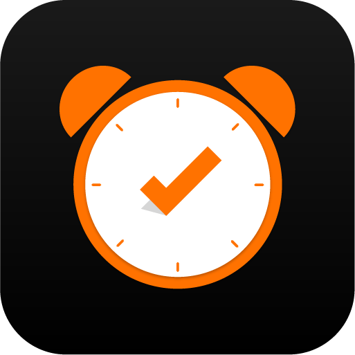
@Yasujizr Hi can I ask you for sending to me hi-res 512 x 512 alarm logo icon (so it can be used as logo at Google Play store)
Hi, of course. If you want, I can send it by mail. Will these pages be designed for the User Interface?
@Yasujizr Yes, firstly I recommend to download this app to have some experience with UX and UI. We can start from the main screen (with big circle button in the middle). Feel free to propose any new design or changes and I will tell you if I can implement those changes in code. I created new issue for this. Thanks for sending bigger logo :)