bugbug
 bugbug copied to clipboard
Make sure graphs above the list view only include bugs with active filters applied
When I restrict to release 86 I'm seeing some of the graphs going back to 2009, with some data points included that isn't in the bug list. The graphs time range / data should be bounded by the buglist after all filters are applied.
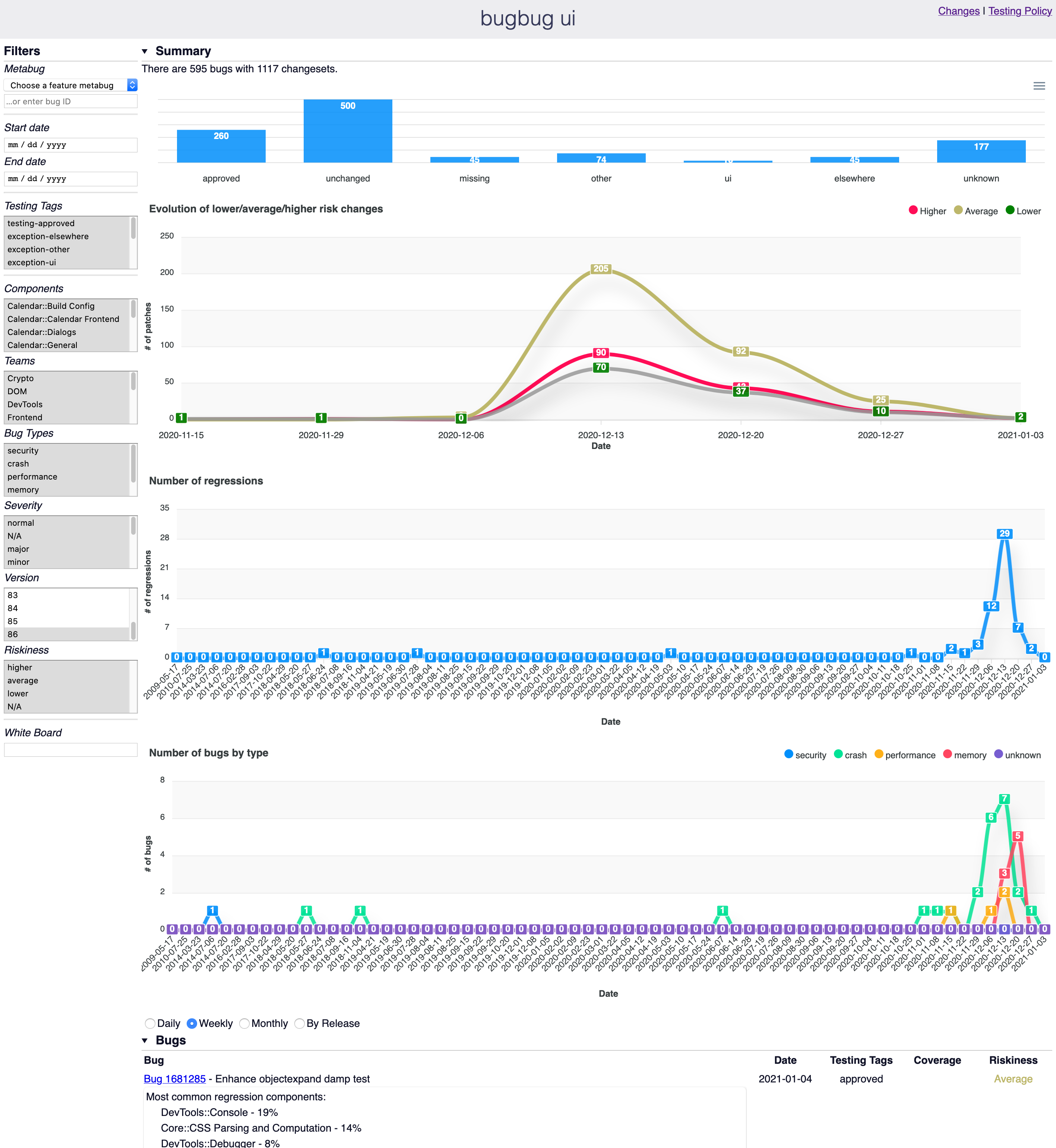
It seems like the risk evolution graph is doing this correctly - the two graphs below should act the same way.
Though, there's one bug from 2020-11-20 (https://bugzilla.mozilla.org/show_bug.cgi?id=1629140) and one from 2020-11-30 (https://bugzilla.mozilla.org/show_bug.cgi?id=1620114) where it landed in 85 but then got backed out of beta, so the tracking firefox86=fixed which is causing it to show up in the search. I'm not sure if we really want those to be included, since they didn't land in 86 (Milestone: 85 Branch) but I'm positive.
I think the problem is that we are including active bugs in the filters, but then showing them by creation_date. So if a bug that got fixed was opened a long time ago it'll make the graphs extend way back. The risk summary one happens to work because it clamps to 2 months.
I'm not sure exactly what to do here. On one hand we should just only include closed bugs and clamp to date (i.e. the date it landed) but obv that's not going to work for the regressions chart or bugs by type chart since then you'd only show closed regressions / bugs.
I almost wonder if these should just be separate charts (or separate bars on the same chart) for each. We'd have closed regressions / closed bugs by type where we group by date landed (which will only include bugs in our applied filter dates) and then separate charts for newly opened and unfixed regressions / bugs by type. It seems more relevant anyway - people wouldn't usually want to group opened and closed bugs together in the same line.
The risk summary one happens to work because it clamps to 2 months.
This was incorrect. The riskiness chart does actually already group by date at https://github.com/mozilla/bugbug/blob/7b0781af79f9f6b01e4658da26890c6b9e8c392c/ui/changes/src/index.js#L430 which is the correct behavior for that chart (we don't care about creation_date at all for that particular chart).
I've been thinking about this, but I'm not sure what the best option is.
We could make it so the charts based on creation_date only apply the date filters, but that could be confusing and would hamper the ability of users to freely see what they want to see.
Another option could be to clamp those graphs to one year, since the artifact contains all bugs filed since one year ago. It'll still be confusing as by default we select the last two versions (and so e.g. the "Number of regressions" chart is actually "Number of regressions which were fixed in the last two versions"), but not as confusing as now.
I've split the date filter in two, "fix date" and "creation date", I think this already makes the situation a little less confusing (earlier we had a single date filter that in some cases filtered by the fix date, and in some other cases filtered both by the fix date and the creation date).
Caveat that I'm just paging this back in so this may not be representative of the state today. But I think part of the problem is that when looking at, for example, regression fixes (a) I don't really care about the exact 'created date' for some bug that was filed in 2009 and fixed recently and (b) I need to see two completely separate data sources for "filed but unfixed" regressions and fixed regressions. Right now we stretch out the chart for (a), and we show everything in the same line for (b). I think both would be improved by having two separate graphs - one for fixed and one for unfixed.
Then for (a) what we really care about (I think) is how many regressions there are and roughly how old they are. One way we could think about that for fixed bugs is a stacked bar chart with color codes for how old the fixed bugs are (something like https://apexcharts.com/javascript-chart-demos/column-charts/stacked/), where we see if a bug was > 1 year old, > 1 month, > 1 week, etc. This way we don't have to stretch the timeline all the way back to 2009.