website-v2

website-v2 copied to clipboard
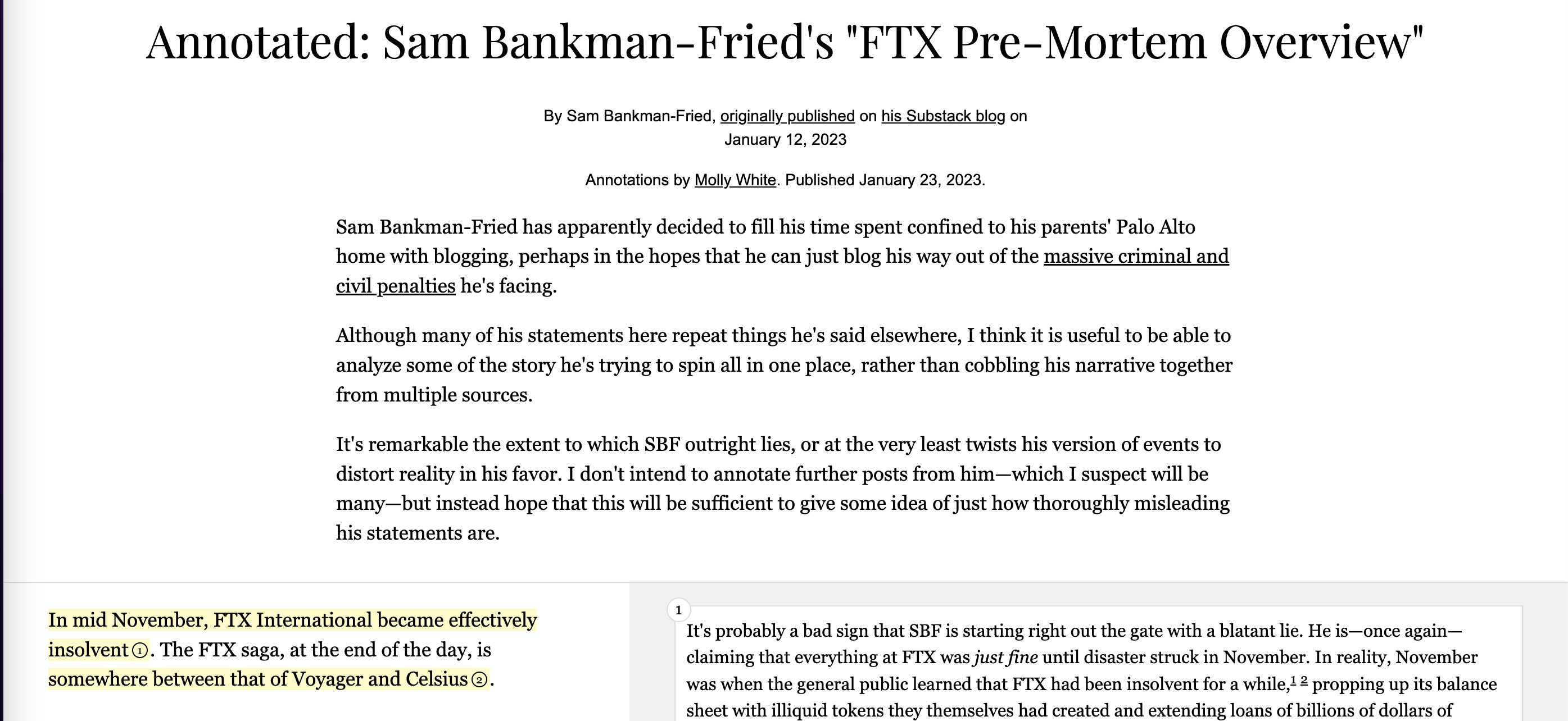
Add subheaders so its clear to first time readers that the source is on the left and annotations are on the right:
Just a suggestion.
Before:

After:

I just noticed my implementation is bad and doesn't work on mobile:

Coincidentally I realized that the current design looks great on mobile. Only on desktop is it ambiguous which is source and which is annnotation.