revolution
 revolution copied to clipboard
MODX 3: Buttons - different button groups
Summary
We have a great new button pattern when editing resources;
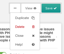
Observed behavior
I wonder if this should be applied to all button groups to make it consistent?
button group when editing template, tv, chunk, snippet, plugin:
/manager/?a=element/template/update&id=1
/manager/?a=element/tv/update&id=1
/manager/?a=element/chunk/update&id=1
/manager/?a=element/snippet/update&id=1
/manager/?a=element/plugin/update&id=1

button group when updating a user:
/manager/?a=security/user/update&id=1

button group when editing a form customisation set:
/manager/?a=security/user/update&id=1

button group when updating a dashboard group:
/manager/?a=system/dashboards/update&id=1

button group when updating a context
/manager/?a=context/update&key=web

button group when updating a user group
/manager/?a=security/usergroup/update&id=1

button group when updating an access policy / policy template
/manager/?a=security/access/policy/update&id=2
/manager/?a=security/access/policy/template/update&id=1

button group when updating a media source
/manager/?a=source/update&id=1

Expected behavior
To follow the new button pattern that the resource page uses.
I appreciate that the resource page is the most import for content editors and the other parts of the CMS are more for site builders, but surely 1 pattern is better than 2?
Environment
3.x branch built from github
Personally, I don't think "Close" should ever be in a group; it's used much too often by users in my experience.
It's also weird that we are hiding functionality behind a dropdown menu that requires clicking.
Yes, I also do not understand why hide the "Copy" button for example?
Why not to leave the same kind of buttons in MODX3 ?

It's very pretty and clean, but I'm not sure quite as good on the UX front.
I wonder how it would work to change the help button into a clickable "?" icon and leaving the remaining buttons as text-only? I might could buy into the checkmark icon on the primary action (save), but adding icons to all the others gets too busy for my personal preference.
Yes, the text + icons, it seems to me, looks superfluous. We can think of something with various options, for example:


The help button in the form of an icon will look appropriate, because this button is not often needed :) By the way, the delete button can also be made an icon - there will be less false clicks. If you need to remove - you need to aim :)