moniel
 moniel copied to clipboard
Exploit hierarchical structure also in vis
This is more like "feature request" or even an open-ended discussion (if you prefer to have it on email, mine is [email protected]).
In definition of layers you use hierarchical structures. However, in visualisation you don't - so even AlexNet looks heavy VGG16 - unreadable, and I don't dare thinking about GooglLeNet or ResNet.
How about exploiting this structure not only in definitions, but also - drawings. And passing "free hyperparameters" of layers, e.g. the number of channels. See e.g.:

from Deep learning for satellite imagery via image segmentation (by my colleague).
I am also concerned how to visualize networks (e.g. https://github.com/stared/keras-sequential-ascii as I was missing a tool for that) and I do have some experience in data visualization with D3.js (see http://p.migdal.pl/projects/); though I can be opinionated (see: Why do people draw neural networks upside down?, from which I learnt about your tool).
If you have goal to create neural network visualizations as informative as the one above, and as eye-candy as the one bellow, I would be happy to join forces with you (as clearly you have a lot of nice ideas)!
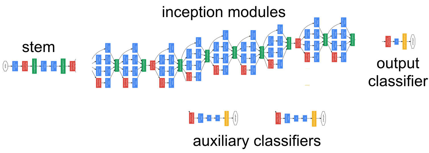
GoogLeNet looks okay, I guess.
But you are right – the graph in the visualization is not hiding anything, i.e. composite nodes (metanodes) are shown expanded. That's why it looks impossible to read. It's overcrowded. But the hierarchy is visible – every metanode is posing as a separate box, so there is clear distinction of where module begins and where it ends. Compare that to the official GoogLeNet visualization, where there are shown only TF ops.

There should be a non-expanded view, but I don't think it would provide much for now. I would like to see something different...
Basically, the problem is that when the whole network is displayed, everything is small and unreadable. I would like to see coupling between cursor in the text and the viewport of the visualization. Simple example depicted on the picture above – if I would be over "im" Inception Module in the definition, only that portion of the visual graph would be shown. What do you think about that? But of course that would be useless for the renderings of the whole architecture...
BTW I have a feeling that U-Net would look ridiculous using current layout.
Also displaying shape of tensor on the edge is planned, but it would be better handled by the actual DL framework. But I am not settled on this yet...
Btw have you considered keras-graph-asci? :)
Your visualization of GoogLeNet is nice, and being able to zoom is wonderful. What I miss though is:
- some "folded" view where I only see the high-level structure (like "inception module") - otherwise I need to guess if these are same blocks or similar (maybe just different colors for InceptionModule, Stem, Classifier and AuxiliaryClassifier?)
- this thing with tensor shapes between modules (and for convs - kernel sizes!).
I am not sure if I understand:
Also displaying shape of tensor on the edge is planned, but it would be better handled by the actual DL framework
Having some export of network from a framework to Moniel would be great, sure! I think that for Keras it would be particularly simple, due its JSON exports and high-level structures.
Well, this ASCII stuff makes sense for very sequential models. Once I get with anything not entirely sequential (not only U-Net, but also - Inception or SqueezeNet modules), it breaks. So I frozen this project and think about doing a D3.js (or something different, but resulting in an interactive SVG graph) one (ideally: then also for Jupyter Notebooks).
maybe just different colors for InceptionModule, Stem, Classifier and AuxiliaryClassifier?
In fact they are different colors. Color is dynamically assigned by module name, so all Inception Modules have the same color. But the opacity of the color is probably too low, so it is not very visible. Also, the function that generates the colors should be more random, so it produces really distinct colors.
some "folded" view where I only see the high-level structure
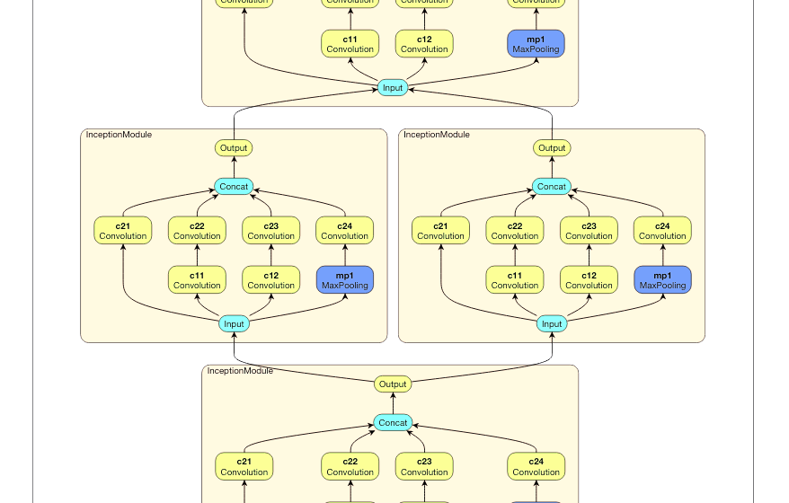
When you don't provide definition body for the metanode, e.g. instead of +Module{ In -> ... -> Out } you just write +Module the metanode will become normal node:

Now you can clearly see that the color function I mentioned needs some tweaks. :D
This is early reply where I don't address all points you made. I'll look at it in the evening again. :)
Yes, it was I meant; just interactive to tweak level of unfolding.
For colors, I recommend on of these themes: http://bl.ocks.org/aaizemberg/78bd3dade9593896a59d
Having some export of network from a framework to Moniel would be great, sure! I think that for Keras it would be particularly simple, due its JSON exports and high-level structures.
That is currently not possible – there is no code generation for Moniel notation. But you probably meant only the visualization part. Yes, that can be done – inside serialized Keras model there is a DAG which can be visualized in a similar way. But Keras already does visualization. Even in Jupyter notebook. What do you mean by "interactive SVG graph"? How it should be interactive?
Also displaying shape of tensor on the edge is planned, but it would be better handled by the actual DL framework.
Moniel notation is capable of representing any static computational graph... So in theory you could define model in this notation, then generate runnable PyTorch code from it. PyTorch knows everything about the computational graph, so it knows all tensors sizes, which could be fed back to the visualization. This covers not only tensor sizes but the contents of the tensor as well. Something like this or this
Yes, it was I meant; just interactive to tweak level of unfolding.
Yes, I'll add it. But it's going to be a brutal hack. :D
For colors, I recommend on of these themes
That is not a good solution, since there are more than 20 distinct operations. And if user can define their own, there is infinite amount of them. Current solution is scalable, but needs a bit of careful tweaking of the hash function.
But you made me realize that there should be some kind of print-friendly color scheme...
OK, I thought your goal was to visualize networks, but I see that you want a more tightly knit solution.
Sure, Keras exports structures in JSON; so they question was if you have something for translation. (Same question for other tools.)
Some color recommendations :
- optimal colors for screen are not the same as for printing (trying to do both at the same time is a bad idea; at the same time it's super easy to have a few color schemes)
- hash function and more than 20 colors is not a good idea (tempting, tried); you will get in worse patterns than using hand-picked colors; infinite color generators are better, vide https://plnkr.co/edit/xVWgSA?p=preview, still - don't count to get more than 16, or 20, easily distinguishable colors; still, in practice there should be no more that ~6 different layers (colors) for a given hierarchy level.
I found an ancient mockups and they are probably relevant, so posting them here. (No technical progress on this issue whatsoever. :D)


@mlajtos This slow motion is what I meant, thanks for sharing. :)
In any case - do you plan to continue your project?
This June I might be working on some network viz project, if I create anything - I'll let you know.
@stared I revisited the concept and did something more practical – L1: Tensor Studio.
The visualization part of the data flow is gone. Instead this is about the actual data and the real computation. It is much more fun than just seeing dead DAGs... However, I still believe that seeing the graph helps somehow.
Recently I decided to rewrite the interpreter, so it is kinda crippled right now... But I am slowly fixing it and it should be much more impressive and public-ready after the summer. Anyway, I hope you will like it... :)
@mlajtos Thanks for your update!
In the meantime, I gave a talk about "Simple diagrams of convoluted neural networks" (slides here). Obviously, I talk about your vis as well. :)
Got quite inspired by Netscope; the newest version/fork is here: https://dgschwend.github.io/netscope/quickstart.html While I miss the hierarchy part (which, IMHO, needs to be included to make diagrams readable).
L1 - looks interesting! BTW: As you may have seen, I am interested in interactive ML, see this list: https://github.com/stared/interactive-machine-learning-list. In a few weeks I start project "In Browser AI" - about using TF.js and related for demos and tutorials. If interested, I am happy to say more. In you want to get notified when it starts, here is the signup form.
In the meantime, I gave a talk about "Simple diagrams of convoluted neural networks" (slides here). Obviously, I talk about your vis as well. :)
😊😆, the most useless thing on the list...
Got quite inspired by Netscope
Yes, Netscope is nice. However, lacking hierarchy and interactivity. Until Caffe prototxt won't support some kind of metanodes, there won't be any hierarchy. :(
L1 - looks interesting!
Thank you. It is A LOT to digest – and it is pain to get details right – but I think it is worth it.
http://p.migdal.pl/interactive-machine-learning-list/
ML Explorables, awesome :) I haven't seen many from the list – got a lot to catch on :)
In Browser AI
I have signed up. Btw L1 uses TF.js as a backend, so learning more about it would be a big plus!