stat_lineribbon and multimodal distributions
Hi I'm using stat_lineribbon with mode_hdi to plot a multimodal distribution changing with time.
It correctly plots the uncertainty in splitted intervals but it only shows a global mode. It is possible to show all the modes instead of the biggest one only? Is this functionality implemented?
thanks FKG
Yeah there isn't an easy way to do this currently, unfortunately. If you had code that got you the second mode you could plot it separately just using a geom_line... I suppose given the two sets of intervals you could subset the data and find the mode within the two regions of high density. This could be done prior to plotting, then you would plot the ribbons with geom_lineribbon(color = NA) (to turn off the line) then plot the lines separately using geom_line.
I do wonder a bit why you need to plot a line along each mode? Without being able to see the chart I obviously can't say, but my guess is the location of the second mode is probably fairly obvious visually even without the line along it.
Hi I generated some data with multimodal sample:
library(tidyverse)
library(tidybayes)

N = 100
Nt = 50
Ns = 200
mydata = tibble(
  patid = paste0("pat", 1:N),
  treatment = sample(c('d1', "d2"), N, replace = T)
  )
mydata = mydata %>% group_by(patid) %>%
  do((function(df){
    param1 = runif(Ns, -0.3, -0.1)
    param2 = runif(Ns, -1.5, -1.3)
    param2b = runif(Ns, -1, -0.5)
    ng = sample(c(1, 2), Ns, prob = c(0.5, 0.5), replace = T)
    time = seq(1, 20, length.out = Nt)
    map_df(time,
           function(tt){
             tibble(
               samples = 1:Ns,
               time = tt,
               treatment = df$treatment,
               Surv = ifelse(treatment == "d1",
                             exp(param1* time),
                             exp(ifelse(ng == 1, param2, param2b)* time))
             )
           })
  })(.))
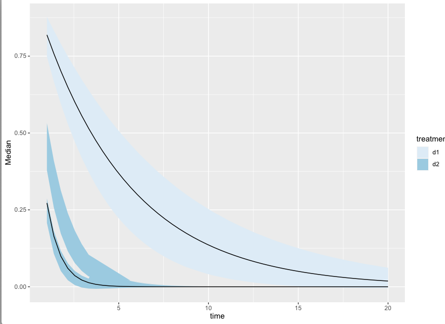
the intervals I'm getting are odd:
mydata %>% ggplot(aes(x = time, y = Surv, fill = treatment)) +
  stat_lineribbon(point_interval = median_hdi, .width = c(0.8))+
  scale_fill_brewer()

However, if I manually create this plot:
mydatasum = mydata %>%
    group_by(time, treatment) %>%
    do(.,{
      allhdis = HDInterval::hdi(density(.$Surv), 0.8, allowSplit = TRUE)
      med = median(.$Surv)
      if(class(allhdis) == 'matrix'){
	data.frame(
          Median = med,
          lower = allhdis[, "begin"],
          upper = allhdis[, "end"],
          group = 1:nrow(allhdis)
        )
      }else{
	data.frame(
		   Median = med,
          lower = allhdis["lower"], upper = allhdis["upper"],
          group = 1
		   )
	}
    })

mydatasum %>%
  ggplot(aes(x = time, y = Median)) +
  geom_ribbon(aes(
    fill = treatment,
    ymin = lower,
                  ymax = upper,
                  group = interaction(treatment, group))) +
  geom_line(aes(group = treatment)) +
  scale_fill_brewer()
Questions:
- stat_lineribbon is really not showing the multimodality even with median_hdi. In fact it seems to be showing the 2nd mode.
- wouldn't it make sense to show a median per mode
- I would love to see your suggestions on how to better plot something like this.
thanks! FKG