Strange right edge behavior in dot plots
The dot plot is not symmetric, and for both x or -x as input the rightmost column of dots is too short. I would expect the plot with -x to be mirror image of plot with x (at least almost).
library(ggplot2)
library(ggdist)
library(patchwork)
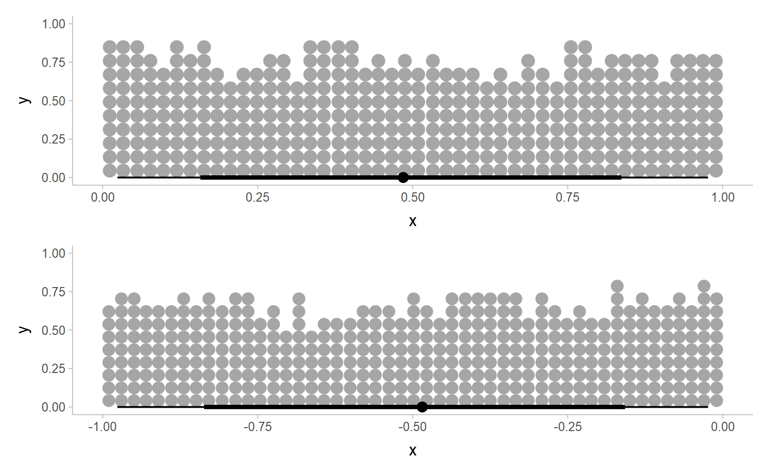
set.seed(1)
ru=runif(4000)
p1=data.frame(x=ru) |> ggplot(aes(x=x)) + stat_dotsinterval(quantiles=4000)
p2=data.frame(x=-ru) |> ggplot(aes(x=x)) + stat_dotsinterval(quantiles=4000)
p1/p2
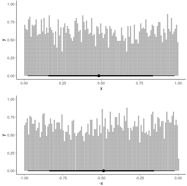
p1=data.frame(x=ru) |> ggplot(aes(x=x)) + stat_dotsinterval(quantiles=400)
p2=data.frame(x=-ru) |> ggplot(aes(x=x)) + stat_dotsinterval(quantiles=400)
p1/p2
I tried to look at the code, but could in a few minutes to find the relevant place which would cause this artefact.
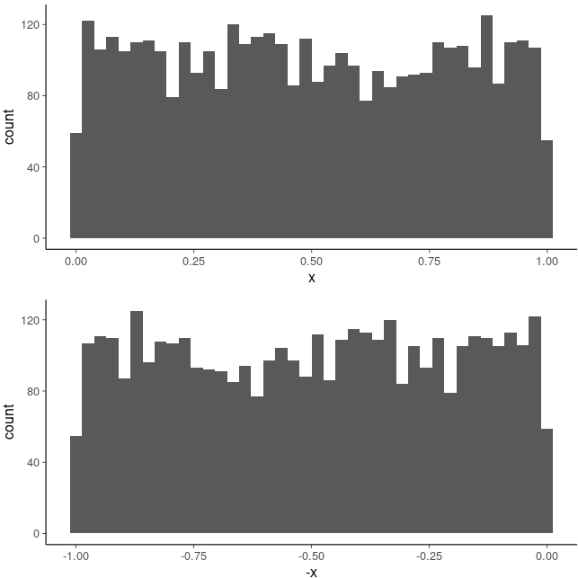
The bounded range is difficult and histogram has also edge effects, but the edge effect is symmetric
p1=data.frame(x=ru) |> ggplot(aes(x=x)) +  geom_histogram(bins=40)
p2=data.frame(x=ru) |> ggplot(aes(x=-x)) + geom_histogram(bins=40)
p1/p2
It may be that I just don't understand the dots plot algorithm and the reason for non-symmetric behavior, and maybe this doesn't need fixing, but I hope this issue makes it easier to discuss this
Adding that with layout='weave', the same artefact is visible, and with layout='swarm' the plots look more symmetric (with symmetric edge effect as in histogram, which is fine when the bounds are unknown)
Yeah, this is a result of the binning algorithm starting from the left edge of the data. Basically, the idea is to:
- start at the smallest value, say x
- combine all data points <= x + binwidth into a bin
- place those values in a stack of dots centered on the midpoint of the range of that bin
- repeat with x = the next largest datapoint above the last bin
This differs from histogram binning in that it allows bins with only one datapoint to be placed "exactly" (in the sense that the dot is centered on that datapoint).
Alternatives include binning from the right, binning from the center outwards (which is currently done automatically only in cases with theoretical distributions that are exactly symmetrical, as it can cause artifacts otherwise), or using a histogram binning algorithm (which does not allow bins with single dots to be placed "exactly").
Not sure the best solution. Currently all but the histogram algorithm are implemented internally, but not exposed to the user. An "easy" solution would be to allow finer control over the layout algorithm by selecting among these. I say "easy" because it might be preferable to have something that works well automatically without manual tweaking. Perhaps at least exposing this choice would be a good start, and improvements to automatic bin method selection can be made later.
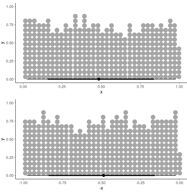
Okay, I thought about this more and I think I've got a robust solution now on the dev branch. It should correct the edge effect (has done so on everything I've tried). It doesn't guarantee mirrored data gives a mirrored layout, but I think it should be close enough. On your example:
set.seed(1)
ru=runif(4000)

p1=data.frame(x=ru) |> ggplot(aes(x=x)) +  stat_dotsinterval(quantiles=4000)
p2=data.frame(x=-ru) |> ggplot(aes(x=x)) + stat_dotsinterval(quantiles=4000)
p1/p2

p1=data.frame(x=ru) |> ggplot(aes(x=x)) +  stat_dotsinterval(quantiles=400)
p2=data.frame(x=-ru) |> ggplot(aes(x=x)) + stat_dotsinterval(quantiles=400)
p1/p2